Scoring genre clarity...

Space Chaos capsule

Space Chaos

A frantic co-op game where you manage hazardous cargo inside an unstable space station as everything spirals out of control. Only your team’s coordination can keep the flow moving.

$7.99Positive(16)
MultiplayerOnline Co-OpCasual
Tin Can StudioApr 22, 2026

Space Chaos scores 73/100 — better than 56% of Steam capsules we've analysed (n=22,658).

Positive (16 reviews) · $7.99 · Released Apr 22, 2026 · By Tin Can Studio

Quick text summary

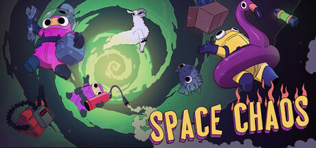
Space Chaos scored 73/100 on Steam Analyzer — Good for a Steam capsule. Top priority fix: [composition] Reduce character overlap or increase visual layering depth (foreground-midground-background separation) to clarify focal hierarchy and reduce center clutter.

Capsule scores by dimension

  • Genre Clarity: 7/10 — Space action with comedic chaos energy. The colorful alien characters, spiral warp portal, and scattered space debris clearly signal a space-themed game with vibrant arcade or indie sensibilities. At TINY size, the bright magenta and purple characters and green vortex still read as space chaos rather than a traditional shooter, though the exact genre (logistics vs. action) remains slightly ambiguous from visuals alone. The whimsical character designs hint at cooperative or party gameplay rather than serious military action.
  • Title Readability: 8/10 — Golden title clear at most sizes. The SPACE CHAOS title uses bold yellow-gold lettering positioned in the lower right, with strong contrast against the dark background and mid-tone space elements. At SMALL size it remains legible; at TINY size it shrinks but the high saturation and weight preserve readability. The title placement avoids heavy overlap with the busy character cluster, supporting quick recognition during fast scroll.
  • Contrast & Color: 8/10 — Vibrant palette pops against dark base. The neon magenta, bright purple, yellow-gold, and lime green elements create strong value and saturation separation from the dark blue-black background and mid-tone green spiral. Character silhouettes are distinct even at reduced sizes due to bold color choices and clean edges. Grayscale stress test shows solid mid-to-light value separation, though the green vortex and dark background compress slightly when desaturated.
  • Uniqueness & Polish: 7/10 — Charming indie art with cohesive style. The hand-drawn or painterly character aesthetic, warm color palette, and playful alien designs feel intentional and distinctive within the space game category, avoiding the hard sci-fi or military look of AAA benchmarks. Visual storytelling emphasizes chaos and cooperation through overlapping characters and dynamic spiral energy rather than a generic spaceship scene. The polish is solid indie standard—clean rendering and coherent art direction—but not premium AAA presentation.
  • Brand Consistency: 7/10 — Consistent whimsical character style. All visible characters share a consistent soft, rounded design language with bold outlines and warm-to-neon color blocking, creating a memorable visual identity. The purple tentacled character, magenta robot, and yellow creature all feel like they belong to the same game world and art direction. The brand identity is internally cohesive but relies on character uniqueness rather than a signature symbol or motif that would persist across store assets without context.
  • Composition: 7/10 — Busy center with anchored title placement. The composition layers characters and effects in the center-left, with the bright green spiral creating a focal vortex that draws the eye upward. The title anchors to the lower right, providing balance and ensuring it survives Steam's potential edge cropping. At TINY size, the overlapping characters still read as a cohesive chaotic group rather than scattered elements, though the busy midground competes slightly with the spiral for attention.

What works

  • Strong color saturation and contrast. Neon magenta, purple, and yellow characters pop decisively against the dark steam background, maintaining clarity even at TINY thumbnail size.
  • Distinctive character-driven identity. The soft, quirky alien designs feel cohesive and memorable, setting the game apart from generic space shooters in the genre.
  • Readable title with safe placement. SPACE CHAOS in bold gold lettering at lower right remains legible across all viewing sizes and avoids cropping risk.
  • Cohesive art direction signals indie polish. The painterly character rendering and unified color language communicate intentional craft and a distinctive visual style.

What hurts the capsule

  • Busy composition obscures focal clarity. Multiple overlapping characters and the spiral vortex create visual noise that competes for attention, especially at SMALL size where hierarchy becomes muddled.
  • Genre intent partially ambiguous at tiny size. The logistics/simulation gameplay core is not visually apparent from the capsule alone; it reads more as action or party chaos without additional context clues.
  • Mid-tone value compression in grayscale. The green spiral and dark background compress together when desaturated, reducing silhouette separation and mid-tone clarity in reduced contrast scenarios.

Priority fixes

  1. [composition] Reduce character overlap or increase visual layering depth (foreground-midground-background separation) to clarify focal hierarchy and reduce center clutter.
  2. [genre_clarity] Add a subtle UI element or logistics/coordination visual cue (e.g., cargo container, supply lines, or coordination indicator) to hint at the game's core simulation mechanic.
  3. [contrast_color] Increase the outline weight or add a subtle dark halo around the green spiral to prevent mid-tone merging with the background in grayscale viewing.

Store copy priority fixes

  1. [feature_communication] Add one concrete example round: 'A typical mission: two players manage cargo intake while a third handles dock logistics. One mistake triggers an alarm, forcing all three to adapt in real-time.' This grounds abstract concepts in actionable gameplay.
  2. [genre_clarity] In the short description, optionally add a gameplay verb: 'A cooperative space logistics game where you manage cargo and systems—until coordination collapses under pressure.' This reinforces the management gameplay loop.
  3. [hook_strength] Strengthen the final CTA by referencing the emotional payoff: 'Can your team stay coordinated when alarms blare and mistakes pile up? Add Space Chaos to your wishlist.' This ties curiosity back to the core tension hook.

Related guides

Steam app ID: 2819410