Scoring genre clarity...

A Gentlemen's Dispute capsule

A Gentlemen's Dispute

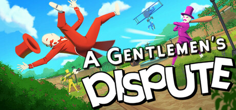
A fancy party brawler for proper scoundrels! Sling traps, swing bats, and fire cannons in destructible arenas as you scramble for absurd perks and weapons. Outlast your so-called peers by any gentlemanly means necessary - all in the name of good sport, of course.

$4.95Very Positive(40)
MultiplayerActionFunny
Blast Furnace GamesSep 19, 2025

A Gentlemen's Dispute scores 70/100 — better than 30% of Steam capsules we've analysed (n=22,658).

Very Positive (40 reviews) · $4.95 · Released Sep 19, 2025 · By Blast Furnace Games

Quick text summary

A Gentlemen's Dispute scored 70/100 on Steam Analyzer — Good for a Steam capsule. Top priority fix: [title_readability] Increase the size and weight of 'A Gentlemen's' text and add a stronger drop shadow or dark outline so the full title reads at tiny thumbnail size

Capsule scores by dimension

  • Genre Clarity: 7/10 — Whimsical brawler party game. The flying gentleman in red, the purple top-hatted character, and the chaotic outdoor arena scene strongly suggest a party brawler or casual action game with a comedic tone. At tiny size the cartoonish characters and dynamic poses still hint at a competitive multiplayer game, though the strategy element is invisible. The biplane and scattered characters reinforce chaotic multiplayer action without being genre-misleading.
  • Title Readability: 7/10 — Bold title reads at small size. The title 'A Gentlemen's Dispute' uses a clean white bold font for 'DISPUTE' which remains readable down to small size, while 'A Gentlemen's' in a thinner style is harder to parse at tiny size. The white lettering against the busy mid-tone background gets some help from the slight drop shadow, but at tiny thumbnail size 'A Gentlemen's' collapses and only 'DISPUTE' survives as readable text. Placement in the lower-center foreground area gives it reasonable breathing room.
  • Contrast & Color: 7/10 — Warm palette pops against Steam dark. The bright red suit of the flying character creates a strong focal contrast against the warm sky-blue background, and the overall warm-tone palette separates reasonably well from Steam's dark #1b2838 background. In grayscale the red character still reads as the brightest mid-value subject against the lighter sky, giving decent silhouette clarity. The green grass and mid-tone background elements create some muddiness in the lower portion at tiny size.
  • Uniqueness & Polish: 7/10 — Charming whimsy with genre appeal. The capsule has a distinctive whimsical character with the exaggerated flying gentleman and cartoonish art style that stands out clearly from the darker, more serious action game competitors in the genre benchmarks. The humorous premise is communicated visually through the absurd poses and top hats, which is a genuine selling point for the casual brawler niche. However, the overall execution feels slightly like a competent indie capsule without that extra layer of polish or cinematic craft that would push it higher.
  • Brand Consistency: 7/10 — Cohesive gentleman theme identity. The top hat motif, exaggerated British gentlemen aesthetic, bright complementary colors, and cartoonish 3D render style form a recognizable internal identity that feels consistent throughout. The color-coded characters in red, purple, and yellow hint at a multiplayer party game with distinct character identities. The whimsical tone and visual language feel consistent with what a party brawler branded around 'gentlemen disputes' would communicate, making it a memorable and cohesive identity signal.
  • Composition: 7/10 — Dynamic focal point with clear hierarchy. The large flying red gentleman in the upper-left dominates as the primary focal point, with the title anchored in the lower-center creating a diagonal energy across the frame. The biplane and purple character in the upper-right provide supporting context without competing for attention at full size. At small and tiny sizes the composition holds reasonably well with the red character and bold 'DISPUTE' text still readable, though the supporting characters and background detail collapse into visual noise at tiny thumbnail size.

What works

  • Strong hero character contrast. The bright red flying gentleman creates an immediate focal point that separates cleanly from the sky-blue background at all sizes.
  • Communicates tone effectively. The absurd, comedic gentleman brawler premise is conveyed visually through exaggerated poses and top hats without needing text explanation.
  • Bold DISPUTE text survives small size. The large white bold lettering of 'DISPUTE' remains legible even at tiny thumbnail dimensions.
  • Distinctive genre niche identity. The whimsical top-hat aesthetic stands out from darker, more serious action game capsules in the same genre space.

What hurts the capsule

  • 'A Gentlemen's' text collapses at tiny size. The thinner, smaller upper portion of the title becomes unreadable at thumbnail dimensions, leaving only 'DISPUTE' as the recognizable word.
  • Busy background creates lower-third muddiness. The green grass, yellow character, and environment details in the lower portion blur into indistinct noise at small and tiny sizes.
  • Strategy genre element absent. Nothing in the capsule suggests the strategy component of the game, potentially missing a segment of the target audience.
  • Supporting characters compete at full size. The purple gentleman and biplane in the upper-right area create a secondary focal pull that dilutes the primary hero character read.

Priority fixes

  1. [title_readability] Increase the size and weight of 'A Gentlemen's' text and add a stronger drop shadow or dark outline so the full title reads at tiny thumbnail size
  2. [composition] Simplify or darken the lower-third background to reduce visual noise from the grass and yellow character, giving the title text a cleaner contrasting region
  3. [contrast_color] Add a subtle vignette or shadow gradient behind the title area to ensure the white text separates from the bright background at all sizes
  4. [genre_clarity] Consider adding a subtle visual cue such as a crossed-bats or arena motif to hint at the brawler strategy gameplay without disrupting the whimsical tone

Store copy priority fixes

  1. [feature_communication] Restructure the detailed description to explicitly list or group features: Weapons (with 2-3 examples), Perk System (how many, when applied), Hazards, Arena Scale. Use bullet points or bold headers to improve scannability.
  2. [uniqueness] Add 1-2 sentences explaining what is mechanically distinct: e.g., 'Between-round perk drafting adds strategic depth' or 'Destructible arena hazards create dynamic gameplay each round'—clarify how this differs from other party brawlers.
  3. [feature_communication] Include an example or two of perks or hazards to make the chaos concrete: e.g., 'Grab perks like Speed Boost or Explosive Ammo' and 'Dodge falling trains and shark-infested water'.

Related guides

Steam app ID: 2820700