Scoring genre clarity...

He is Coming capsule

He is Coming

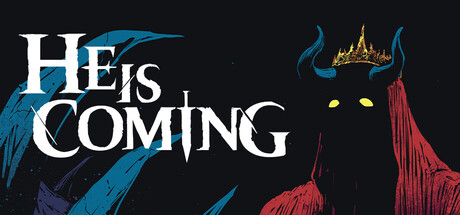
Deep in the forgotten corners of the world, a dark force stirs – the Demon King rises once more. Sharpen your wits, seek out powerful artifacts, and stand firm in the face of the apocalypse in this roguelite RPG auto battler.

$8.99Very Positive(75)
StrategyRoguelikeDungeon Crawler
ChronocleJul 17, 2025

He is Coming scores 63/100 — better than 6% of Steam capsules we've analysed (n=22,658).

Very Positive (75 reviews) · $8.99 · Released Jul 17, 2025 · By Chronocle

Quick text summary

He is Coming scored 63/100 on Steam Analyzer — Solid for a Steam capsule. Top priority fix: [genre_clarity] Add a subtle visual cue to the background or foreground such as card icons, dice, or a battlefield minimap element to hint at the strategy or roguelite mechanic without disrupting the tone.

Capsule scores by dimension

  • Genre Clarity: 5/10 — Dark fantasy unclear subgenre. The crowned demon figure and dark fantasy aesthetic communicate a dark RPG or strategy setting effectively at full size. However, at tiny size the image collapses into a dark blob with glowing eyes, which hints at a boss or antagonist reveal but gives no clear signal of roguelite, auto battler, or strategy mechanics. The genre reads as broad dark fantasy rather than any specific subgenre.
  • Title Readability: 7/10 — Bold serif reads well at small. The title 'HE IS COMING' uses a large, bold white serif font with strong contrast against the near-black background, making it readable at small capsule size. At tiny thumbnail size the letterforms become compressed but the white-on-black contrast keeps it just about legible. The stacked layout with varied sizing on 'IS' is slightly decorative but does not collapse badly at small sizes.
  • Contrast & Color: 7/10 — Strong dark contrast, muted palette. The near-black background separates well from the Steam dark background #1b2838 because the capsule uses true black rather than navy, creating a clear edge. The glowing yellow eyes and gold crown provide the only warm accent and act as a focal point even at tiny size. The blue-grey wing silhouette on the left has weaker separation and blends at tiny size, but the right-side demon figure reads clearly in grayscale due to the red-tinged dark tones against the black.
  • Uniqueness & Polish: 6/10 — Competent comic art, generic concept. The comic book ink style with hatching and limited color palette gives it a distinctive hand-drawn quality that stands out slightly from fully rendered 3D capsules common in the genre. However, the concept of a dark demon king looming against a black background is extremely common in dark fantasy and does not communicate a unique selling point or any hint of the roguelite auto battler mechanics. At small size it reads as a competent but generic dark fantasy capsule.
  • Brand Consistency: 7/10 — Cohesive ink-style dark identity. The comic book ink aesthetic, limited palette of black, deep red, muted blue, gold, and white, and the strong demon king motif create a recognizable internal identity. The typography style complements the hand-drawn art direction without clashing. The crowned demon with glowing yellow eyes is a memorable enough icon that could serve as a recurring brand element across store assets.
  • Composition: 6/10 — Left title, right figure, sparse. The layout places the title on the left third and the demon figure on the right third, which is a conventional split that works reasonably well at full size. The blue wing element on the far left feels underutilized and creates an awkward dead zone in the center-left area that does not contribute meaningfully. At small and tiny size the composition loses the center entirely and the two halves feel disconnected, with the title and character competing as separate focal points rather than forming a unified hierarchy.

What works

  • High contrast title text. The bold white serif title against the black background remains legible even at small capsule size due to strong value separation.
  • Memorable demon king icon. The glowing yellow eyes and gold crown create a distinctive focal point that is visible even at tiny thumbnail size.
  • Distinctive ink art style. The comic book hatching style differentiates this from fully rendered 3D genre peers and gives it a recognizable hand-crafted feel.
  • Effective dark palette edge contrast. Using true black rather than dark navy ensures the capsule edge separates from Steam's #1b2838 background without a halo or blending issue.

What hurts the capsule

  • No genre mechanic cues. Nothing in the image hints at roguelite, auto battler, or strategy gameplay, meaning players browsing by genre will not self-select correctly.
  • Weak center composition. The large empty dark center between the title block and the demon figure creates a void that makes the capsule feel sparse and disconnected at small sizes.
  • Blue wing element underused. The blue-grey wing on the left adds little readable information at small or tiny size and blends into the background, wasting prime left-edge real estate.
  • Generic dark fantasy concept. A looming demon antagonist on a black background is one of the most common dark fantasy tropes and does not communicate the game's unique roguelite auto battler hook.

Priority fixes

  1. [genre_clarity] Add a subtle visual cue to the background or foreground such as card icons, dice, or a battlefield minimap element to hint at the strategy or roguelite mechanic without disrupting the tone.
  2. [composition] Bring the demon figure closer to center and reduce or remove the isolated blue wing to close the dead zone and create a tighter unified focal point that survives cropping at tiny size.
  3. [uniqueness_polish] Introduce a small but distinctive tagline or visual motif that communicates the auto battler or roguelite USP, differentiating from generic dark fantasy antagonist capsules in the same genre.
  4. [contrast_color] Increase the saturation or brightness of the crown and glowing eyes slightly so the key focal point pops more aggressively at tiny thumbnail size under quick-scroll conditions.

Store copy priority fixes

  1. [feature_communication] Clarify the auto-battler mechanic early: explain whether battles are fully automated, player-controlled, or hybrid, and show how it differs from active combat roguelites—this is a core genre identifier that is completely absent.
  2. [genre_clarity] Explicitly address the card game / deckbuilding tags by introducing card mechanics into the detailed description—currently the copy reads as pure item-based roguelite with no mention of cards, causing genre confusion.
  3. [uniqueness] Add a sentence contrasting this game's strategy depth or synergy system against named competitors or roguelite subgenres (e.g., 'Unlike static card pools, every item-based build is unique to your hunt' or 'Deeper synergy trees than traditional deckbuilders').
  4. [hook_strength] Rewrite the opening line to lead with the most distinctive mechanic rather than generic apocalypse framing (e.g., 'Master 350+ items to outsmart 30+ unique bosses hunting you every three days' or 'Build the perfect defense against a new threat every 72 hours').

Related guides

Steam app ID: 2824490