Scoring genre clarity...

Wrath of the Roothless capsule

Wrath of the Roothless

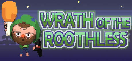
Wrath of the Roothless is a 2d melee roguelike, where you play as jacob wielding his trusty Drumstick and Trashcan Lid to fight your way through hordes of monsters. Fight your way through to exact revenge and teach those monsters a lesson!

$2.992 user reviews
ActionAction RoguelikeAdventure
DKat GamesMar 12, 2024

Wrath of the Roothless scores 68/100 — better than 17% of Action capsules (n=8,734).

2 user reviews · $2.99 · Released Mar 12, 2024 · By DKat Games

Quick text summary

Wrath of the Roothless scored 68/100 on Steam Analyzer — Solid for a Action capsule. Top priority fix: [title_readability] Increase the point size of 'of the' text or use a uniform large size for the entire title so all words remain readable at 120x45 thumbnail scale

Capsule scores by dimension

  • Genre Clarity: 7/10 — Pixel melee action clear. The pixel art style immediately signals indie action game, and the combat-ready poses of the central bearded character wielding a drumstick and flanking enemy characters reinforce a melee brawler or roguelike reading. The dark fantasy night sky background with monster enemies on both sides clearly communicates combat gameplay. At tiny size the pixel characters are still distinguishable as fighters in an action context, though the specific roguelike subgenre is not explicitly communicated.
  • Title Readability: 7/10 — Bold pixel font reads well. The title 'Wrath of the Roothless' uses a chunky green pixel font with dark outlines that provides decent contrast against the purple-blue night sky background. At full size the lettering is clear and readable. At tiny thumbnail size the larger words WRATH and ROOTHLESS remain legible due to their bold weight, but 'of the' in smaller letters between them collapses and becomes unreadable, making the full title unclear at minimum scale.
  • Contrast & Color: 7/10 — Good separation against dark background. The warm orange moon behind the central character creates a strong focal highlight that pops well against the cool purple-blue background and Steam's dark #1b2838 browser background. The green hoodie of the main character provides good chromatic contrast against the muted background. In grayscale the silhouettes of the three main characters are reasonably distinct, though the darker enemy characters on the left and right edges have slightly less separation from the background at tiny size.
  • Uniqueness & Polish: 6/10 — Charming but genre-standard indie style. The pixel art has a consistent and appealing style with the bearded protagonist wielding a drumstick and trashcan lid as weapons, which is a quirky and memorable hook that differentiates from generic fantasy. However the overall composition of hero-flanked-by-enemies against a night sky is a very common indie capsule template. The craft is competent and clean but does not feel premium or particularly distinctive when compared to top-tier indie capsules like DAVE THE DIVER or Balatro that have a stronger unique visual hook.
  • Brand Consistency: 7/10 — Cohesive pixel art identity. The pixel art rendering style is consistent across all visible elements including characters, background trees, moon, and title font which all share the same aesthetic language. The color palette of cool purples and blues with warm orange accent and green character pop is internally coherent. The quirky character design with the bearded hoodie-wearing protagonist wielding improvised weapons gives a recognizable identity that could be recalled across multiple exposures.
  • Composition: 7/10 — Clear three-character hierarchy works. The composition places the main character centrally with the orange moon as a backing spotlight creating a clear focal point, while flanking enemy characters provide dynamic energy without competing for primary attention. The title sits cleanly in the upper portion over the relatively uncluttered sky. At small size the central character remains the dominant readable element, though at tiny size the three-character arrangement compresses and the flanking enemies become hard to distinguish as separate figures from the central hero.

What works

  • Strong central focal point. The orange moon behind the protagonist creates an effective spotlight that immediately draws the eye to the main character even at small viewing sizes.
  • Quirky weapon identity. The drumstick and trashcan lid weapons visible on the protagonist give the game a memorable and unique personality that stands out within the melee roguelike subgenre.
  • Consistent pixel art palette. The cool blue-purple background with warm orange and green accent colors creates a coherent and appealing color story across all elements.
  • Clean title placement. The title text occupies the upper sky region with minimal background noise, giving it a controlled backdrop that aids legibility at multiple sizes.

What hurts the capsule

  • Small title words collapse at tiny size. The words 'of the' in the title are significantly smaller than WRATH and ROOTHLESS and become completely unreadable at 120x45 thumbnail size.
  • Edge characters lose separation at small size. The darker enemy characters on the left and right edges blend into the dark background at tiny size, reducing the dynamic three-character impact of the composition.
  • Generic night-sky backdrop. The purple night sky with small trees is a very common indie pixel art setting that does not distinguish the game's world or tone from dozens of similar titles.
  • No gameplay mechanic visual cue. The roguelike or wave-based gameplay mechanics are not visually implied by any UI element, icon, or compositional metaphor that would help differentiate it from a simple brawler.

Priority fixes

  1. [title_readability] Increase the point size of 'of the' text or use a uniform large size for the entire title so all words remain readable at 120x45 thumbnail scale
  2. [contrast_color] Add a subtle rim light or brighter outline to the flanking enemy characters on the left and right edges to improve silhouette separation from the dark background at small sizes
  3. [uniqueness_polish] Reinforce the improvised-weapon humor angle with a small visual gag or effect such as a motion blur on the drumstick or a comedic impact star to communicate the game's unique tone more instantly
  4. [genre_clarity] Add a subtle visual cue referencing the roguelike loop such as a dungeon doorway in the background or a small horde indicator to distinguish the genre from a basic brawler at a glance

Store copy priority fixes

  1. [hook_strength] Rewrite the short description to lead with 'A war veteran armed with a drumstick and trash can lid must punch his way through hordes of monsters to reclaim his destroyed home—in this absurdist 2D roguelike' to create emotional stakes and curiosity before naming the genre.
  2. [feature_communication] Expand the Gameplay section to explain what 'wrath' currency concretely does (e.g., 'Spend wrath at a shop to unlock new combos, or sacrifice it to unlock god favors that fundamentally alter your powers') so the loop feels consequential.
  3. [uniqueness] Add a 1-2 sentence paragraph articulating what mechanically or narratively differentiates Wrath from other action roguelikes—e.g., a unique combo or blessing system, a specific tone or art direction that matters, or a roguelike twist on a familiar concept.
  4. [audience_targeting] Include a brief signal about who this is for (e.g., 'For fans of risk-reward roguelikes and quirky indie action') or clarify expected run length and difficulty tier so the right players self-identify.

Related guides

Steam app ID: 2827490 · Tags: Action, Action Roguelike, Adventure, 2D Fighter, Hack and Slash