Scoring genre clarity...

BRAVELY DEFAULT FLYING FAIRY HD Remaster capsule

BRAVELY DEFAULT FLYING FAIRY HD Remaster

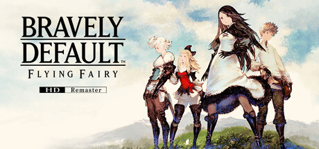
BRAVELY DEFAULT returns in HD! Relive the tale of the warriors of light. Enjoy strategic battles and over 20 different jobs. Plus modern gameplay enhancements and all-new minigames. The story of light and shadow that never fades is reborn.

$27.99Very Positive(31)
RPGViolentJRPG
Square Enix, Cattle Call Inc.Mar 12, 2026

BRAVELY DEFAULT FLYING FAIRY HD Remaster scores 68/100 — better than 19% of Steam capsules we've analysed (n=22,658).

Very Positive (31 reviews) · $27.99 · Released Mar 12, 2026 · By Square Enix

Quick text summary

BRAVELY DEFAULT FLYING FAIRY HD Remaster scored 68/100 on Steam Analyzer — Solid for a Steam capsule. Top priority fix: [uniqueness_polish] Add a distinctive visual hook—such as a signature color accent, iconic character silhouette, or battle-related UI element—that immediately signals Bravely Default's unique identity within the JRPG space.

Capsule scores by dimension

  • Genre Clarity: 7/10 — Fantasy RPG evident from cast. The grouped party of stylized characters in fantasy attire and the pastoral landscape clearly signal a JRPG setting. At tiny size, the silhouettes of the diverse cast still read as a fantasy party, though specific job roles become difficult to discern. The art style and composition effectively communicate the genre without ambiguity.
  • Title Readability: 8/10 — Bold title with minor tagline issues. BRAVELY DEFAULT and FLYING FAIRY read clearly at all sizes due to strong black sans-serif typography with excellent contrast against the light sky background. The small tagline 'HD Remaster' is readable at full and small sizes but becomes illegible at tiny size, though the main title remains strong. Strategic placement in the upper left avoids the character cluster and maintains legibility across viewing conditions.
  • Contrast & Color: 7/10 — Sky background supports title contrast. The light blue sky and pale background create strong value separation from the dark title text and the mid-to-dark-toned character silhouettes in the center-right. Characters have clear edges against the landscape, and the overall composition avoids muddy mid-tones. At tiny size the contrast holds reasonably well, though some character detail merges into the background foliage.
  • Uniqueness & Polish: 6/10 — Competent but familiar fantasy ensemble. The character group pose and pastoral setting are well-executed but follow familiar JRPG marketing conventions seen in Persona 3 Reload and similar titles. The art quality is clean and polished, with good rendering of clothing and poses, but the composition lacks a distinctive hook or unique visual storytelling that would elevate it above genre baseline. The remaster branding adds context but doesn't enhance the visual distinctiveness.
  • Brand Consistency: 6/10 — Generic fantasy presentation, no iconic motifs. The capsule uses standard JRPG visual language—diverse party standing together, fantasy costumes, pastoral setting—with no memorable identity cues that would distinguish Bravely Default from competitors. While the art is internally consistent and well-rendered, there are no signature colors, character motifs, or design elements that signal this specific franchise. The presentation is cohesive but interchangeable with other mid-tier fantasy RPGs.
  • Composition: 7/10 — Clear title hierarchy, balanced character placement. The title dominates the upper left with strong visual weight, while the party is arranged naturally across the right and center with good depth layering against the landscape. The focal point shifts appropriately from title to ensemble cast, creating natural visual flow. At small and tiny sizes, the composition remains clear, though character distinctions flatten; the upper title placement ensures readability is never compromised by the character cluster below.

What works

  • Strong title contrast and placement. Black sans-serif type against the light sky ensures BRAVELY DEFAULT and FLYING FAIRY remain readable at all viewing sizes, with strategic positioning away from character clutter.
  • Cohesive landscape composition. The pastoral background, character grouping, and depth layering create a polished, professional look that reads cleanly even at small size without visual chaos.
  • Clear JRPG identity signaling. The ensemble party pose, fantasy costumes, and outdoor setting immediately communicate the game is a fantasy RPG without ambiguity.

What hurts the capsule

  • Generic fantasy presentation. The capsule lacks distinctive visual hooks or memorable brand identity cues that would differentiate Bravely Default from other fantasy RPGs in a crowded genre.
  • Illegible tagline at tiny size. The 'HD Remaster' label becomes unreadable at thumbnail scale, though the main title survives; secondary information is lost during quick scroll.
  • Character detail loss at small scales. While silhouettes remain visible at tiny size, individual character poses and outfit distinctions merge into an undifferentiated group, reducing visual richness.

Priority fixes

  1. [uniqueness_polish] Add a distinctive visual hook—such as a signature color accent, iconic character silhouette, or battle-related UI element—that immediately signals Bravely Default's unique identity within the JRPG space.
  2. [brand_consistency] Integrate a recurring design motif or palette signature (from other store assets) that would be recognizable across marketing materials and strengthen franchise identity on repeat viewing.
  3. [title_readability] Remove or enlarge the 'HD Remaster' tagline so it remains legible at small capsule size, or use a more prominent badge treatment for the remaster branding.

Store copy priority fixes

  1. [hook_strength] Add a sentence in the short description that explains the appeal beyond remaster status—e.g., 'Master the Brave/Default command system to outwit enemies with strategy and timing' or 'Switch between 20+ classes mid-battle to adapt to any challenge.' This gives newcomers a gameplay reason to care.
  2. [uniqueness] Expand the Brave/Default mechanic explanation to emphasize what makes it strategically unique—e.g., 'Plan ahead by banking actions with Default, then unleash devastating multi-turn combos with Brave; overspend and leave yourself vulnerable.' This sets it apart from standard turn-based JRPGs.
  3. [audience_targeting] Add a sentence addressing new players—e.g., 'New to the series? This remaster is the perfect entry point with modernized controls and quality-of-life features.' This signals accessibility and broadens appeal beyond franchise loyalists.
  4. [feature_communication] Clarify the 20+ jobs system by adding a concrete example—e.g., 'Switch jobs on the fly to combine abilities: pair Warrior offense with Monk support for endless tactical depth.' This makes the system's value tangible.

Related guides

Steam app ID: 2833580