Scoring genre clarity...

Koltera 2 capsule

Koltera 2

Gather resources, craft items, and grow a team of creatures in this relaxed incremental idle RPG. Automate your skills, send creatures on expeditions, and keep progressing even while offline.

Free to PlayMostly Positive(25)
IdlerRPGCasual
BraymenMar 6, 2026

Koltera 2 scores 60/100 — better than 0% of Steam capsules we've analysed (n=22,658).

Mostly Positive (25 reviews) · Free to Play · Released Mar 6, 2026 · By Braymen

Quick text summary

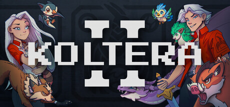
Koltera 2 scored 60/100 on Steam Analyzer — Solid for a Steam capsule. Top priority fix: [contrast_color] Darken the capsule background significantly or add a strong vignette so the overall image separates cleanly from Steam's dark UI and character edges read in grayscale.

Capsule scores by dimension

  • Genre Clarity: 6/10 — Creature collector RPG implied. The presence of anime-style trainers flanking colorful creature companions strongly suggests a creature-collector or monster-taming RPG, which aligns with the actual genre. However, the 'relaxed idler' and 'incremental' nature of the game is not communicated at all from the visuals alone. At tiny size, the creature silhouettes and character poses still loosely hint at a Pokémon-style RPG, which is reasonably accurate but not precise enough to suggest the idle/casual layer.
  • Title Readability: 7/10 — Bold pixel title, small size holds. The 'KOLTERA II' logotype uses a chunky pixel/block serif style in white with visible drop shadow against the darker center background, which aids separation. At full size it reads clearly. At tiny size (120x45), 'KOLTERA' remains legible due to its large block letterforms, though the 'II' roman numeral stacked above may compress and become ambiguous. The pixel styling is distinctive and fits the indie aesthetic without collapsing entirely at small scales.
  • Contrast & Color: 6/10 — Mid-range contrast, center holds. The central logo area benefits from a dark grey hexagonal background that separates the white title text clearly. However, the characters on both sides are rendered against a relatively light grey background, creating poor separation from the Steam dark interface (#1b2838) where a light capsule body would contrast but the character edges blend into the mid-grey. In grayscale, the creature silhouettes on the far left and right lose edge definition and can merge with the background at tiny size.
  • Uniqueness & Polish: 5/10 — Competent but genre-generic feel. The anime character art and creature companions are competently drawn but evoke a very familiar Pokémon-trainer aesthetic without a strong unique hook. The pixel-font title adds a retro indie touch but the overall layout — two trainers flanking a logo with small creatures scattered around — is a common template for creature-collector games. There is no strong visual storytelling element that communicates the incremental idle loop or any unique selling point that differentiates it from dozens of similar indie RPGs.
  • Brand Consistency: 6/10 — Coherent anime creature-collector identity. The art style is internally consistent — all characters and creatures share the same anime line-art rendering style and a muted but warm color palette with teal and red accents. The pixel logotype pairs acceptably with the hand-drawn art style, though the tonal shift from chunky pixel text to fluid anime illustration is a mild inconsistency. The overall package would be recognizable across store assets if the same character roster and palette are maintained, but lacks a truly iconic anchor element like a mascot or signature symbol.
  • Composition: 6/10 — Symmetrical layout, crowded at edges. The composition uses a symmetrical split — one trainer on each side, logo centered, creatures filling negative space — which is functional and balanced. However, at small and tiny sizes the outer characters and edge creatures (the bird top-left, the boar bottom-right) are cropped or compressed into illegible shapes, weakening the ensemble feel. The center-weighted logo placement is smart for crop resilience, but the busy arrangement of six characters and creatures creates equal visual weight throughout, with no single strong focal point that anchors the eye at tiny scale.

What works

  • Legible pixel logo at small size. The bold block letterforms of 'KOLTERA' hold up reasonably well at small capsule sizes due to high stroke width and white-on-dark placement.
  • Clear creature-collector theme. Trainers paired with diverse creature companions immediately signals a monster-taming RPG to genre-aware browsers without needing to read any text.
  • Internally consistent art style. All characters and creatures share a unified anime line-art rendering and a coherent warm-cool palette that feels professionally directed.
  • Centered logo is crop-resilient. Placing the title in the horizontal center of the header ensures it survives most Steam cropping scenarios without being clipped.

What hurts the capsule

  • No idle or casual tone communicated. Nothing in the visual language suggests the relaxed incremental idle loop, which is the game's core differentiator from action RPGs.
  • Edge characters compress to noise at tiny size. The outer trainer figures and small creature icons near the corners collapse into unreadable detail blobs at 120x45, diluting the ensemble impact.
  • Light mid-grey background reduces Steam contrast. The capsule's overall light-grey tone does not separate cleanly from Steam's dark #1b2838 interface, reducing pop during quick scroll.
  • No single dominant focal point. Six characters and creatures compete for attention with roughly equal visual weight, preventing a fast single-glance read at small sizes.

Priority fixes

  1. [contrast_color] Darken the capsule background significantly or add a strong vignette so the overall image separates cleanly from Steam's dark UI and character edges read in grayscale.
  2. [genre_clarity] Introduce a subtle visual cue for the idle/casual tone — such as a progress bar, resource icons, or a looping automation motif — to differentiate from action creature-collectors.
  3. [composition] Reduce the character count visible at small size by making one central character or creature the clear hero focal point, pushing others to supporting roles with reduced scale.
  4. [uniqueness_polish] Add a distinctive visual hook or unique creature mascot that acts as an iconic anchor recognizable across all store assets and thumbnails.

Store copy priority fixes

  1. [uniqueness] Add 1–2 sentences explaining what the Awakening prestige system offers that is specific to Koltera 2: e.g., 'Awaken creatures to reset their level but unlock permanent stat bonuses and cosmetics, creating a prestige loop that exponentially accelerates your late-game farming speed.' This transforms a generic feature mention into a concrete differentiator.
  2. [hook_strength] Replace "cozy incremental idle RPG" with a more active, benefit-focused hook in the short description: e.g., 'Summon and automate 120 unique creatures to idle for you—earn rewards, prestige, and progress even while offline in this completely free, no-MTX RPG.' Lead with the player agency (summoning) rather than atmosphere.
  3. [feature_communication] Expand the prestige and skill automation sections with one additional sentence each explaining the player feedback loop: e.g., 'Assign creatures to automate your gathering and crafting, compounding your resource production each time you return.' This clarifies *why* automation matters mechanically.
  4. [uniqueness] Add a closing sentence to the detailed description that explicitly contrasts Koltera 2 against the free-to-play monetization norm: e.g., 'Unlike most F2P idle games, Koltera 2 has zero battle passes, cosmetic paywalls, or time-gated content—pure progression for everyone.' This transforms a feature (no MTX) into a brand positioning statement.

Related guides

Steam app ID: 2834700