Scoring genre clarity...
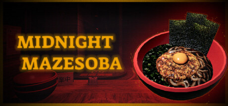
Midnight Mazesoba is a bite-sized atmospheric horror-cooking sim where you run a cozy ramen stall, serving warm bowls of mazesoba amid creeping shadows. Upgrade your shop, get to know your customers, and uncover the fate of the other late-night food carts.
$4.99Mostly Positive(43)
HorrorSimulationPsychological Horror
MagiStone GamesOct 31, 2025