Scoring genre clarity...

Machine Mind capsule

Machine Mind

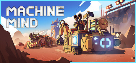
Machine Mind is an action game in a post-apocalyptic setting with elements of survival and RTS. You will fight, craft modules, build your transport, develop and protect your base. You can control other vehicles to automate operations. Discover all the secrets of the destroyed world!

$13.99Mostly Positive(36)
RPGBase BuildingTower Defense
Chudo-Yudo GamesMar 5, 2026

Machine Mind scores 65/100 — better than 11% of Steam capsules we've analysed (n=22,658).

Mostly Positive (36 reviews) · $13.99 · Released Mar 5, 2026 · By Chudo-Yudo Games

Quick text summary

Machine Mind scored 65/100 on Steam Analyzer — Solid for a Steam capsule. Top priority fix: [contrast_color] Darken the background desert area behind the central machine and add a subtle vignette or gradient toward #1b2838 at the edges to improve separation from Steam's dark UI during scroll.

Capsule scores by dimension

  • Genre Clarity: 7/10 — Post-apoc strategy survival clear. The isometric view of a cobbled-together mobile base/vehicle surrounded by alien threats and wasteland terrain strongly communicates a post-apocalyptic survival strategy game. The alien spacecraft silhouettes in the top-left and the scrap-built machine in the center together imply an RTS or survival-builder genre effectively. At tiny size the isometric machine and alien enemies still suggest strategy or base-building, though the RTS action element is harder to parse.
  • Title Readability: 7/10 — Bold title reads at small size. The title 'FORGOTTEN MACHINES' uses a bold, chunky font with a white top word and orange bottom word, placed on a clean upper-right area with minimal background competition. At full size it is clearly legible. At tiny size the two-line stacked layout and high-contrast orange 'MACHINES' still reads, though 'FORGOTTEN' in white may fade slightly against the light sandy background at the smallest thumbnail sizes.
  • Contrast & Color: 6/10 — Warm desert palette limits pop. The sandy beige and warm brown palette of the desert landscape is close in value to Steam's dark background only at the very edges, but the central machine and alien ships have reasonable silhouette separation. In a grayscale test the center machine reads as a distinct mid-dark shape, but the background desert sand is very light and creates a flat, washed-out feel against #1b2838. The alien blue ice patches and glowing effects add some contrast variety but aren't dominant enough to rescue the overall warmth.
  • Uniqueness & Polish: 6/10 — Charming style, generic execution. The cartoon isometric art style is clean and appealing with good character in the scrap-built machine design, suggesting a distinctive visual identity. However, the composition feels like a standard 'game scene' capsule rather than a curated hero moment, and compared to top-performing indie strategy capsules like Manor Lords or Frostpunk 2 it lacks a strong visual storytelling hook or a single iconic image that sells the unique selling point. The craft is competent but doesn't stand out in a crowded genre scroll.
  • Brand Consistency: 7/10 — Cohesive art direction, clear palette. The cartoon isometric style, warm desert palette, and scrap-machine aesthetic feel internally consistent and suggest a recognizable visual identity that likely matches the in-game screenshots. The alien designs and the central vehicle share a unified rendering style with consistent line weight and shading. The orange accent in the logo ties to the overall warm palette, reinforcing brand cohesion, though the identity is not yet distinctive enough to be recognized without the title.
  • Composition: 6/10 — Centered subject, safe but static. The central scrap-machine acts as a clear focal point in an isometric scene with background alien ships and foreground debris providing some depth layering. The title sits safely in the upper right without competing with the main subject. At small and tiny sizes the center machine remains readable as the primary subject, but the composition feels flat and spread out, with the alien ships at top-left and the smaller machines at bottom-right dividing attention without a strong hierarchy pull toward a single dramatic focal point.

What works

  • Bold two-color title treatment. The white and orange stacked logo is chunky and legible even at small capsule sizes.
  • Recognizable isometric scrap-machine hero. The central cobbled-together vehicle is distinctive and communicates the game's core identity at a glance.
  • Genre cues present at small size. Alien threats, isometric view, and base-like vehicle together clearly imply post-apoc strategy/survival without needing text.
  • Internally consistent art direction. Cartoon line-art rendering, warm palette, and scrap aesthetic feel unified across all visible elements.

What hurts the capsule

  • Sandy background washes out at tiny size. The light beige desert ground creates low separation against Steam's dark UI and makes the overall capsule feel faded in a scroll.
  • No single iconic hero moment. The scene reads as a generic game overview rather than a curated dramatic moment that sells the game's unique appeal.
  • Divided focal attention. Alien ships top-left, secondary machines bottom-right, and scrap base center compete equally without a clear visual hierarchy.
  • Title placement on light background. The white 'FORGOTTEN' text sits against the sandy background at the right edge, reducing contrast and risking readability at tiny sizes.

Priority fixes

  1. [contrast_color] Darken the background desert area behind the central machine and add a subtle vignette or gradient toward #1b2838 at the edges to improve separation from Steam's dark UI during scroll.
  2. [composition] Elevate the central scrap-machine to a more dramatic hero pose or close-up crop, reducing competing elements at corners to create a single undeniable focal point at tiny size.
  3. [title_readability] Add a subtle dark shadow, outline, or semi-transparent backing panel behind 'FORGOTTEN' in white to ensure it reads against the light sandy background at all sizes.
  4. [uniqueness_polish] Replace the generic overhead scene composition with a more dynamic angle or a cinematic moment that illustrates a unique mechanic, such as the vehicle in motion or a standoff with an alien threat.

Store copy priority fixes

  1. [hook_strength] Rewrite the opening to emphasize the unique consciousness-in-a-machine premise as the emotional hook: 'Your mind is trapped in a metal shell. Survive the post-apocalypse, rebuild a shattered world, and uncover the truth behind humanity's collapse—command rover fleets, fortify your base, and battle mutant raiders.'
  2. [feature_communication] Add one concrete example per major feature: 'Customize rovers with weapon modules for combat or mining attachments for gathering. Assign your fleet to autonomous tasks—some defend while others gather resources—and strategically focus your own piloting on critical battles.'
  3. [uniqueness] Clarify the hybrid appeal in the short description with a single differentiating sentence: 'Blend real-time action combat with strategic base management: pilot vehicles yourself, or delegate to your fleet while you focus on tower defense and resource logistics.'
  4. [audience_targeting] Add a sentence signaling playstyle: 'Single-player campaign focused on strategic decision-making and exploration—pause and plan your rover assignments, then execute in real-time combat.' (or vice versa if gameplay differs).

Related guides

Steam app ID: 2861590