Scoring genre clarity...

Restaurats capsule

Restaurats

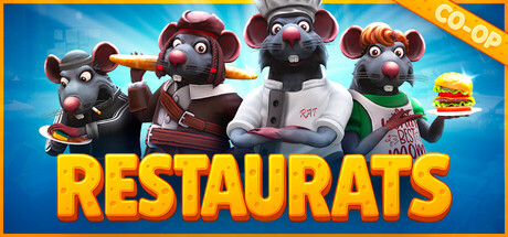
Lead a medieval restaurant with a team of rats like you! Cook the food, throw it at the guests, wipe the drinks under the skeletons! Become a legendary rat chef, proving to orcs and vampires that the most delicious bloody meat is served in your restaurant!

$9.95Very Positive(73)
Co-opMultiplayerCooking
toR StudioNov 7, 2025

Restaurats scores 72/100 — better than 44% of Steam capsules we've analysed (n=22,658).

Very Positive (73 reviews) · $9.95 · Released Nov 7, 2025 · By toR Studio

Quick text summary

Restaurats scored 72/100 on Steam Analyzer — Good for a Steam capsule. Top priority fix: [composition] Promote one central hero rat character as the clear focal point and push the other three into supporting positions to create stronger visual hierarchy at tiny size.

Capsule scores by dimension

  • Genre Clarity: 7/10 — Restaurant sim with rats. The four anthropomorphic rat characters dressed in chef and waiter uniforms, one holding a burger and another holding a baguette, clearly communicate a food or restaurant theme. The cartoonish 3D style and character costumes point toward a casual simulation game. At tiny size the rat chef silhouettes and food props are still recognizable enough to imply a cooking or restaurant genre.
  • Title Readability: 8/10 — Bold title reads well. The title RESTAURATS is rendered in large, bold yellow letters with a dark outline at the bottom of the capsule, providing strong contrast against the lighter background. The wordplay combining restaurant and rats is clever and legible at small size. At tiny size the letters compress but the thick stroke and high contrast keep it readable, though the finer outlines may soften slightly.
  • Contrast & Color: 7/10 — Warm palette pops from dark. The bright blue gradient background contrasts well against Steam's dark #1b2838 interface, giving the capsule a warm-cool dynamic that helps it stand out. The rat characters have varied warm tones and the yellow title creates a strong value anchor at the bottom. In grayscale the character silhouettes separate reasonably from the background, though the lighter rat on the right blends slightly with the bright blue sky.
  • Uniqueness & Polish: 7/10 — Charming but genre-familiar style. The anthropomorphic rat restaurant premise is distinctive and the 3D character renders are clean and expressive with good detail in the costumes. The concept has a clear visual hook that differentiates it from generic casual sim capsules. However, the overall composition and style feel familiar to other indie casual games and it does not reach the visual ambition of top-tier capsules in the genre.
  • Brand Consistency: 7/10 — Cohesive cartoon rat identity. The four rat characters form a consistent ensemble cast with matching tonal rendering and the same cartoon 3D style, creating a recognizable identity. The blue background, warm character palette, and bold yellow title form a coherent visual brand. The rat-restaurant theme is memorable enough to be recognizable across multiple touchpoints, though the identity could be stronger with a more distinctive signature motif or logo element.
  • Composition: 7/10 — Clear ensemble with strong title. The four rat characters are evenly spread across the center of the capsule forming a clear horizontal band, with the title anchored solidly at the bottom. The bright blue background provides clean negative space that keeps the characters from feeling cluttered. At small and tiny sizes the character group reads as a unified silhouette and the title remains the secondary focal point, though the equal weighting of all four characters means there is no single hero focal point to draw the eye first.

What works

  • Bold legible title. The thick yellow outlined RESTAURATS lettering stays readable even at tiny thumbnail sizes due to high contrast and generous stroke weight.
  • Distinctive premise communicated visually. Rat characters in restaurant uniforms holding food immediately communicate the game's unique concept without requiring the player to read any text.
  • Clean bright background separation. The solid blue sky gradient ensures the capsule pops clearly against Steam's dark #1b2838 background in quick scroll.
  • Expressive character renders. The four 3D rat characters have clear costumes and food props that add personality and genre clarity at a glance.

What hurts the capsule

  • No single hero focal point. Four equally sized characters spread horizontally share attention without a clear primary subject, weakening the hierarchy at tiny size.
  • Lighter rat blends into background. The grey rat on the far right has limited separation from the bright blue background in grayscale, reducing silhouette clarity.
  • Generic ensemble composition. The four-character lineup format is very common in casual game capsules and does not create a strongly memorable or distinctive layout.
  • Medieval theme not visible. The game's medieval setting and RPG elements from the description are not communicated in the capsule, creating a genre expectation gap.

Priority fixes

  1. [composition] Promote one central hero rat character as the clear focal point and push the other three into supporting positions to create stronger visual hierarchy at tiny size.
  2. [genre_clarity] Introduce a subtle medieval or fantasy environmental element such as a stone castle wall or torch in the background to hint at the RPG setting described.
  3. [contrast_color] Add a darker vignette or gradient behind the right-side lighter rat character to improve silhouette separation in grayscale and low-attention viewing.
  4. [uniqueness_polish] Add a distinctive logo mark or emblem above or integrated with the RESTAURATS title to create a more memorable brand signature across store touchpoints.

Store copy priority fixes

  1. [feature_communication] Expand the detailed description with 2-3 concrete examples of dishes, boss types, or roguelike twists that players encounter, and clarify how many players can join and what co-op roles exist.
  2. [feature_communication] Add a bullet-point breakdown of core mechanics: progression/unlocks between runs, customization depth examples, and how the time pressure/guest satisfaction system works.
  3. [genre_clarity] Explicitly label it as a roguelite co-op cooking management game in the opening to reduce ambiguity for players skimming the store page.
  4. [uniqueness] Add a sentence or two explaining what makes the rat restaurant setting strategically or mechanically distinct from other cooking sims—why rats, and how does that affect gameplay beyond flavor?

Related guides

Steam app ID: 2870920