Scoring genre clarity...

祟り坂 | TATARI Curse road capsule

祟り坂 | TATARI Curse road

A simple survival horror set in a hilly town where you must escape from a ghost. There are no puzzles, item usage, or complex controls. If you fail, try again, memorize the roads, and find your way to the goal.

$1.29Positive(42)
HorrorActionIndie
STUDIO DYDNov 15, 2025

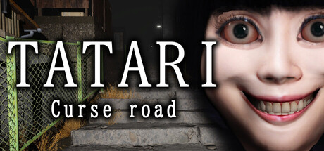
祟り坂 | TATARI Curse road scores 68/100 — better than 23% of Horror capsules (n=3,118).

Positive (42 reviews) · $1.29 · Released Nov 15, 2025 · By STUDIO DYD

Quick text summary

祟り坂 | TATARI Curse road scored 68/100 on Steam Analyzer — Solid for a Horror capsule. Top priority fix: [genre_clarity] Add a small environmental detail or UI hint (e.g., a HUD element, road marker, or silhouette of terrain) that reinforces survival/escape mechanics and differentiates this from generic psychological horror.

Capsule scores by dimension

  • Genre Clarity: 7/10 — Horror intent clear, execution uneven. The close-up grotesque face with exaggerated smile and wide eyes immediately signals horror/psychological tension, and the suburban setting with chain-link fence grounds it in a relatable scary scenario. However, at tiny size the face detail collapses into a blob, making genre intent ambiguous—it could read as comedy or parody rather than survival horror, which weakens recognition of the core threat dynamic.
  • Title Readability: 8/10 — Strong title contrast and clarity. TATARI in large white sans-serif dominates the upper third with excellent contrast against the dark background and face, remaining fully legible even at tiny size. The subtitle 'Curse road' is smaller but still readable at small size; however, at tiny thumbnail it begins to blur and loses clarity, which is a minor penalty for a supporting line.
  • Contrast & Color: 8/10 — High-value face pops against dark. The pale skin and vivid pink mouth of the close-up face create strong luminosity contrast against the #1b2838 background and dim environment, with the bright teeth adding punch. At small and tiny sizes the silhouette remains recognizable; in grayscale the face maintains clear separation, though the fine details of expression fade at very small scales.
  • Uniqueness & Polish: 6/10 — Memorable image, generic execution. The unsettling grinning face is distinctive and haunting, serving as a strong visual hook for the ghost threat, but the overall composition—centered close-up over a blurred street backdrop—follows a familiar horror formula without additional craft, lighting effects, or visual storytelling layers. The effect feels more like a stock horror trope than a premium indie survival game with signature visual identity.
  • Brand Consistency: 5/10 — No recurring identity cues visible. The capsule shows only the antagonistic ghost face and a generic suburban street; there are no recurring symbols, color palette signatures, UI elements, or visual motifs that would anchor brand recognition across the 8 available screenshots or future marketing. Without comparison to other game materials, the image feels like a one-off horror scare rather than part of a cohesive brand language.
  • Composition: 7/10 — Clear focal point, safe placement. The face occupies the right and center frame with strong visual weight, while the title anchors the top left in white, creating a stable hierarchy with no awkward empty spaces or edge-cutting hazards. The blurred street background provides atmospheric context without competing for attention, though the composition is fairly static—the supporting elements do not guide the eye through a narrative journey, they simply frame the threat.

What works

  • Title legibility at scale. TATARI remains sharp and readable down to tiny thumbnail size with strong white-on-dark contrast and clean sans-serif letterforms.
  • Immediate horror signaling. The grotesque grinning face with wide eyes communicates threat and psychological horror intent at a glance, establishing genre expectation.
  • Safe composition layout. Title and focal point are well-positioned within safe margins; no critical elements crowd edges or risk Steam cropping loss.

What hurts the capsule

  • Face detail collapses at tiny size. The fine expression nuance and teeth definition blur into a generic pale blob at thumbnail resolution, reducing the scare impact and clarity of the threat.
  • Generic suburban backdrop. The blurred chain-link fence and street offer no distinctive setting identity or gameplay hint; the location could be any small town rather than the specific 'hilly town' of the game's core setting.
  • No unique visual signature. The close-up horror face is a well-worn genre cliché without distinctive lighting, color grading, or artistic treatment that would make this game's horror stand apart from other indie psychological horror titles.

Priority fixes

  1. [genre_clarity] Add a small environmental detail or UI hint (e.g., a HUD element, road marker, or silhouette of terrain) that reinforces survival/escape mechanics and differentiates this from generic psychological horror.
  2. [uniqueness_polish] Introduce a signature color grade, glow effect, or atmospheric lighting layer (fog, moonlight, streetlight) that feels intentional and premium, not just a stock horror face crop.
  3. [brand_consistency] Establish a visual motif or secondary symbol (cursed object, road sign, or recurring character element) that could anchor identity across marketing materials and store screenshots.

Store copy priority fixes

  1. [hook_strength] Replace the censored dialogue with an actual hook line that reveals enough to intrigue without spoiling—e.g., 'A ghostly woman appears at night seeking someone by name—and you must run before she finds out it is you.'
  2. [uniqueness] Add a sentence after the features list explaining the design philosophy—e.g., 'By stripping away puzzles and inventory, every moment is about pure survival instinct and map knowledge.'
  3. [tone_match] Move or reframe the bonus content note to match the eerie tone—replace 'Keep clicking...!?' with something like 'Explore Ayumu's apartment for hidden secrets buried in the mailbox.'
  4. [audience_targeting] Add one explicit sentence identifying the core audience—e.g., 'Perfect for horror fans who want atmospheric tension over complex mechanics' or 'Built for speedrunners and memorization enthusiasts.'

Related guides

Steam app ID: 2871820 · Tags: Horror, Action, Indie, Survival Horror, Adventure