Scoring genre clarity...

Sea of Change capsule

Sea of Change

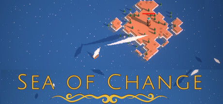
Sea of Change is a game that blends exploration with strategic base defense. Build, defend, and expand your base against waves of enemies, all while uncovering the mysteries of a dynamic world that shifts with every playthrough. Set sail to find islands and collect resources. How long can you last?

$3.99Mixed(18)
Tower DefenseExplorationSailing
Simran AnandJun 28, 2024

Sea of Change scores 72/100 — better than 44% of Steam capsules we've analysed (n=22,658).

Mixed (18 reviews) · $3.99 · Released Jun 28, 2024 · By Simran Anand

Quick text summary

Sea of Change scored 72/100 on Steam Analyzer — Good for a Steam capsule. Top priority fix: [uniqueness_polish] Introduce a distinctive character or mascot element (captain, creature, or icon) that appears consistently across marketing to create immediate brand recognition and visual differentiation from competitor strategy games.

Capsule scores by dimension

  • Genre Clarity: 7/10 — Strategy with naval exploration cues. The orange isometric base structure and starfield immediately signal a strategy or building game, while the small ship silhouette and water ornament suggest naval/exploration themes. At TINY size, the orange geometric forms read as a strategic structure, and the ship provides genre context, though the blend of exploration and base defense could be slightly clearer without additional context.
  • Title Readability: 8/10 — Clear, readable title placement. The title 'SEA OF CHANGE' uses spaced golden uppercase letters with strong contrast against the dark blue background, positioned in the lower third with ample breathing room. The decorative wave ornament beneath adds thematic reinforcement without compromising legibility, and the text remains readable at SMALL size with no collapse at TINY size due to generous letter spacing and weight.
  • Contrast & Color: 8/10 — Strong warm-cool separation. The warm orange isometric base pops distinctly against the cool deep blue starfield, creating immediate visual separation in both color and value. The white ship and golden text further enhance contrast; in grayscale, the orange structure maintains clear value separation from the background, ensuring silhouette clarity even at TINY size with minimal blur risk.
  • Uniqueness & Polish: 7/10 — Polished but genre-familiar aesthetic. The isometric art style and color treatment show clean craft and intentional lighting, with the 3D base rendering appearing premium and well-lit. However, the isometric base-building aesthetic is well-established in indie strategy games, so while the execution is solid, the visual hook relies more on competent polish than distinctive innovation or unique mechanic communication.
  • Brand Consistency: 6/10 — Coherent but generic identity. The capsule presents a consistent warm-orange and deep-blue palette with clean 3D rendering throughout, and the wave motif ties to the 'Sea' theme. However, without memorable character mascots, icons, or signature visual elements beyond these thematic choices, the brand identity feels functional rather than distinctly recognizable; the aesthetic could apply to multiple similar strategy games.
  • Composition: 7/10 — Balanced focal hierarchy with safe spacing. The orange base structure anchors the center-upper composition with the small ship providing secondary narrative interest to the left; the title sits firmly in safe margins at the bottom with no edge cropping risk. The starfield background provides visual depth and texture without overwhelming the focal point, though at TINY size the ship detail compresses and becomes less prominent, leaving the base as the dominant read.

What works

  • Strong color contrast. Warm orange and cool blue create immediate visual pop against the Steam dark background with excellent value separation in grayscale.
  • Legible title treatment. Generous letter spacing and high contrast golden text ensure the title remains readable across all viewing sizes without decorative collapse.
  • Clear strategic genre signals. The isometric base structure immediately communicates building and strategy gameplay despite the indie scale.

What hurts the capsule

  • Generic isometric aesthetic. The base-building visual style is well-worn in indie strategy; the capsule lacks a distinctive memorable hook beyond competent execution.
  • Ship detail loses prominence at TINY. The small vessel silhouette that hints at exploration compresses and becomes difficult to parse at thumbnail size, weakening the naval narrative.
  • Limited brand identity beyond theme. No iconic character, mascot, or signature visual pattern that would make this capsule instantly recognizable in a lineup of similar strategy games.

Priority fixes

  1. [uniqueness_polish] Introduce a distinctive character or mascot element (captain, creature, or icon) that appears consistently across marketing to create immediate brand recognition and visual differentiation from competitor strategy games.
  2. [composition] Enlarge or reposition the ship to maintain visible detail and thematic clarity at SMALL and TINY sizes, ensuring the exploration mechanic reads as quickly as the base structure.
  3. [brand_consistency] Establish a signature visual motif beyond the wave ornament (unique UI style, color accent, or symbolic element) that becomes instantly recognizable across all Sea of Change media.

Store copy priority fixes

  1. [hook_strength] Delete the developer apology paragraph entirely (budget, skill limitations, sequel plans) and replace the opening of the detailed description with a strong, gameplay-forward hook such as: 'Command a floating base, defend it nightly from enemy waves, and sail into uncharted waters to unlock new islands and resources. Every playthrough is different.'
  2. [uniqueness] Explicitly articulate what makes the exploration-plus-base-defense fusion unique: explain how sailing and island discovery impact strategy, progression, or base-building (e.g., 'Discover rare resources on distant islands to unlock advanced defenses' or 'Plan your exploration routes—islands respawn, forcing you to adapt your supply chains').
  3. [feature_communication] Expand each feature bullet with concrete gameplay details—e.g., 'Constantly build, expand, and upgrade your base: unlock new defensive structures as you gather rarer materials' instead of a bare claim.
  4. [audience_targeting] Add a line early in the short description or first paragraph that clarifies the intended play mode and player mindset—e.g., 'A relaxing tower defense game where strategy and patience are rewarded' or 'For players who enjoy both tactical combat and peaceful resource management.'

Related guides

Steam app ID: 2891160