Scoring genre clarity...

SPLITGATE: Arena Reloaded  capsule

SPLITGATE: Arena Reloaded

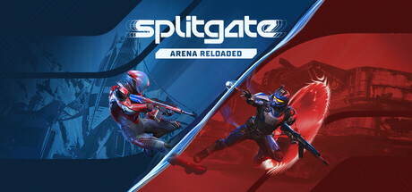
SPLITGATE: Arena Reloaded fuses the best of Splitgate 1 & 2, bringing back that classic arena shooter feel. Jump into fast-paced arena modes or drop into Arena Royale, a battle royale built on arena DNA. Play Season 2 now.

Free to PlayMixed(128)
Free to PlayShooterMultiplayer
1047 GamesMay 22, 2025

SPLITGATE: Arena Reloaded scores 70/100 — better than 30% of Steam capsules we've analysed (n=22,659).

Mixed (128 reviews) · Free to Play · Released May 22, 2025 · By 1047 Games

Quick text summary

SPLITGATE: Arena Reloaded scored 70/100 on Steam Analyzer — Good for a Steam capsule. Top priority fix: [uniqueness_polish] Incorporate a visible portal or portal-ring visual element into the composition to communicate Splitgate's unique mechanic and differentiate it from generic arena shooters.

Capsule scores by dimension

  • Genre Clarity: 8/10 — Sci-fi arena shooter clear. Two armored sci-fi soldiers in combat stances with rifles clearly communicate competitive FPS arena shooter. The diagonal split composition with blue versus red color coding reinforces the team-versus-team deathmatch context. At tiny size the armed soldiers and color opposition still read as competitive shooter, though subgenre nuance like portal mechanics is not visible.
  • Title Readability: 7/10 — Bold logo readable at small. The 'splitgate' wordmark uses a clean, modern sans-serif with good weight that reads well at small capsule size. 'ARENA RELOADED' subtitle in smaller caps beneath is legible at full size but collapses to an unreadable line at tiny size. The white logo on the relatively controlled diagonal center strip has adequate contrast, though the busy character art behind it creates mild noise.
  • Contrast & Color: 7/10 — Strong blue-red split pops well. The bold blue-left and red-right diagonal split creates strong value contrast against Steam's dark #1b2838 background, particularly on the blue side which separates cleanly. The armored characters are lit with accent colors matching their team sides, providing reasonable silhouette separation. In grayscale the two soldier silhouettes maintain distinction but the busy background glow effects muddy their edges slightly at tiny size.
  • Uniqueness & Polish: 6/10 — Competent but genre-familiar. The blue-versus-red diagonal team split is a well-worn competitive shooter trope and doesn't strongly differentiate Splitgate from genre peers like Halo or Valorant capsules. The craft is clean and professional with good lighting on the characters, but there is no visual nod to the game's signature portal mechanic which is its core unique selling point. At small size it reads as polished but generic arena shooter.
  • Brand Consistency: 7/10 — Cohesive sci-fi arena identity. The blue and red team palette, sleek armored character designs, and modern geometric logo form a consistent internal visual identity. The diagonal split motif and neon accent lighting feel coherent and on-brand for a fast-paced arena shooter. The 'splitgate' wordmark with its clean geometry is distinctive enough to be recognizable across capsule sizes, though the brand would benefit from a more unique visual signature like a portal element.
  • Composition: 7/10 — Clear diagonal focal hierarchy. The diagonal divide creates two clear focal zones with one character per side, and the title is well-centered at the visual apex of the split providing a logical reading order from logo down to action. At small size the composition holds because the diagonal and opposing characters remain the dominant read. However the subtitle text and secondary character details crowd the composition slightly and the characters hug the edges, risking crop issues on some Steam layouts.

What works

  • Strong team color coding. The blue versus red diagonal split immediately signals competitive multiplayer and reads clearly even at tiny thumbnail size.
  • Clean title placement. The 'splitgate' wordmark sits at the natural center apex of the diagonal divide on a controlled region, maintaining legibility at small size.
  • Armored character silhouettes. Both soldiers in combat stances clearly communicate action FPS genre with good lighting separation from their respective backgrounds.
  • Professional lighting craft. Neon rim lighting on both characters and the glow effects feel polished and consistent with high-production sci-fi shooter aesthetics.

What hurts the capsule

  • No portal mechanic visibility. Splitgate's defining unique mechanic, the portal system, is completely absent from the visual, making it indistinguishable from any other sci-fi arena shooter at a glance.
  • Subtitle collapses at tiny size. 'ARENA RELOADED' becomes an unreadable line of grey text at 120x45, wasting the opportunity to communicate relaunch context.
  • Edge-hugging characters. Both soldier figures are pushed to the far left and right edges, risking crop loss on smaller capsule formats and reducing visual breathing room.
  • Generic competitive shooter feel. The blue-red team split composition is overused in the genre and does not create a memorable or distinctive visual identity compared to top-tier benchmarks like Helldivers 2 or Armored Core VI.

Priority fixes

  1. [uniqueness_polish] Incorporate a visible portal or portal-ring visual element into the composition to communicate Splitgate's unique mechanic and differentiate it from generic arena shooters.
  2. [title_readability] Increase the size and contrast of 'ARENA RELOADED' subtitle or drop it entirely if it cannot be made readable at 120x45 to avoid visual noise.
  3. [composition] Pull both character figures slightly inward away from the edges to improve crop resilience and give the composition more breathing room at small sizes.
  4. [genre_clarity] Add a subtle HUD or environmental cue like a portal ring or arena architecture in the background to reinforce the game's specific subgenre identity.

Store copy priority fixes

  1. [hook_strength] Rewrite the short description opening to lead with the portal mechanic and action verb: 'Portal through impossible angles in fast-paced arena combat and a reimagined battle royale' instead of 'fuses the best of Splitgate 1 & 2.' This removes franchise baggage and hooks on the unique mechanic immediately.
  2. [audience_targeting] Add a sentence early in the detailed description acknowledging new players: 'New to Splitgate? Arena Reloaded is a fresh start' or 'Whether you are returning or new to arena shooters, Arena Reloaded delivers…' to clarify that franchise knowledge is not required.
  3. [feature_communication] Add team size, match duration, and map count to the arena modes section to match the specificity given to battle royale (e.g., '6v6 or 8v8 matches' and 'compete on 5+ fan-favorite maps').
  4. [hook_strength] Replace 'Play Season 2 now' with a concrete reason: 'Play Season 2 now with [specific new mode/weapon/map]' to create urgency and specificity beyond a generic call-to-action.

Related guides

Steam app ID: 2918300