Scoring genre clarity...

Bloodwood Dungeon capsule

Bloodwood Dungeon

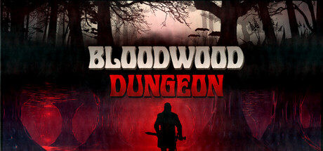
Detailed, gritty text-based fantasy RPG centered on dungeon crawling with traps, puzzles, fights and loot. Recreates the gameplay of the old gamebooks. Simple battle system and hassle-free inventory management.

$1.19Positive(12)
RPGAdventureInteractive Fiction
Nimavoha InteractiveApr 29, 2024

Bloodwood Dungeon scores 63/100 — better than 6% of Steam capsules we've analysed (n=22,658).

Positive (12 reviews) · $1.19 · Released Apr 29, 2024 · By Nimavoha Interactive

Quick text summary

Bloodwood Dungeon scored 63/100 on Steam Analyzer — Solid for a Steam capsule. Top priority fix: [uniqueness_polish] Add a foreground character silhouette or iconic monster emerging from the dungeon corridor to create a memorable focal subject and communicate the RPG combat theme.

Capsule scores by dimension

  • Genre Clarity: 7/10 — Dark fantasy dungeon RPG clear. The stone archway corridor with crimson glowing portal at the end clearly signals a dark fantasy dungeon setting, which aligns well with the RPG dungeon-crawl genre. The gothic atmosphere with twisted trees and ancient stonework reinforces the fantasy subgenre effectively. At tiny size the glowing red portal provides a strong focal cue that keeps the dungeon context readable, though the text-based nature of the gameplay is not communicated visually.
  • Title Readability: 8/10 — Bold white title reads well. The large bold white serif-style title BLOODWOOD DUNGEON dominates the upper two-thirds of the capsule with strong contrast against the dark background, making it highly legible at full and small sizes. At tiny size the letterforms remain recognizable due to the thick weight and high contrast, though some fine details in the decorative font may compress slightly. No tagline or secondary text competes with the main title, which is a clean decision.
  • Contrast & Color: 7/10 — Strong title contrast, moody mid-scene. The white title pops sharply against the dark stone and forest background, providing excellent value separation for the most important element. The red glowing portal in the center midground creates a useful color accent that draws the eye through the archway corridor. In grayscale the background mid-tones are somewhat uniform and muddy, meaning the scene itself lacks strong silhouette definition at small and tiny sizes beyond the title text.
  • Uniqueness & Polish: 5/10 — Generic AI art, competent execution. The background environment reads as AI-generated atmospheric art, which is competent but lacks the distinctive hand-crafted character illustrations or iconography seen in top-performing genre capsules like Baldur's Gate 3 or Metaphor. The title treatment is clean but straightforward with no unique typographic flourish or logo identity beyond plain white bold text. Compared to genre benchmarks, this capsule communicates the setting adequately but offers no memorable visual hook or unique selling point that sets it apart.
  • Brand Consistency: 5/10 — Atmospheric but no signature identity. The dark gothic dungeon palette of deep greys, blacks, and crimson red provides internal cohesion and could serve as a recognizable color signature. However there is no iconic character, symbol, or distinctive motif that would allow a player to immediately recognize this brand across multiple touchpoints. The plain white title treatment without a custom logo or emblem weakens brand recall, and without a character or mascot the identity feels generic within the dark fantasy space.
  • Composition: 6/10 — Title heavy, empty lower third. The title text occupies the upper half while the atmospheric dungeon corridor fills the lower half, creating a simple two-zone layout with a clear focal path toward the glowing portal. The centered archway with leading lines toward the red light is compositionally sound and creates depth. However the lower third of the image is largely empty dark ground with no supporting element, and at small size the composition feels top-heavy with the large text block leaving the scene feeling underpopulated and slightly unbalanced.

What works

  • High title legibility. The large bold white title maintains strong readability even at tiny thumbnail sizes due to its thick letterforms and high contrast against the dark background.
  • Clear genre atmosphere. The stone archway corridor and crimson glowing portal immediately establish a dark fantasy dungeon setting that aligns with the RPG genre expectation.
  • Effective color accent. The red glowing portal provides a single warm accent that breaks up the dark scene and draws the eye to the depth of the image at multiple sizes.
  • Clean uncluttered layout. Absence of taglines, studio logos, or secondary text keeps the capsule focused and prevents visual noise that would hurt tiny-size legibility.

What hurts the capsule

  • AI art lacks distinctiveness. The background environment appears AI-generated and generic, offering no unique visual hook or memorable character that differentiates it from dozens of similar dark fantasy capsules.
  • No character or iconic focal subject. Without a hero, monster, or distinctive symbol in the foreground, the capsule relies entirely on environment which becomes a weak blur at tiny size.
  • No custom logo or brand mark. The plain white bold text serves as the only identity element with no emblem, crest, or distinctive typographic treatment that could build brand recognition.
  • Empty lower third weakens composition. The dark ground area below the archway adds no visual information and creates a dead zone that makes the capsule feel sparse and unfinished at small sizes.

Priority fixes

  1. [uniqueness_polish] Add a foreground character silhouette or iconic monster emerging from the dungeon corridor to create a memorable focal subject and communicate the RPG combat theme.
  2. [brand_consistency] Develop a custom logo treatment for BLOODWOOD DUNGEON with a distinctive emblem, crest, or decorative border that creates a recognizable brand mark beyond plain white text.
  3. [composition] Rebalance the layout by moving the title to the upper portion and filling the lower third with a character, creature, or atmospheric foreground element to eliminate the dead zone.
  4. [genre_clarity] Introduce a visual cue referencing the gamebook or text-based nature such as a worn tome, dice, or parchment texture overlay to differentiate from standard action RPGs.

Store copy priority fixes

  1. [hook_strength] Rewrite the short description opening to lead with a verb and emotional or curiosity hook, e.g., 'Descend into Bloodwood: a text-based dungeon crawl that captures the gritty, choice-driven adventure of 1980s gamebooks.' Replace the genre-first structure.
  2. [uniqueness] Add a positive differentiation statement explaining what the game *offers* beyond 'no stats-tinkering,' such as: 'uncompromising narrative focus and atmosphere in an era of bloated UI and filler content' or similar.
  3. [hook_strength] Include one evocative sensory or narrative phrase in the short description (e.g., 'dark,' 'lethal,' 'choice matters') to emotionally signal the game's tone and appeal to the right audience immediately.

Related guides

Steam app ID: 2929130