Quick text summary
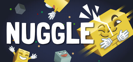
Nuggle scored 75/100 on Steam Analyzer — Good for a Sokoban capsule. Top priority fix: [genre_clarity] Add a subtle visual hint of the core puzzle mechanic (e.g., matching pairs, tile connection, or block arrangement) through the character poses or foreground elements to differentiate from generic casual games.
Capsule scores by dimension
- Genre Clarity: 7/10 — Casual puzzle with character appeal. The bright yellow geometric characters and playful pose immediately signal a casual, lighthearted game. The simplicity of the character designs and the scattered small objects (gems, shapes) suggest puzzle gameplay. At TINY size, the cheerful character silhouettes and bright yellow palette still read as casual puzzle rather than action or narrative game, though the specific mechanic is not obvious.
- Title Readability: 8/10 — Bold, clear title with strong presence. NUGGLE is rendered in large, clean white sans-serif letters with excellent contrast against the dark navy background. The title placement in the upper-left to center region keeps it away from noisy elements and maintains legibility at all sizes including TINY. At small capsule size, the title remains crisp and readable without any collapse or obscuration.
- Contrast & Color: 8/10 — Vibrant yellow pops on dark navy. The bright warm yellow of the main characters and geometric shapes creates strong value separation against the cool dark navy background, ensuring the focal elements read clearly even at thumbnail size. The white title further strengthens contrast hierarchy. In grayscale, the silhouettes maintain clear edge definition and separation from the background.
- Uniqueness & Polish: 7/10 — Charming character design with cohesive style. The hand-drawn style characters with expressive faces and simple geometric forms feel intentional and distinctive rather than templated. The yellow color palette and playful poses suggest a premium indie sensibility aligned with successful casual games like Balatro and Moonstone Island. The craft is clean but the visual hook is character-focused rather than mechanically distinctive.
- Brand Consistency: 7/10 — Consistent character style and warm palette. The yellow-and-navy color scheme with geometric character design appears to establish a recognizable visual identity for the brand. The expressive character faces and consistent line work across multiple characters suggest strong internal cohesion. Without access to all 6 store screenshots, consistency feels strong within this capsule's self-contained universe, though iconic symbol recognition could be stronger.
- Composition: 8/10 — Balanced focal point with strong hierarchy. The large yellow character in the right-center dominates attention while the title anchors the left, creating clear depth layering with background elements (smaller objects, gems) supporting rather than competing. The composition uses negative space effectively and maintains safe margins from edges. At SMALL and TINY sizes, the primary character and title remain the clear focal points without scatter.
What works
- Excellent title contrast and legibility. White sans-serif on dark navy background ensures NUGGLE reads clearly at all viewing sizes including tiny thumbnails.
- Strong color-based visual hierarchy. The vibrant yellow characters and objects pop distinctly against the dark background, making the capsule memorable in quick scroll.
- Cohesive character-driven aesthetic. The expressive geometric characters with consistent style suggest premium indie craft aligned with top casual game aesthetics.
- Clear focal point and composition. The large character in right-center with title anchor creates intuitive visual hierarchy that survives reduction to small sizes.
What hurts the capsule
- Mechanic clarity is ambiguous. While the casual puzzle genre is clear, the specific mechanic (matching, moving, solving pattern) is not visually communicated by the capsule alone.
- Generic scattered elements lack purpose. The small floating gems and shapes in the background feel decorative rather than conveying a specific puzzle type or core mechanic.
- Brand identity lacks iconic symbol. While the character style is appealing, there is no single recognizable motif or symbol that would allow instant brand recall compared to stronger indie benchmarks.
Priority fixes
- [genre_clarity] Add a subtle visual hint of the core puzzle mechanic (e.g., matching pairs, tile connection, or block arrangement) through the character poses or foreground elements to differentiate from generic casual games.
- [uniqueness_polish] Strengthen the distinctive art hook by introducing a signature visual motif or symbol (icon, pattern, or character expression) that becomes iconic across all store materials.
- [composition] Consider adding subtle visual depth cues or layering effects to the floating background elements so they feel intentional world-building rather than random scatter.
Store copy priority fixes
- [hook_strength] Rewrite the short description to lead with the core mechanic verb: 'Puzzle game where all blocks move together—one wrong command and they all miss the mark' paired with the cozy tone.
- [feature_communication] Clarify the win condition in one sentence: 'Get all blocks to touch each other without leaving any isolated' to make the spatial constraint concrete.
- [uniqueness] Add one sentence comparing or contrasting to similar games: 'Unlike traditional Sokoban, your commands move every block in sync, forcing you to think in symmetry' to establish clear differentiation.
Related guides
Steam app ID: 2943750 · Tags: Sokoban, Puzzle, Arcade, 2.5D, Cute