Scoring genre clarity...
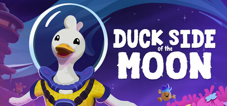
Waddle and fly as a duck in space! Explore every corner of the galaxy and find curious creatures and materials along the way. Craft gadgets, upgrade your spaceship, and get cozy in this relaxing adventure.
$19.99Very Positive(83)
AdventureCasualExploration
Starbrew GamesMay 7, 2026