Scoring genre clarity...

Toymaker: Threads of Joy capsule

Toymaker: Threads of Joy

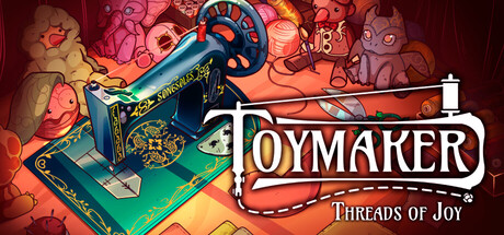
Toymaker is a toy-crafting and store management simulator set in the 1910s Spain. Meet unique customers and colorful locals in a bustling city, and discover a magical story based on a folk legend. Follow two different mythic paths, and change the future of your hometown!

CasualSimulationInteractive Fiction
Uprising StudiosComing soon

Toymaker: Threads of Joy scores 68/100 — better than 19% of Steam capsules we've analysed (n=22,659).

Released Coming soon · By Uprising Studios

Quick text summary

Toymaker: Threads of Joy scored 68/100 on Steam Analyzer — Solid for a Steam capsule. Top priority fix: [contrast_color] Add a subtle dark vignette or thin dark border around the capsule edges to create separation from Steam's #1b2838 background and improve shelf pop during quick scroll.

Capsule scores by dimension

  • Genre Clarity: 7/10 — Crafting sim signals clear. The central sewing machine is a strong, immediately readable prop that communicates crafting and making. Surrounding plush toy figures reinforce a toy-creation theme, and the warm handmade aesthetic aligns well with casual simulation. At tiny size the sewing machine silhouette is still recognizable, though the surrounding toy clutter blends together and the specific 'store management' layer is not communicated visually.
  • Title Readability: 6/10 — Title readable, tagline fails small. TOYMAKER is set in a decorative serif/script hybrid with decent size and a light outline against the warm background, remaining legible at small size. The subtitle 'Threads of Joy' uses a thinner, smaller script that completely disappears at tiny size and even struggles at small capsule dimensions. The decorative flourishes around the title add charm at full size but reduce crispness when scaled down.
  • Contrast & Color: 6/10 — Warm palette blends on Steam dark BG. The overall palette is dominated by warm oranges, reds, and teal accents, which provides internal contrast but creates a moderate challenge against Steam's dark #1b2838 background since the edges of the capsule are also warm-toned without a strong dark framing. The sewing machine's teal-green body provides useful separation from the orange surroundings. In grayscale, the mid-tones cluster closely, reducing silhouette clarity of individual elements at tiny size.
  • Uniqueness & Polish: 7/10 — Charming handmade aesthetic stands out. The illustrated style with soft textures, hand-sewn dashed border motif, and period-appropriate sewing machine gives this capsule a distinctive personality not common in the casual sim genre. The craft feels intentional and cohesive rather than templated. However, the background is visually busy with many small toy characters competing for attention, which dilutes the premium feel slightly and makes it feel closer to a cluttered illustration than a refined capsule.
  • Brand Consistency: 8/10 — Strong cohesive handcrafted identity. The warm illustrated style, dashed-line border suggesting stitching, and recurring plush toy motifs create a recognizable visual identity that would carry across store screenshots. The 1910s period aesthetic is subtly present in the sewing machine design and color palette. The title typography with its decorative flourishes reinforces the handmade brand, giving the game a signature look that would be recognizable in a genre lineup.
  • Composition: 7/10 — Clear focal point, busy periphery. The sewing machine anchors the center-left as a strong focal point, with the TOYMAKER title sitting naturally to its right in a well-balanced arrangement. The dashed decorative border frames the composition neatly and helps define the capsule edges. However, the surrounding plush toy figures in the background create visual noise that competes at small sizes, and at tiny size the periphery becomes indistinct muddy texture rather than supporting context.

What works

  • Distinctive prop as focal anchor. The period sewing machine is an instantly recognizable silhouette that communicates the crafting theme clearly even at small capsule size.
  • Cohesive handmade visual identity. The stitched dashed border, warm illustrated palette, and plush toy characters form a consistent brand language that feels intentional and charming.
  • Main title placement and contrast. TOYMAKER is positioned on a relatively controlled warm-light region, giving it sufficient contrast and size to remain readable at the small capsule size.
  • Genre differentiation in the sim space. The whimsical illustrated art style clearly separates this from sterile management sim capsules, giving it stronger shelf appeal among casual audiences.

What hurts the capsule

  • Tagline vanishes at small and tiny sizes. 'Threads of Joy' in thin script is completely unreadable below small size, wasting the subtitle's narrative potential.
  • Busy background compresses into noise. The many small plush toy figures around the edges merge into indistinct warm texture at tiny size, adding visual clutter without communicating additional meaning.
  • Weak contrast against Steam dark background. The warm orange edges of the capsule have low separation from the #1b2838 UI, causing the capsule to lack a punchy pop during quick scroll browsing.
  • Store management aspect invisible. Nothing in the composition suggests the shop-running or customer-interaction layer of the game, leaving half the core fantasy uncommunicated.

Priority fixes

  1. [contrast_color] Add a subtle dark vignette or thin dark border around the capsule edges to create separation from Steam's #1b2838 background and improve shelf pop during quick scroll.
  2. [title_readability] Remove or significantly enlarge the 'Threads of Joy' subtitle, or integrate it into the main logo treatment so it reads at small size rather than disappearing as fine script.
  3. [composition] Reduce the density of background toy characters by simplifying them into softer, less detailed silhouettes so they read as atmosphere rather than competing focal points at tiny size.
  4. [genre_clarity] Introduce a subtle visual cue hinting at shop or customer interaction — such as a price tag, coin, or small customer figure — to surface the store management gameplay layer.

Store copy priority fixes

  1. [feature_communication] Restructure the detailed description to include a bulleted or clearly separated feature section listing: Crafting System (materials, colors, patterns, sewing), Customer Interactions (commissions, pricing, reputation), Exploration (Salamanca locations), and Narrative (two mythic paths with consequences). This would improve scannability and mental model clarity.
  2. [uniqueness] Add a sentence that explicitly contrasts this game from other toy-crafting or cozy sims—for example, 'Unlike typical crafting sims, your choices between tradition and innovation reshape your entire town's future' or highlight a specific mechanical depth that sets it apart.
  3. [hook_strength] Replace one instance of 'magical' or 'enchanting' with a concrete gameplay consequence or emotional beat—for example, 'Discover how your toy designs unlock hidden folklore' or 'Your crafting choices unlock two entirely different endings for Salamanca.'
  4. [feature_communication] Expand the reputation system description with a concrete example—for example, 'A satisfied customer might commission a special toy, while a disappointed one spreads the word to avoid your shop, shrinking your clientele.'

Related guides

Steam app ID: 2968270