Scoring genre clarity...
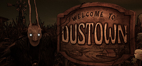
Welcome to Dustown is a single-player or cooperative horror game for up to 4 players. Play as field scientists exploring vast labyrinthine cornfields, collecting samples and evidence for a mysterious corporation. Make sure you don't get killed at the crossroads.
Free to PlayMixed(14)
Psychological HorrorOnline Co-OpHorror
Onze 8 DegrésApr 12, 2025