Scoring genre clarity...

Planet of Lana II capsule

Planet of Lana II

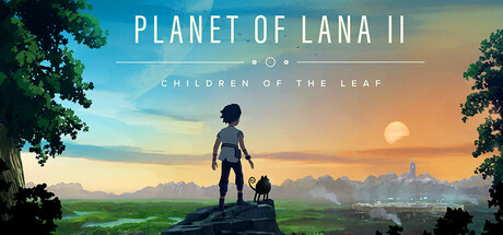
As greed and power divide the tribes of their home planet, Lana and her little companion, Mui, must stand together against the forces reshaping their world – struggling not just for survival, but for the soul of their home.

$14.99Very Positive(68)
AdventurePuzzle PlatformerCasual
WishfullyMar 5, 2026

Planet of Lana II scores 73/100 — better than 56% of Steam capsules we've analysed (n=22,659).

Very Positive (68 reviews) · $14.99 · Released Mar 5, 2026 · By Wishfully

Quick text summary

Planet of Lana II scored 73/100 on Steam Analyzer — Good for a Steam capsule. Top priority fix: [title_readability] Increase subtitle CHILDREN OF THE LEAF font size or place it on a darker controlled band to ensure legibility at small capsule size.

Capsule scores by dimension

  • Genre Clarity: 7/10 — Cinematic adventure, narrative indie. The silhouetted child figure standing on a rock with a small animal companion against a painterly alien landscape strongly signals a cinematic narrative adventure or puzzle-platformer. The soft sci-fi environment with twin moons and distant city-like structures hints at the genre well. At tiny size the silhouette duo remains readable but the specific subgenre could blur with walking simulators or atmospheric platformers like COCOON or Jusant.
  • Title Readability: 7/10 — Title clear, subtitle fades small. PLANET OF LANA II uses a clean, well-spaced serif-adjacent font in white with good contrast against the mid-tone sky, and reads clearly at full and small sizes. The subtitle CHILDREN OF THE LEAF is notably smaller and sits on a busier horizon band, making it unreadable at tiny size. At tiny size only the main title survives, which is acceptable but the subtitle is entirely lost.
  • Contrast & Color: 7/10 — Warm gradient pops on dark Steam. The warm orange-to-teal gradient sky provides strong separation against Steam's dark #1b2838 background, and the central silhouette duo stands out clearly as a dark shape against the bright sky. In grayscale the silhouette reads well due to the backlit rim lighting effect. However, the dark foreground rocks and lower greenery blend into Steam's dark background at the bottom edge, slightly weakening bottom-edge separation.
  • Uniqueness & Polish: 7/10 — Polished painterly style, somewhat familiar. The painterly hand-crafted art style is genuinely attractive and feels premium for an indie, with deliberate depth layering from foreground silhouette through lush midground to a glowing sky. However, the child-with-companion silhouette against a scenic backdrop is a visual trope used by many narrative indie games, and compared to benchmark titles like COCOON or ANIMAL WELL, it does not deliver a strongly distinctive hook. The craft is solid but the concept reads as familiar within the genre.
  • Brand Consistency: 8/10 — Strong identity, recognizable sequel branding. The Lana and Mui silhouette duo is a signature identity element carried from the first game, and the warm alien-world palette with stylized flora reinforces a recognizable visual language. The typography treatment with the small orbital motif between title and subtitle adds a subtle but consistent brand detail. Players familiar with Planet of Lana 1 will immediately recognize the IP, and the art direction feels internally cohesive.
  • Composition: 8/10 — Clear focal silhouette, strong hierarchy. The composition places the child and companion silhouette centrally on the lower third, creating an immediate focal point with the bright sky as a natural backdrop. The title sits cleanly in the upper center above the action and the subtitle bridges neatly below it via the small decorative element. At small size the two-figure silhouette remains the dominant read with the title above it, which is a good hierarchy. The deep foreground darkness anchors the image without cluttering the prime center zone.

What works

  • Signature silhouette duo. The child and small animal companion silhouette is immediately recognizable as the game's brand identity and reads clearly even at tiny size against the bright backlit sky.
  • Warm painterly sky gradient. The orange-to-teal gradient creates natural contrast against Steam's dark interface and draws the eye instantly during a quick scroll.
  • Clean title placement. PLANET OF LANA II sits in a clean sky region with strong value contrast, making the main title legible at both full and small sizes.
  • Layered depth and world-building. The foreground, midground vegetation, and distant alien cityscape establish a rich sense of place that communicates an explorable sci-fi world.

What hurts the capsule

  • Subtitle unreadable at small sizes. CHILDREN OF THE LEAF is too small and placed on a noisy horizon band, rendering it completely illegible at tiny size.
  • Familiar silhouette trope. The lone child gazing at a scenic landscape is visually shared by many narrative indie titles, reducing differentiation against genre competitors.
  • Bottom edge bleeds into Steam background. The dark foreground rocks and lower greenery lack sufficient brightness or edge definition to separate cleanly from Steam's #1b2838 background.
  • No strong genre action cue. While the adventure tone is clear, nothing in the image hints at the action or conflict elements, which could lead to genre expectation mismatch.

Priority fixes

  1. [title_readability] Increase subtitle CHILDREN OF THE LEAF font size or place it on a darker controlled band to ensure legibility at small capsule size.
  2. [contrast_color] Add a subtle bright edge or vignette separation along the bottom foreground to prevent the dark rocks from merging with Steam's dark background.
  3. [uniqueness_polish] Introduce a small but distinctive visual element — such as a glowing artifact, a threatening mechanical shape in the sky, or a conflict hint — to differentiate from the generic contemplative silhouette trope and hint at the action-adventure conflict.
  4. [genre_clarity] Consider adding a subtle environmental tension cue such as distant smoke, tribal structures, or mechanical enemies in the background to reinforce the action-adventure subgenre beyond pure atmospheric exploration.

Store copy priority fixes

  1. [uniqueness] Add a sentence comparing or contrasting Lana II's puzzle design, movement mechanics, or narrative structure to one specific competitor or genre standard—e.g., 'Unlike traditional logic puzzles, each challenge requires reading the environment and coordinating Lana and Mui's unique abilities.'
  2. [feature_communication] Clarify puzzle difficulty and accessibility in one sentence—e.g., 'Puzzles can be skipped or solved at your own pace, with no time pressure or game-over states' or 'Puzzles demand observation and precise timing, designed for players seeking thoughtful challenge.'
  3. [hook_strength] Strengthen the short description's final clause by replacing 'struggling not just for survival, but for the soul of their home' with a more specific consequence or emotional stakes—e.g., 'must uncover the truth about technology reshaping their world—before it erases who they are.'

Related guides

Steam app ID: 2997230