Scoring genre clarity...
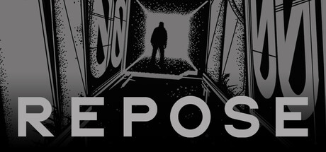
In the facility, each step, each shot, each mistake costs precious energy. Rendered entirely in black and white, this mystery can be unravelled. The puzzle can be solved. Don't ask who tried to solve it before. Do the job. Find oxygen and sleep. Go deeper. And don't ask about Aaron.
$6.39Very Positive(142)
HorrorPixel GraphicsSci-fi
Bozó Attila BertoldApr 14, 2025