Quick text summary

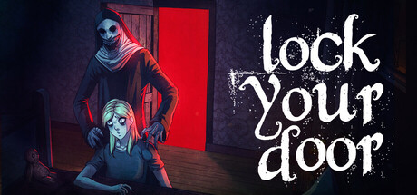
LockYourDoor scored 72/100 on Steam Analyzer — Good for a Horror capsule. Top priority fix: [genre_clarity] Add subtle visual cue indicating co-op gameplay, such as multiple figures in coordinated pose or shared environment interaction that suggests teamwork.

Capsule scores by dimension

  • Genre Clarity: 7/10 — Horror atmosphere clearly readable. The hooded figures, dim lighting, and red door establish a horror tone effectively at full size. At TINY size, the silhouettes remain distinguishable and the red accent reads as a threat indicator, communicating psychological horror gameplay. However, the exact co-op action mechanics are not immediately obvious from visuals alone.
  • Title Readability: 8/10 — Handwritten style reads well. The white handwritten 'lock your door' text is placed on the dark right side with good contrast and clear letterforms. At SMALL and TINY sizes, the organic brush stroke font maintains legibility despite being decorative. The title placement avoids clashing with character silhouettes and remains the dominant text element.
  • Contrast & Color: 8/10 — Strong red and white pop. The bright red rectangular door and white title text create sharp value separation against the #1b2838 Steam background. The cool blue-lit character silhouettes and warm red accent create deliberate color contrast that reads clearly at SMALL size. In grayscale, the value range remains distinct with good silhouette definition throughout.
  • Uniqueness & Polish: 7/10 — Stylized horror with coherent vision. The art direction shows intentional character design with hooded figures and a minimalist environment focused on the red door as a symbolic focal point. The handwritten typography and moody color grading elevate it above generic horror templates. However, the composition feels somewhat familiar within psychological horror conventions—solid execution but not groundbreaking.
  • Brand Consistency: 6/10 — Visually cohesive but identity unclear. The capsule maintains internal consistency through cool-blue and red color palette, minimalist staging, and handwritten title style. However, without reference to the 15 store screenshots, there are no immediately iconic character or symbol cues that would make this distinctly recognizable as LockYourDoor months later. The visual language feels more like generic indie horror than a branded identity.
  • Composition: 7/10 — Balanced hierarchy with clear focus. The composition uses depth layering—hooded figures in foreground, red door in midground, dark backdrop—creating visual hierarchy. The title occupies the right side cleanly without competing with character silhouettes. At TINY size, the arrangement remains readable with the red door and figures clearly separated; however, the seated figure at bottom-left could be slightly cropped on some platforms due to edge proximity.

What works

  • Strong color accent strategy. The red door and white text create vivid pop against the Steam dark background with excellent value separation that persists at tiny thumbnail sizes.
  • Readable handwritten title treatment. The organic brush-stroke typography maintains legibility and personality across all viewing sizes without becoming decorative noise.
  • Clear horror genre signaling. Hooded figures, dim staging, and psychological composition immediately communicate horror gameplay direction at full and small sizes.

What hurts the capsule

  • Generic identity markers. The capsule lacks a distinctive character, symbol, or visual motif that would make LockYourDoor uniquely recognizable versus other indie horror titles.
  • Co-op mechanic not conveyed. The 1-4 player co-op element is not visually apparent in the capsule despite being a core selling point—figures appear isolated rather than collaborative.
  • Bottom figure edge risk. The seated character positioned near the lower left edge risks partial cropping on certain Steam platform layouts or when displayed at non-standard aspect ratios.

Priority fixes

  1. [genre_clarity] Add subtle visual cue indicating co-op gameplay, such as multiple figures in coordinated pose or shared environment interaction that suggests teamwork.
  2. [brand_consistency] Develop an iconic visual motif or character design element that is repeated across marketing materials to build recognizable brand identity.
  3. [composition] Reposition the bottom-left seated figure slightly toward center to ensure full visibility across all Steam display contexts and safe margin compliance.

Store copy priority fixes

  1. [feature_communication] Replace 'Long and pleasing gameplay' with a concrete statement about playtime length, replayability loops, or progression systems—e.g., 'Escalating threat waves lasting 20-60 minutes per session with procedural room layouts and item placements.'
  2. [hook_strength] Strengthen the short description by leading with the unique survival tension—e.g., 'Survive 1-4 player co-op horror: fading light, emerging threats, and the choice to save your friend Darvin or sacrifice teammates.'
  3. [uniqueness] Add a sentence to the opening or Key Features explaining what distinguishes LockYourDoor—e.g., 'The door-locking system forces tactical positioning, while Darvin's hidden clues unlock the true ending only for teams who pay attention.'
  4. [feature_communication] Clarify the solo play experience with a single sentence—e.g., 'Works solo against AI-controlled teammates or in full co-op for maximum challenge and emergent betrayal moments.'

Related guides

Steam app ID: 3004140 · Tags: Horror, Multiplayer, Psychological Horror, First-Person, Online Co-Op