Scoring genre clarity...

The last keeper capsule

The last keeper

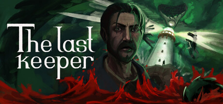
Take on the role of a lighthouse keeper on a remote island. Maintain the machinery, use the radio and the map to guide ships into the harbor. Survive and uncover the mysteries of Farpoint Island in a horror experience inspired by Voices of the Void and No One Lives Under the Lighthouse.

Psychological HorrorSimulationLife Sim
AstraInteractiveGames2026

The last keeper scores 82/100 — better than 93% of Steam capsules we've analysed (n=22,658).

Released 2026 · By AstraInteractiveGames

Quick text summary

The last keeper scored 82/100 on Steam Analyzer — Good for a Steam capsule. Top priority fix: [genre_clarity] Introduce a small but visible lighthouse or nautical UI element (radio, gauge, or map) in the composition to signal the simulation and maintenance mechanics that differentiate this game.

Capsule scores by dimension

  • Genre Clarity: 7/10 — Horror atmosphere clear, genre slightly ambiguous. The red wave silhouettes and green supernatural lighting clearly signal horror and mystery elements, supported by the character's intense expression. However, at tiny size the lighthouse keeper simulation and maintenance mechanics are not visually obvious—it reads as pure supernatural horror rather than a maintenance-focused adventure game. The visual hierarchy prioritizes dread over the unique gameplay hook of lighthouse operation.
  • Title Readability: 8/10 — Clean serif typography, strong legibility. The white serif title 'The last keeper' has excellent contrast against the dark green background and maintains readability at small and tiny sizes due to generous letterform spacing and clean stroke weight. At tiny size the text remains distinguishable, though fine serif detail softens slightly. Title placement in the upper left avoids the busy character and red effect elements, anchoring it in a clear zone.
  • Contrast & Color: 8/10 — Strong value separation, effective atmospheric lighting. The capsule uses a deep cool-toned background (dark green) with warm red accent elements and a well-lit character face in the midground, creating clear visual separation in both color and value. The grayscale test shows the character silhouette reads distinctly against the background, and the red wave elements pop as a distinct mid-tone layer. At tiny size the light-dark separation remains clear, though atmospheric effects begin to blur.
  • Uniqueness & Polish: 6/10 — Competent horror presentation, limited narrative clarity. The capsule demonstrates solid technical polish with professional character rendering, atmospheric effects, and purposeful color grading that feels intentional rather than generic. However, the visual story is somewhat generic—a bearded man in supernatural distress could fit multiple horror games, and the unique 'lighthouse keeper simulator' hook is invisible. The red wave effect is evocative but not distinctive enough to stand apart in the indie horror market.
  • Brand Consistency: 6/10 — Atmospheric tone consistent, no iconic identity. The capsule establishes a cohesive horror atmosphere with consistent cool-green and warm-red color language that would carry across marketing materials. However, there is no distinctive visual motif, signature character landmark, or symbolic lighthouse element that creates a memorable brand hook—the design feels like a competent horror template rather than a game with a visual identity. Without reference to the 11 store screenshots, this image alone does not create a recognizable brand signature.
  • Composition: 7/10 — Clear focal point, supporting effects guide eye. The character face is the dominant focal point in the center-right zone, supported by the title in the upper left and the red wave elements anchoring the lower third. This three-part hierarchy works at all sizes—at tiny size the character and title remain the primary read, with effects providing atmospheric context without competing. The composition benefits from depth layering: dark background, green lighting, character midground, and red wave foreground. Safe margins are generally respected, though the character's right shoulder edges close to the frame.

What works

  • Typography and title placement. Clean serif font with excellent contrast against the background and consistent readability from full size down to tiny thumbnail, positioned strategically away from busy elements.
  • Atmospheric depth and lighting. Three-layer composition with clear background-midground-foreground separation creates visual interest while maintaining a strong focal point on the character face.
  • Color value separation. Strong contrast between dark cool greens, warm red accents, and well-lit character creates silhouette clarity even at tiny size and translates well in grayscale.

What hurts the capsule

  • Genre gameplay hook invisible. The unique lighthouse keeper and maintenance simulation elements are completely absent from the visual design, which reads as generic horror rather than communicating the core gameplay loop.
  • Lack of distinctive visual identity. No iconic character feature, symbol, or memorable motif exists to create brand recognition—the bearded face and red effects could belong to any indie horror game.
  • Character edge framing. The character's shoulder and arm extend very close to the right edge, creating minor crop vulnerability and reducing compositional breathing room.

Priority fixes

  1. [genre_clarity] Introduce a small but visible lighthouse or nautical UI element (radio, gauge, or map) in the composition to signal the simulation and maintenance mechanics that differentiate this game.
  2. [uniqueness_polish] Develop a signature visual motif or symbolic element tied to Farpoint Island that could become the game's recognizable brand icon across all marketing.
  3. [brand_consistency] Ensure all capsule and screenshot designs reinforce the lighthouse operator role with consistent UI or environmental cues that make the game instantly identifiable.

Store copy priority fixes

  1. [uniqueness] Replace the opening comp-title reference with a concrete unique mechanic or narrative hook: e.g., 'Your decisions via radio communications directly determine the fates of ships and their crews' or identify what makes the mystery of Farpoint Island specifically compelling.
  2. [audience_targeting] Add a sentence clarifying the intended player type, e.g., 'For players who crave slow-burn psychological horror with consequence-driven choices and atmospheric solitude' to strengthen audience resonance.
  3. [hook_strength] Move the 'light remains the only boundary between life and madness' tagline into the short description as the opening line to strengthen the emotional hook for skimmers.

Related guides

Steam app ID: 3005700