Scoring genre clarity...

Man I Just Wanna Go Home capsule

Man I Just Wanna Go Home

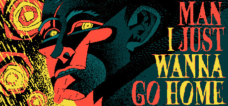
Man I Just Wanna Go Home is an "MSPaint-noir" visual novel with 13 endings, a unique visual style and a killer 80s inspired soundtrack. The story revolves around a delivery person stranded in an unfamiliar part of the city under the devastating rain. All he wants is to get home. Help him!

HK$ 9.80Very Positive(658)
Choose Your Own AdventureInteractive FictionVisual Novel
JZPS Games12 Jul, 2024

Man I Just Wanna Go Home scores 72/100 — better than 44% of Steam capsules we've analysed (n=22,658).

Very Positive (658 reviews) · HK$ 9.80 · Released 12 Jul, 2024 · By JZPS Games

Quick text summary

Man I Just Wanna Go Home scored 72/100 on Steam Analyzer — Good for a Steam capsule. Top priority fix: [genre_clarity] Add a subtle visual novel cue such as a dialogue box fragment, branching arrow motif, or rain street scene thumbnail in the background to signal the narrative genre without disrupting the noir composition.

Capsule scores by dimension

  • Genre Clarity: 5/10 — Noir mood unclear genre signal. The stylized close-up face with dramatic teal and red palette communicates a noir or thriller atmosphere effectively, and the title text reinforces a narrative-driven experience. However, at tiny size there is no clear visual novel iconography, dialogue box, or gameplay hint that separates it from an action game or point-and-click adventure. The MSPaint-noir art style is distinctive but genre-ambiguous to a quick scroller.
  • Title Readability: 8/10 — Bold title reads well at small. The title 'MAN I JUST WANNA GO HOME' uses large, bold, high-contrast yellow and teal block lettering stacked vertically on the right side against a dark teal background region, giving it strong separation from the illustrated face. At small capsule size the title remains readable due to its scale and weight. At tiny thumbnail size the individual words compress but the bold letterforms still hold their shape, though 'GO HOME' competes with the face for the same horizontal zone.
  • Contrast & Color: 7/10 — Strong warm-cool palette separation. The red-orange face against a deep teal background creates strong warm-cool contrast that pops well against Steam's dark #1b2838 background. The yellow title text further punches out from the teal field. In a mental grayscale test, the face silhouette separates cleanly from the background due to value difference. At tiny size the left side yellow abstract shapes and the face blend slightly but the right side title block remains visually distinct.
  • Uniqueness & Polish: 8/10 — Distinctive MSPaint-noir art hook. The flat, graphic, comics-influenced illustration style with heavy hatching and a restricted teal-red-yellow palette is visually memorable and unlike most capsules in the casual-indie space. It communicates a handcrafted, auteur sensibility that stands out against polished pixel art or 3D renders common in the genre. The composition feels intentional and the typography matches the raw, expressive visual style, though the overall execution could feel slightly rough to some audiences.
  • Brand Consistency: 8/10 — Cohesive restricted palette identity. The teal, red-orange, and yellow three-color palette is applied consistently across the illustration, background, and title typography, creating a tight internal visual identity. The graphic, flat illustration style with visible texture and hatching lines reads as a signature aesthetic that would likely carry through store screenshots. There are no mismatched rendering styles or inconsistent elements visible, and the title font matches the bold, expressive energy of the artwork.
  • Composition: 7/10 — Clear split layout with focal face. The composition divides cleanly into a left illustration zone and a right title zone, creating a readable two-part hierarchy. The dramatic close-up face is the primary focal point and draws the eye immediately, with the title block acting as a strong secondary anchor. At small size the split still reads but the abstract left-edge totem shapes add mild clutter. At tiny size the face and title compete equally for attention and there is no clear single entry point, which slightly weakens crop resilience.

What works

  • Distinctive restricted palette. The teal, red-orange, and yellow three-color scheme is immediately eye-catching and rare in the casual-indie capsule space.
  • Bold title scale and placement. Large stacked block lettering on a controlled dark teal background region ensures the title remains legible at small capsule sizes.
  • Strong warm-cool contrast. The red-orange face against deep teal creates clear silhouette separation that holds up in grayscale and against Steam's dark background.
  • Auteur art style communicates tone. The graphic illustration style with hatching and flat fills telegraphs a handcrafted, noir-inflected indie personality that feels distinct.

What hurts the capsule

  • Genre completely ambiguous at tiny size. Nothing in the image signals visual novel, casual, or narrative game to a first-time viewer scanning quickly at thumbnail scale.
  • Left edge clutter. The abstract totem shapes along the far left edge add visual noise without contributing to the focal hierarchy and can confuse at small sizes.
  • No gameplay or story cue. The image communicates mood and tone but gives no hint of mechanics, choices, or narrative structure that would attract the visual novel audience.
  • Title and face compete at tiny size. At 120x45 pixels the face and stacked title block are roughly equal in visual weight, removing a clear single entry point for the eye.

Priority fixes

  1. [genre_clarity] Add a subtle visual novel cue such as a dialogue box fragment, branching arrow motif, or rain street scene thumbnail in the background to signal the narrative genre without disrupting the noir composition.
  2. [composition] Reduce the visual weight of the left-edge abstract totem shapes so they recede clearly behind the main face at small sizes, strengthening the single focal point.
  3. [title_readability] Add a thin dark outline or drop shadow to the yellow title words where they overlap the face area to prevent any bleed at tiny thumbnail size.
  4. [genre_clarity] Consider adding a one-line genre descriptor such as 'Visual Novel' in small but legible type beneath the title to eliminate genre ambiguity for new viewers.

Store copy priority fixes

  1. [feature_communication] Explain the core interaction verb in the detailed description—e.g., 'navigate the city by selecting dialogue options and decisions' or 'piece together the truth through environmental clues and NPC conversations' to clarify what players actually do moment-to-moment.
  2. [audience_targeting] Add a sentence specifying estimated playtime and replay value—e.g., 'Each path takes 20-30 minutes; chasing all 13 endings will take 3-4 hours'—to help players gauge whether this suits their time commitment.
  3. [feature_communication] Replace 'multilayered puzzle of a narrative' with a concrete description of the narrative structure—e.g., 'uncover the truth behind the murder through interconnected storylines with branching reveals' to make the story hook tangible.

Related guides

Steam app ID: 3010070