Scoring genre clarity...

Abra-Cooking-Dabra capsule

Abra-Cooking-Dabra

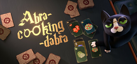
Abra-Cooking-Dabra is a cooking card game. Manage ingredients and make British dishes to keep toves, borogoves, and mome raths fed. Meet timers and fulfill puzzling orders despite the angry wacky Cat being your boss. You are Wonderland's new chef.

$7.14Mostly Positive(233)
Card GamePuzzleResource Management
Door 407Nov 17, 2025

Abra-Cooking-Dabra scores 68/100 — better than 19% of Steam capsules we've analysed (n=22,658).

Mostly Positive (233 reviews) · $7.14 · Released Nov 17, 2025 · By Door 407

Quick text summary

Abra-Cooking-Dabra scored 68/100 on Steam Analyzer — Solid for a Steam capsule. Top priority fix: [title_readability] Increase the font weight and add a stronger dark outline or drop shadow to the title text so it remains legible at 120x45 tiny thumbnail size, and consider reducing the title to a single line or tighter lockup to avoid stacking collisions with the cat.

Capsule scores by dimension

  • Genre Clarity: 7/10 — Cooking card game reads clearly. The three illustrated cards featuring a chicken, a frying pan, and a sandwich immediately communicate a card-based cooking mechanic, which is a strong and accurate genre signal. The whimsical cat character on the left reinforces the casual, quirky tone. At tiny size the cards still read as cards and food items are recognizable, though the cat mascot becomes a small blob that loses its personality.
  • Title Readability: 6/10 — Decorative font limits tiny legibility. The title 'Abra-cooking-dabra' uses a stylized serif/fantasy font in warm gold tones with moderate contrast against the teal background, which works reasonably at full size. The hyphenated stacked layout helps parse the word play but the decorative letterforms and moderate weight cause the title to collapse into illegible marks at tiny thumbnail size. At small capsule size the top half of the title is marginally readable but the lower 'dabra' portion competes with the cat illustration.
  • Contrast & Color: 7/10 — Warm cards pop on teal background. The warm-toned illustrated cards and gold title contrast well against the dark teal background, creating clear value separation that holds up on Steam's dark UI. The radiating sunburst lines on the background add visual energy without muddying the foreground subjects. In grayscale the cards still separate cleanly from the background, though the black cat on the dark teal left side has reduced silhouette contrast and risks merging with the Steam dark background at the image edge.
  • Uniqueness & Polish: 7/10 — Charming concept, competent execution. The Abracadabra-cooking pun combined with the Wonderland theming is a distinctive hook that stands out from generic cooking simulators and standard card games. The illustration style is clean and consistent with appealing card art, and the cat mascot adds personality. However compared to top-performing peers like Balatro the typography and overall graphic design feel mid-tier, with the stacked hyphenated title layout feeling slightly awkward rather than intentionally branded.
  • Brand Consistency: 7/10 — Cohesive whimsical cooking identity. The teal palette, illustrated card motif, and eccentric cat mascot form a recognizable internal visual identity that feels cohesive. The warm illustrated card style is consistent across all three visible card items. The fantasy-pun title font pairs reasonably with the whimsical tone, though a stronger iconic brand symbol or signature color treatment would help this stand out as a memorable identity in a Steam library row.
  • Composition: 7/10 — Clear focal cascade, cat slightly crowded. The composition flows naturally from the title and cat mascot on the left to the fanned card trio on the right, creating a readable left-to-right hierarchy. The cards are well-sized and the fanned arrangement adds depth and visual interest. At small and tiny sizes the left third becomes congested as the title text and cat overlap, reducing the clarity of both elements, and the rightmost sandwich card is partially cropped at the edge which could be cut further on certain Steam display formats.

What works

  • Strong genre signal via card art. The three illustrated food cards immediately communicate a card-based cooking game without any ambiguity, which is rare for casual card games on Steam.
  • Warm-cool color contrast. The warm orange-gold card tones against the dark teal background create natural pop on Steam's dark UI without needing heavy glow effects.
  • Distinctive concept pun branding. The Abracadabra cooking wordplay is immediately memorable and signals a quirky, lighthearted game that differentiates it from both serious cooking sims and standard card games.
  • Clean card illustration quality. The chicken, pan, and sandwich card art is polished and legible even at small sizes, with clear silhouettes and appealing stylization.

What hurts the capsule

  • Title collapses at tiny size. The decorative hyphenated stacked font becomes nearly illegible at 120x45 thumbnail size, which is a critical discoverability failure on Steam browse pages.
  • Cat mascot loses detail at small sizes. The black witch-cat character on the left, which is a key personality element, reduces to an unreadable dark smudge at small and tiny viewing sizes.
  • Left side composition congestion. The title text and cat character compete for the same visual space on the left third, creating a cluttered area that hurts hierarchy at reduced sizes.
  • Rightmost card partially cropped. The sandwich card is cut off at the right edge, which could worsen on certain Steam display crops and makes the composition feel slightly unfinished.

Priority fixes

  1. [title_readability] Increase the font weight and add a stronger dark outline or drop shadow to the title text so it remains legible at 120x45 tiny thumbnail size, and consider reducing the title to a single line or tighter lockup to avoid stacking collisions with the cat.
  2. [composition] Shift the cat mascot slightly left and down or give it a dedicated cleared zone so the title and character do not overlap, ensuring both read independently at small capsule size.
  3. [contrast_color] Add a subtle light rim or glow to the cat silhouette to separate it from the dark teal background, especially on the left edge which risks blending into Steam's #1b2838 UI.
  4. [uniqueness_polish] Pull the rightmost card fully inside the safe frame to avoid cropping, and consider adding a subtle magical sparkle or wand motif to reinforce the Wonderland-magic cooking concept more distinctively.

Store copy priority fixes

  1. [feature_communication] Add a second paragraph explaining core mechanics: 'Combine cards to cook dishes faster, manage ingredient inventory, and unlock recipes. Each order is a unique puzzle—match taste preferences and time limits to earn coins and unlock new recipes.'
  2. [uniqueness] Insert a specific differentiator: 'Unlike other cooking games, every customer is a capricious Wonderland character with unique preferences, forcing you to adapt strategy rather than repeat the same recipe.'
  3. [hook_strength] Rewrite the opening line to lead with emotional stakes: 'You've accidentally landed in Wonderland's chaotic kitchen—now a wacky Cat boss expects you to feed its eccentric creatures before time runs out.'

Related guides

Steam app ID: 3021530