Scoring genre clarity...
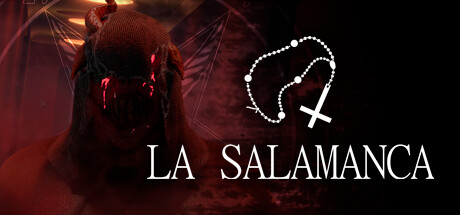
"La Salamanca" is an inmersive first-person psychological horror experience inspired by a local legend from Argentina, a story-driven game where you traverse different sections, solve puzzles, and hide from the horrors lurking in the shadows of a twisted apartment complex.
$11.99Mixed(15)
HorrorPuzzlePsychological Horror
Carpincho StudioJun 24, 2025