Scoring genre clarity...

Cubetory capsule

Cubetory

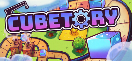
Build a huge factory on a tiny island! Resources are scarce and unique - tweak and optimize everything for peak efficiency. Start with simple painted cubes, unlock tons of upgrades, and scale up to complex production chains. No enemies, just satisfying spaghetti.

$14.99Positive(35)
AutomationBuildingSimulation
Robogoose GamesApr 13, 2026

Cubetory scores 80/100 — better than 87% of Automation capsules (n=670).

Positive (35 reviews) · $14.99 · Released Apr 13, 2026 · By Robogoose Games

Quick text summary

Cubetory scored 80/100 on Steam Analyzer — Good for a Automation capsule. Top priority fix: [composition] Move the top-right decorative element 15-20px inward to ensure safe margin clearance across all Steam display contexts.

Capsule scores by dimension

  • Genre Clarity: 8/10 — Clear factory builder with charm. The visual language immediately reads as a building/simulation game through the isometric factory structures, colorful production elements, and gear icon integrated into the logo. At tiny size, the stacked boxes and factory aesthetic remain readable, though the specific 'cube' mechanics may not be obvious without context. The bright, playful art style distinguishes it from darker simulators in the benchmark set.
  • Title Readability: 9/10 — Excellent bold typography. The 'CUBETORY' logo uses thick, vibrant purple lettering with a consistent outline and the gear symbol integrated seamlessly into the 'O'. At tiny size (120x45), the title remains legible and recognizable due to strong letter forms and high saturation against the light background. The outline treatment protects readability even under blur and quick scroll conditions.
  • Contrast & Color: 8/10 — Bright palette pops on dark UI. The capsule uses high-saturation purples, oranges, yellows, and blues against a light sky gradient, creating strong value separation from Steam's #1b2838 background. The vibrant factory elements and character-like cube structures have clean silhouettes that read clearly at small sizes. In grayscale, the sky gradient provides good tonal separation, though some mid-tone yellows could be slightly more defined.
  • Uniqueness & Polish: 8/10 — Distinctive indie aesthetic with personality. The capsule demonstrates high craft with intentional color harmony, consistent cartoon rendering, and a cohesive cheerful tone that matches the game's 'no enemies, just satisfying' design philosophy. The gear-integrated logo and colorful factory buildings communicate the core mechanic clearly without feeling derivative of the benchmark titles. The style is premium and stands out in the indie sim space.
  • Brand Consistency: 8/10 — Consistent visual identity evident. The purple and orange color palette, cartoon cube aesthetic, and gear iconography create a recognizable brand fingerprint that would carry across store screenshots and marketing. The cheerful, slightly whimsical art direction is internally consistent throughout, with no tonal shifts or rendering conflicts. The logo design establishes a memorable symbol that could become iconic with repeated exposure.
  • Composition: 7/10 — Solid hierarchy with minor imbalance. The title sits prominently in the upper-center region with strong visual weight, and the factory scene below provides context without competing for attention. The foreground factory structure, mid-ground clouds, and background sky create layered depth. At tiny size, the layout reads well, though the right edge element (gear/cloud) sits slightly close to the margin and could benefit from safer spacing.

What works

  • Integrated logo design. The gear symbol seamlessly integrated into the 'CUBETORY' text serves as both a title element and a core mechanic visual cue.
  • High saturation cohesion. The purple, orange, and yellow palette creates a cohesive, premium look that pops distinctly against Steam's dark background.
  • Clear genre communication. Isometric factory buildings and cube elements immediately telegraph simulation and builder gameplay even at glance size.
  • Readable at all scales. Typography and primary visual elements maintain clarity from full header down to tiny thumbnail thanks to strong outline treatment and scale-appropriate design.

What hurts the capsule

  • Right edge element vulnerability. The curved cloud/gear shape at the top right sits close to the edge and may be cropped or cut off depending on Steam's display context.
  • Limited visual storytelling. While cheerful and clear, the capsule shows factory infrastructure but does not hint at the 'scarce resources' or 'spaghetti production chains' tension that differentiates this game.

Priority fixes

  1. [composition] Move the top-right decorative element 15-20px inward to ensure safe margin clearance across all Steam display contexts.
  2. [genre_clarity] Consider adding a subtle visual element (perhaps resource tokens or a simplified chain icon) to hint at the optimization/efficiency core loop that would strengthen genre specificity at tiny size.

Store copy priority fixes

  1. [feature_communication] Replace 'tons of other machines' in the short description with 2–3 specific examples (e.g., 'assemblers, splitters, and power stations') to remove the vague catch-all phrase and reinforce feature density.
  2. [uniqueness] Add a closing sentence to the detailed description that explicitly states what makes Cubetory different (e.g., 'Unlike infinite-space factory games, every resource patch is unique and must be spent wisely, forcing you to plan your entire island layout from the start.').
  3. [feature_communication] Clarify 'non-deterministic processes' in the Complexity section by briefly explaining what it means in context (e.g., 'processes with variable outcomes that require routing and logic puzzles to manage').

Related guides

Steam app ID: 3027060 · Tags: Automation, Building, Simulation, Cozy, Puzzle