Scoring genre clarity...

Katanaut capsule

Katanaut

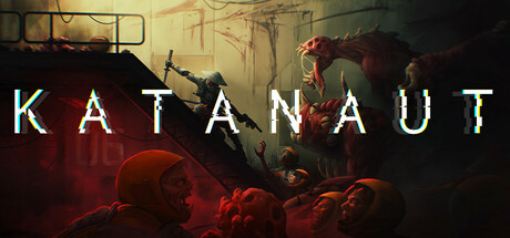
Katanaut is a fast-paced, Metroidvania-inspired action roguelite blending fluid combat and cosmic horror. Slash, dodge, and wield powerful abilities as you battle through a station sprawling with twisted, once-human horrors. Adapt, survive, and descend into the shadows to uncover dark secrets.

$8.99Very Positive(15)
ActionAction RoguelikeRoguelike
VoidmawSep 10, 2025

Katanaut scores 68/100 — better than 19% of Steam capsules we've analysed (n=22,658).

Very Positive (15 reviews) · $8.99 · Released Sep 10, 2025 · By Voidmaw

Quick text summary

Katanaut scored 68/100 on Steam Analyzer — Solid for a Steam capsule. Top priority fix: [contrast_color] Increase the soldier's brightness or add a rim light effect so the protagonist silhouette separates clearly from the background in grayscale at small sizes

Capsule scores by dimension

  • Genre Clarity: 7/10 — Sci-fi action horror implied. The armed soldier silhouette on a staircase facing grotesque mutant creatures clearly communicates action combat in a horror sci-fi setting, which aligns well with the Metroidvania roguelite premise. At small size the soldier-vs-monsters confrontation still reads, though the specific roguelite or Metroidvania subgenre nuance is lost. At tiny size it collapses to a dark action-horror scene, which is still directionally correct.
  • Title Readability: 7/10 — Clean title, small size holds. KATANAUT is rendered in a clean, wide-spaced sans-serif with a subtle chromatic aberration glitch effect and placed at the bottom center over a relatively controlled dark region. At full size it reads clearly and the glitch treatment adds character. At tiny size the letterforms remain legible as a single bold word, though the glitch effect detail is completely lost and the spacing becomes tight — it still passes a basic readability check.
  • Contrast & Color: 6/10 — Dark palette with muddy midtones. The image is dominated by desaturated dark greys, deep reds, and browns, which creates atmosphere but also causes the key figure — the soldier on the staircase — to blend into the background at small sizes due to similar value ranges. The large red-flesh creature on the right has slightly better separation but still merges with the warm background. In grayscale the image loses significant hierarchy, with the staircase, soldier, and background wall all occupying similar mid-to-dark tonal zones.
  • Uniqueness & Polish: 7/10 — Distinctive horror tone, competent art. The painted illustration style is above average for an indie capsule and the specific design of the foreground zombie-like hordes combined with the larger mutant creature gives it visual identity. The composition tells a story — outnumbered soldier holding a bottleneck — which is a stronger visual hook than a generic hero pose. However, the overall darkness and color restraint mean it risks blending into the sea of dark sci-fi indie capsules rather than punching above its weight against AAA benchmarks in the genre.
  • Brand Consistency: 7/10 — Coherent dark sci-fi horror identity. The moody industrial setting, grotesque once-human creatures, lone armed protagonist, and glitch-styled title all cohere into a recognizable identity for the game. The chromatic aberration on the title is a small but consistent brand signal tied to the cosmic horror tech angle. Without external screenshots to compare directly, the internal palette and rendering style feel unified rather than assembled from disparate assets.
  • Composition: 7/10 — Strong diagonal, crowded lower half. The diagonal staircase creates a strong compositional line leading the eye from the lower-left foreground crowd up to the soldier and creature confrontation at center-right, which is an effective action hierarchy. At small size the lower-left zombie cluster becomes visual noise that competes with the main focal point, and the title at the bottom is squeezed by the foreground heads crowding upward. The upper-left corner is relatively empty, slightly unbalancing the composition, but the staircase diagonal compensates by creating movement and tension.

What works

  • Narrative action beat. The soldier-at-bottleneck composition tells a story of being outnumbered, giving the capsule a memorable visual hook beyond a static hero pose.
  • Title placement and font clarity. KATANAUT sits in a dark controlled zone at the bottom center, keeping letterforms readable even at small capsule sizes.
  • Distinctive creature design. The large fleshy mutant on the right is visually distinctive and helps signal the specific cosmic horror subgenre rather than generic sci-fi.
  • Painted illustration quality. The hand-painted art style elevates the capsule above typical asset-flip indie visuals and signals production investment.

What hurts the capsule

  • Low value contrast on hero figure. The soldier silhouette sits against similarly dark background tones, causing the protagonist to lose legibility at tiny size in grayscale.
  • Foreground crowd creates clutter. The lower-left zombie heads compete with the title area and primary focal point at small sizes, fragmenting attention rather than guiding it.
  • Muddy midtone palette. The heavy use of dark reds and browns across foreground, subject, and background reduces silhouette separation and makes the image feel heavy against Steam's dark UI.
  • Genre subtype ambiguity at tiny size. The Metroidvania or roguelite specific identity is completely lost at tiny size, reading only as generic dark sci-fi action.

Priority fixes

  1. [contrast_color] Increase the soldier's brightness or add a rim light effect so the protagonist silhouette separates clearly from the background in grayscale at small sizes
  2. [composition] Reduce the vertical height of the foreground zombie cluster or darken it significantly so the title zone has more breathing room and the staircase focal point dominates
  3. [genre_clarity] Introduce a subtle environmental cue such as a visible sci-fi corridor or station architecture detail in the midground to reinforce the Metroidvania station setting at small size
  4. [uniqueness_polish] Increase the saturation or brightness of one signature color accent — such as the glitch effect on the title or a weapon glow — to create a memorable color hook that distinguishes this from other dark sci-fi capsules

Store copy priority fixes

  1. [feature_communication] Add a specific example of a memory fragment ability or at least clarify 'safe distance' playstyle options (e.g., 'unlock ranged attacks or shielding abilities' or 'powers range from close-range slashes to beam attacks').
  2. [audience_targeting] Insert a sentence explicitly mentioning difficulty adjustability and accessibility features early in the detailed description (e.g., 'Souls-like challenge with full difficulty options and accessibility features to suit your playstyle') to broaden audience comfort.
  3. [uniqueness] Articulate what makes Katanaut's ability progression or combat feel mechanically distinct from other roguelites (e.g., if time-manipulation affects combat directly, explain how; if the station layout or enemy design is novel, hint at it).
  4. [hook_strength] Strengthen the narrative hook by connecting the mystery to player stakes: instead of 'uncovering what is going on,' try 'uncover why the station fell and stop the spreading corruption' or similar outcome-focused framing.

Related guides

Steam app ID: 3032830