Scoring genre clarity...

Resident Evil capsule

Resident Evil

The game that defined the survival-horror genre is back! Check out the remastered HD version of Resident Evil.

$19.99Very Positive(386)
Survival HorrorZombiesHorror
CAPCOM Co., Ltd.Jan 19, 2015

Resident Evil scores 87/100 — better than 99% of Survival Horror capsules (n=1,308).

Very Positive (386 reviews) · $19.99 · Released Jan 19, 2015 · By CAPCOM Co., Ltd.

Quick text summary

Resident Evil scored 87/100 on Steam Analyzer — Excellent for a Survival Horror capsule. Top priority fix: [title_readability] Increase the size of the quote text or move it to a secondary position that does not compete with main title legibility at small sizes.

Capsule scores by dimension

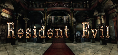
  • Genre Clarity: 9/10 — Classic horror atmosphere unmistakable. The ornate gothic mansion interior with dramatic lighting, red carpet, and architectural grandeur instantly communicates survival-horror. Even at tiny size, the imposing architectural geometry and warm amber lighting against darkness read as classic RE aesthetic. The setting clearly signals a horror game focused on exploration and dread rather than action.
  • Title Readability: 8/10 — Title legible with minor tagline risk. The main 'Resident Evil' title in large tan/gold outline font remains readable at all sizes down to tiny, with strong contrast against the dark background. The quote attribution below is very small and becomes difficult to parse at tiny size, though it does not obscure the core title. At small size the full layout works well; at tiny, only the main title stays crisp.
  • Contrast & Color: 9/10 — Excellent value separation throughout. The warm tan/gold title and architectural highlights create strong separation against the dark mansion interior and black background. The red carpet runner adds a warm focal accent that guides the eye without overwhelming. Grayscale squint test passes cleanly—silhouettes and text remain distinct even when color saturation is removed.
  • Uniqueness & Polish: 8/10 — Iconic setting with premium execution. The remastered HD rendering of the mansion lobby showcases clear production polish and attention to architectural detail. This is a signature location instantly recognizable to franchise fans, avoiding generic horror clichés. The balanced composition and lighting craft feel intentional and premium compared to templated horror designs, though the concept itself is classic rather than novel.
  • Brand Consistency: 9/10 — Signature location reinforces franchise identity. The ornate mansion interior is the iconic setting of the original game, making it a instantly recognizable identity marker for the RE franchise. The warm amber lighting, architectural style, and gothic atmosphere are consistent with how RE has always presented its environments. This location carries enough visual specificity that returning players will recognize it immediately.
  • Composition: 9/10 — Clear hierarchy with purposeful framing. The red carpet creates a strong leading line drawing the eye down the center toward the vanishing point, establishing clear depth and focal hierarchy. Title sits in the upper third with breathing room, and the quote sits below without crowding the primary text. The symmetrical architecture and centered composition work at all sizes, with safe margins protecting key elements from edge crop.

What works

  • Instant genre and franchise recognition. The iconic mansion interior is a signature visual that RE fans recognize immediately, and the gothic horror atmosphere needs no explanation.
  • Strong contrast and legibility hierarchy. Title text in tan/gold outline remains crisp and readable at tiny size with excellent separation from the dark background throughout all viewing sizes.
  • Sophisticated depth and visual polish. The architectural complexity, lighting craft, and HD remaster quality convey a premium, intentional presentation that stands above generic horror templates.
  • Effective compositional framing. The red carpet leading line and symmetrical architecture create natural eye guidance and spatial hierarchy that works at small and tiny sizes.

What hurts the capsule

  • Quote attribution becomes illegible at tiny size. The GameInformer quote and attribution text below the title are too small to read clearly when the capsule shrinks, reducing the credibility signal.
  • Limited color palette variety. The design relies heavily on warm golds and blacks with only the red carpet as a secondary accent, which while appropriate, offers minimal color pop compared to top-performing competitors.

Priority fixes

  1. [title_readability] Increase the size of the quote text or move it to a secondary position that does not compete with main title legibility at small sizes.
  2. [contrast_color] Consider adding a subtle secondary accent color that maintains brand cohesion while increasing overall visual impact and distinguishing the capsule in library scrolls.

Store copy priority fixes

  1. [hook_strength] Replace 'Check out the remastered HD version' with a stronger active verb: 'Experience the iconic survival-horror masterpiece fully restored with modern visuals and accessibility controls' or similar that conveys specific player benefit, not just a passive product existence.
  2. [uniqueness] Add a concrete differentiator after the opening hook, such as 'This rebuild features overhauled HD environments while preserving the original's claustrophobic design' or explain which control/audio/visual enhancements are most impactful to justify the remaster.
  3. [tone_match] Consolidate technical features into a single cohesive paragraph or integrate them into narrative context rather than breaking the horror mood with isolated bullet-point lists; consider rephrasing 'High-Resolution Environments' as 'Every shadow and corridor has been meticulously reconstructed in HD' to match atmospheric tone.
  4. [audience_targeting] Add one sentence clarifying audience: e.g., 'Perfect for veterans returning to Raccoon City or newcomers brave enough to discover where survival horror began' to signal the game's suitability for both legacy players and new audiences.

Related guides

Steam app ID: 304240 · Tags: Survival Horror, Zombies, Horror, Classic, Remake