Scoring genre clarity...

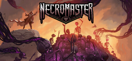
Necromaster capsule

Necromaster

The Necromaster rises again! Raise the dead and reclaim your kingdom from the man who murdered you in this turn-based tactical RPG.

RPGTactical RPGTurn-Based Combat
Dragon DropperTo be announced

Necromaster scores 73/100 — better than 60% of RPG capsules (n=3,716).

Released To be announced · By Dragon Dropper

Quick text summary

Necromaster scored 73/100 on Steam Analyzer — Good for a RPG capsule. Top priority fix: [uniqueness_polish] Introduce a signature visual element—iconic protagonist silhouette, unique undead design pattern, or distinctive magical effect—that differentiates Necromaster's necromancy from competitor dark-fantasy RPGs.

Capsule scores by dimension

  • Genre Clarity: 8/10 — Dark fantasy RPG immediately clear. The necromantic theme is unmistakable through skeletal undead creatures dominating the foreground, a powerful silhouetted caster figure on a central mound, and a menacing purple-magenta aura emanating from the army of the dead. At tiny size, the cluster of skeletal forms and warm-to-cool color contrast still reads as dark fantasy tactical RPG without ambiguity.
  • Title Readability: 8/10 — Bold metallic serif logo, solid hierarchy. The 'NECROMASTER' title uses a strong metallic serif font with a shield-shaped banner and skull icon inset, positioned at the top-center with excellent contrast against the sky. The logo remains readable at small and tiny sizes due to thick letterforms and the iconic banner framing; however, the skull detail becomes less distinct at thumbnail scale.
  • Contrast & Color: 8/10 — Warm-cool separation, strong silhouettes. The orange-gold sunset sky provides excellent value separation from the dark purple skeletal masses in the mid and foreground, creating a dramatic light-dark contrast that pops against Steam's dark background. The grayscale squint test shows clear silhouette definition of the undead cluster and the central figure, though some purple-to-orange transitions lose definition at tiny size due to saturation overlap.
  • Uniqueness & Polish: 7/10 — Distinctive necromancy focus, solid craft. The composition avoids generic fantasy tropes by centering an army of skeletal undead with a clear necromantic rise aesthetic rather than a lone hero moment. The lighting, layering, and creature design show intentional art direction; however, the visual presentation follows familiar dark-fantasy-game conventions that exist in the genre baseline (similar tone to Diablo IV approach) without a strongly unique hook.
  • Brand Consistency: 6/10 — Coherent dark aesthetic, limited identity signal. The image maintains internal visual consistency with a unified purple-skeletal-undead palette and clear art style; however, there are no iconic character, symbol, or signature visual motifs that immediately signal 'Necromaster' specifically versus other necromancy games. The metallic shield logo with skull provides some branding anchor, but without seeing the other five screenshots, the core visual identity feels functionally executed but not distinctly memorable.
  • Composition: 7/10 — Clear focal point, strong depth layering. The central golden-lit mound with the skeletal army creates a strong primary focal point, with foreground undead, midground horde, and sky background providing clear depth layering. At small and tiny sizes, the hierarchical arrangement reads well; however, the logo placement at top-center competes slightly with the landscape focal point, and some edge creatures blur into the frame border at mobile cropping, risking slight compositional loss.

What works

  • Unmistakable dark fantasy RPG identity. The necromantic theme with skeletal army and purple aura immediately communicates tactical undead-focused gameplay without genre confusion.
  • Strong value contrast and silhouette definition. Orange-gold sky against dark purple undead creates excellent separation that reads clearly even at tiny thumbnail scale and pops against Steam's dark background.
  • Effective depth layering and visual hierarchy. Foreground, midground, and background elements guide the eye naturally to the golden-lit central mound, creating compositional clarity across all viewing sizes.
  • Readable metallic logo with iconic shield framing. The bold serif 'NECROMASTER' title with skull-inset banner maintains legibility at small size through thick letterforms and strong contrast.

What hurts the capsule

  • Generic dark-fantasy visual execution. While competently crafted, the skeletal-army-rising aesthetic follows familiar genre conventions (similar to Diablo IV) without a visually distinctive hook or unique selling point that stands out from peer RPGs.
  • Limited brand identity signaling. The logo provides functional branding but lacks iconic character, motif, or memorable palette that would allow the capsule to be recognized as distinctly 'Necromaster' versus other necromancy games.
  • Logo placement competes with landscape focal point. The top-center title banner divides attention between the logo and the golden-lit undead army, slightly weakening compositional dominance of the core visual hook.

Priority fixes

  1. [uniqueness_polish] Introduce a signature visual element—iconic protagonist silhouette, unique undead design pattern, or distinctive magical effect—that differentiates Necromaster's necromancy from competitor dark-fantasy RPGs.
  2. [brand_consistency] Develop a recognizable brand motif (character, symbol, or palette signature) visible in this capsule and reinforced across the five store screenshots to build immediate visual recall.
  3. [composition] Consider repositioning the logo to upper-left or lower-third to allow the golden-lit skeletal army to dominate the primary focal zone without competing framing elements.

Related guides

Steam app ID: 3047690 · Tags: RPG, Tactical RPG, Turn-Based Combat, Dark Fantasy, CRPG