Scoring genre clarity...

Dungeon Rampage capsule

Dungeon Rampage

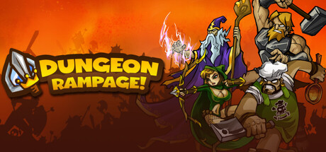
Battle your way to victory in this 1-4 player co-op hack-n-slash dungeon crawler. Play as a dynamic cast of heroes slicing their way through dungeons, earning weapons and loot. Rampage past a gauntlet of enemies and destruction to end the evil Lord Dinglepus' reign!

$7.99Very Positive(74)
Early AccessMultiplayerNostalgia
Gamebreaking StudiosDec 5, 2025

Dungeon Rampage scores 73/100 — better than 56% of Steam capsules we've analysed (n=22,658).

Very Positive (74 reviews) · $7.99 · Released Dec 5, 2025 · By Gamebreaking Studios

Quick text summary

Dungeon Rampage scored 73/100 on Steam Analyzer — Good for a Steam capsule. Top priority fix: [uniqueness_polish] Add a single distinctive visual hook such as a dramatic environment feature, iconic enemy, or loot explosion that communicates a unique selling point beyond generic hero poses

Capsule scores by dimension

  • Genre Clarity: 9/10 — Hack-slash dungeon crawler obvious. Three distinct hero archetypes — a warrior with axe, a mage with staff crackling lightning, and a ranger with bow — are posed dynamically against a fiery dungeon battle backdrop, immediately communicating co-op hack-and-slash fantasy. The cartoonish action poses and weapon variety signal the genre unmistakably. Even at tiny size, the multiple armed characters in an action stance read as a brawler or dungeon crawler.
  • Title Readability: 8/10 — Bold title reads at small size. DUNGEON RAMPAGE uses a chunky, outlined display font with strong yellow-white lettering against the warm orange-red background, providing decent contrast at full size. The exclamation mark adds energy and the stacked two-line layout is clean. At tiny size the letters compress but the bold weight and outline keep the words mostly legible, though RAMPAGE becomes slightly harder to parse than DUNGEON.
  • Contrast & Color: 7/10 — Warm palette pops against Steam dark. The vivid orange-red fiery background creates strong separation from Steam's dark navy #1b2838, making the capsule pop on the store page. The characters have strong outlines that help define their silhouettes against the busy warm background. In grayscale the characters in the center-right cluster slightly blend together in midtones, but the bright lightning effect on the mage and the title text retain good contrast.
  • Uniqueness & Polish: 6/10 — Competent cartoon style, slightly generic. The cartoon art style is consistent and energetic with appealing character designs, but the overall composition feels like a mid-2000s Flash game header rather than a premium capsule. The fiery silhouette crowd in the background adds chaos but not much storytelling depth. Compared to top-tier capsules in the genre, there is no single striking visual hook or memorable compositional idea beyond 'heroes ready to fight.'
  • Brand Consistency: 7/10 — Cohesive cartoon identity holds together. The bold outline cartoon style, warm orange-red palette, and energetic action pose establish a recognizable visual identity that feels internally consistent. The three hero character designs are distinctive enough to be memorable brand anchors across marketing materials. The title treatment with its chunky font and slight drop shadow matches the overall loud, playful tone of the art style well.
  • Composition: 7/10 — Heroes right, title left, clear hierarchy. The layout places the title DUNGEON RAMPAGE in the upper-left with characters occupying the right two-thirds, creating a clear left-to-right read that works well at capsule sizes. The three characters are staggered in size creating a sense of depth and the foreground warrior anchors the bottom edge confidently. At small and tiny sizes the character cluster on the right remains a readable group silhouette, though the bottom edge crops slightly close to the warrior's feet.

What works

  • Immediate genre recognition. Three armed hero archetypes in dynamic action poses communicate co-op hack-and-slash dungeon crawler instantly even at tiny thumbnail size.
  • High contrast against Steam background. The saturated orange-red fiery backdrop creates strong value separation against Steam's dark #1b2838, ensuring the capsule stands out during quick scrolling.
  • Bold readable title font. The chunky outlined letterforms of DUNGEON RAMPAGE hold legibility down to small capsule sizes thanks to strong weight and outline contrast.
  • Cohesive cartoon art direction. Consistent outline weight, character rendering style, and warm palette create a unified identity across all visual elements in the capsule.

What hurts the capsule

  • Generic fiery background lacks storytelling. The orange gradient with silhouetted crowd provides atmosphere but communicates nothing unique about the game's mechanics, setting, or selling point beyond a generic fantasy brawl.
  • Character cluster blends in midtones at tiny size. In grayscale the three heroes lose individual definition at tiny size as their similar mid-range values cause them to merge into one indistinct mass.
  • Premium tier gap versus benchmark titles. Compared to top-performing genre capsules the overall design reads as a mid-budget Flash-era capsule lacking the compositional sophistication or visual storytelling of competitors.
  • Bottom edge crop risk. The warrior character's feet sit very close to the bottom edge and risk being cropped in certain Steam display contexts, destabilizing the composition's anchor.

Priority fixes

  1. [uniqueness_polish] Add a single distinctive visual hook such as a dramatic environment feature, iconic enemy, or loot explosion that communicates a unique selling point beyond generic hero poses
  2. [contrast_color] Add stronger outline or rim lighting separation to the three hero characters to ensure they read as distinct silhouettes in grayscale and at tiny size
  3. [composition] Raise the entire character group slightly upward to add a safe margin at the bottom edge and prevent foot cropping in Steam display contexts
  4. [title_readability] Increase the contrast between the title text and the background in the upper-left region by adding a subtle dark vignette or color wash behind the logo

Store copy priority fixes

  1. [feature_communication] Add a specific sentence in the short or early detailed description defining what Early Access means for this game—expected content roadmap, current feature completeness, or estimated launch timeline to set player expectations.
  2. [uniqueness] Replace the vague "quality of life improvements" phrase with 2-3 concrete examples of modernizations made for this Steam release versus the original Facebook version (e.g., improved matchmaking, new heroes, balance changes).
  3. [feature_communication] Expand the pet recruitment section to clarify how pets are obtained, whether they level/upgrade, and their specific combat role (tank, damage, support) so players understand the strategic layer.
  4. [genre_clarity] Add one sentence early in the detailed description explaining the core progression loop: earn loot → upgrade heroes → tackle harder dungeons, to reinforce the RPG progression layer alongside combat.

Related guides

Steam app ID: 3053950