Scoring genre clarity...

Decksplorers: Into the Shell capsule

Decksplorers: Into the Shell

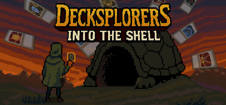
Dive into the world of Decksplorers: Into the Shell, where deckbuilding card combat meets real-time action in a thrilling roguelite adventure! Master the art of strategic card play, swift reflexes, and exploration as you venture into the mysterious ever-changing caves of "The shell"

DeckbuildingCard BattlerCard Game
Shellpad InteractiveOctober 2026

Decksplorers: Into the Shell scores 68/100 — better than 19% of Steam capsules we've analysed (n=22,658).

Released October 2026 · By Shellpad Interactive

Quick text summary

Decksplorers: Into the Shell scored 68/100 on Steam Analyzer — Solid for a Steam capsule. Top priority fix: [uniqueness_polish] Integrate a distinctive visual hook such as unique card designs, glowing effects, or a signature color accent that signals the deckbuilding mechanic and differentiates the capsule from similar pixel titles.

Capsule scores by dimension

  • Genre Clarity: 7/10 — Roguelite exploration with action-adventure undertones. The pixelated character in armor on the left and the large turtle/shell cave structure immediately suggest exploration and adventure gameplay. At TINY size, the silhouettes of the character and shell remain readable, though the card elements scattered in the background don't clearly communicate deckbuilding mechanics without prior knowledge. The warm orange sky and cave setting effectively establish an underground exploration theme that aligns with roguelite conventions.
  • Title Readability: 8/10 — Gold title with solid hierarchy and contrast. The golden 'DECKSPLORERS' text uses a bold serif font that maintains clarity at full size and remains readable at SMALL size due to strong color separation from the reddish background. The white tagline 'INTO THE SHELL' sits below with good contrast and legibility. At TINY size the title still parses as prominent text, though fine serifs soften slightly and the tagline becomes harder to read; however the main title remains recognizable.
  • Contrast & Color: 7/10 — Warm palette with moderate value separation. The golden title pops well against the warm red-orange gradient background, and the dark green character silhouette reads clearly against lighter midtones. The grayscale squint test shows decent separation between the character, shell, and sky, though the overall warm color temperature creates a somewhat limited value range. At TINY size the dark shell and character maintain visibility, but the background becomes a blended gradient that reduces edge definition.
  • Uniqueness & Polish: 6/10 — Competent pixel art with familiar indie aesthetic. The pixelated art style is executed cleanly with consistent quality, and the combination of a lone character facing a large organic structure creates a sense of scale and adventure. However, pixel art roguelites are a well-established visual genre, and this capsule doesn't introduce distinctive artistic flourishes, unique color palettes, or memorable visual hooks that would distinguish it from similar indie titles. The card elements feel like an afterthought rather than integrated storytelling.
  • Brand Consistency: 6/10 — Coherent style without iconic identity signals. The pixelated art direction is internally consistent across the character, shell, background, and UI elements, with a unified approach to form and color. However, there are no distinctive motifs, signature colors, or iconic symbols that would make this capsule immediately recognizable as a specific brand or memorable identity. The visual language is competent but generic within the pixel art indie space.
  • Composition: 7/10 — Clear focal point with good depth layering. The composition uses clear foreground (character), midground (shell cave), and background (sky) layering that guides the eye naturally. The character is positioned left-center as the primary focal point, while the large shell commands secondary attention, creating an effective visual hierarchy. At TINY size the focal point holds, though scattered card elements in the mid-distance create minor visual clutter that doesn't interfere with the core read, and all elements sit safely within margins.

What works

  • Strong title contrast and hierarchy. The golden serif typography reads clearly at SMALL size and creates immediate brand presence against the warm background.
  • Effective scale and depth communication. The character-to-shell size relationship instantly conveys exploration and adventure, establishing genre expectations at a glance.
  • Cohesive pixel art execution. Clean, consistent pixelated style across all elements maintains visual unity and reads well across all viewing sizes.

What hurts the capsule

  • Generic pixel art indie aesthetic. The visual style lacks distinctive hooks or memorable identity signals that would differentiate it from dozens of similar pixel roguelites.
  • Unclear deckbuilding communication. The scattered card elements in the background don't clearly signal the card-combat core mechanic and feel disconnected from the main composition.
  • Warm color palette lacks edge definition. The limited value range between foreground and background reduces silhouette crispness at TINY size, particularly in the gradient sky.

Priority fixes

  1. [uniqueness_polish] Integrate a distinctive visual hook such as unique card designs, glowing effects, or a signature color accent that signals the deckbuilding mechanic and differentiates the capsule from similar pixel titles.
  2. [contrast_color] Add a high-contrast accent color or rim light to the character or shell to increase silhouette separation and visual pop, especially at TINY size.
  3. [composition] Reposition or stylize the card elements to create a more cohesive secondary focal point that reinforces the deckbuilding theme rather than appearing scattered.

Store copy priority fixes

  1. [hook_strength] Replace 'Dive into the world' with a verb-forward opener like 'Build, battle, and adapt through procedurally generated card combat' to lead with the core gameplay loop.
  2. [uniqueness] Add a dedicated sentence explaining positional card play—e.g., 'Placement matters: where you cast your spells determines their impact and range, adding a tactical layer beyond card selection.'
  3. [tone_match] Replace or supplement generic phrases like 'thrilling adventure' and 'adrenaline-pumping' with concrete details about specific card synergies, enemy types, or moment-to-moment decisions that feel native to this game.
  4. [feature_communication] Integrate the Blank card into a narrative or mechanical goal section to clarify whether it is the final victory condition, hidden reward, or ongoing mystery that shapes progression.

Related guides

Steam app ID: 3059730