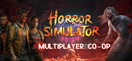
Horror Simulator VR scores 70/100 — better than 34% of RPG capsules (n=3,544).

Quick text summary

Horror Simulator VR scored 70/100 on Steam Analyzer — Good for a RPG capsule. Top priority fix: [uniqueness_polish] Introduce a distinctive visual element or art style hook—such as a signature character pose, UI motif, or stylized rendering that signals Horror Simulator's specific identity and separates it from competing multiplayer horror titles.

Capsule scores by dimension

  • Genre Clarity: 7/10 — Horror multiplayer co-op clearly signaled. The capsule unmistakably communicates horror through zombie/undead character silhouettes on the right, fire/lava elements in the center, and creepy atmosphere cues. The "MULTIPLAYER CO-OP" text below the title reinforces the cooperative gameplay angle. At tiny size, the character archetypes and horror iconography remain recognizable, though specific VR element is less apparent without the logo context.
  • Title Readability: 8/10 — Title reads well across all sizes. The "HORROR SIMULATOR" title uses bold orange/yellow gradient text with solid contrast against the dark background, making it legible at full, small, and tiny sizes. The white "MULTIPLAYER CO-OP" subtitle below provides clear secondary information. Text placement sits on a relatively clean dark region without heavy texture interference, supporting readability even at thumbnail scale.
  • Contrast & Color: 8/10 — Strong warm-cool separation and clarity. Bright orange-yellow title text pops strongly against the dark #1b2838 background, and the cool teal sky gradient creates effective value separation from warm character and fire elements. The white subtitle adds additional contrast punch. The warm/cool color interplay remains visually distinct even at tiny size and in grayscale high-contrast modes.
  • Uniqueness & Polish: 6/10 — Competent but follows horror template. The capsule executes horror multiplayer messaging cleanly with character lineup, zombie antagonist, and fire/danger elements, but the visual composition closely mirrors standard horror game marketing templates rather than establishing a distinctive visual hook. The art direction is professional and well-lit, yet lacks a memorable unique selling point that differentiates it from comparable indie horror titles in the crowded market.
  • Brand Consistency: 6/10 — Coherent but limited identity cues. The color palette, character archetypes, and fire/horror motifs are internally consistent and suggest a cohesive game world, but no iconic character, symbol, or signature visual trademark emerges that would create instant recognition in future marketing. The execution is professional but the brand identity signals are generic enough that this capsule could belong to several different horror co-op games without substantial modification.
  • Composition: 7/10 — Clear hierarchy with balanced elements. The composition establishes a clear focal point with the bold centered title, flanked by player characters on the left and a threatening zombie antagonist on the right, creating visual depth and storytelling balance. Text placement in the center and lower regions avoids dangerous edge cropping, and supporting elements guide attention effectively. The layout remains coherent at small and tiny sizes, though character details flatten somewhat.

What works

  • Title contrast and legibility. Orange-yellow gradient text with strong value separation reads clearly at all viewing sizes from full header down to tiny thumbnail.
  • Immediate genre and mood communication. Horror and multiplayer cooperative gameplay are instantly recognizable through character archetypes, zombie enemy, fire elements, and direct text labeling.
  • Balanced visual composition. Character lineup on left, threatening zombie on right, and centered title create depth and narrative tension without clutter or dead zones.

What hurts the capsule

  • Generic horror game visual template. The capsule follows predictable indie horror marketing conventions with character lineup and antagonist pose, offering no distinctive visual hook that sets it apart from similar titles.
  • Limited brand identity markers. No iconic character, memorable symbol, or signature visual element emerges that would enable later recognition of Horror Simulator specifically versus other horror co-op games.
  • VR focus not visually prominent. While VR is part of the game's core identity, the capsule does not communicate VR gameplay through visual cues or design choices, limiting differentiation in a crowded genre.

Priority fixes

  1. [uniqueness_polish] Introduce a distinctive visual element or art style hook—such as a signature character pose, UI motif, or stylized rendering that signals Horror Simulator's specific identity and separates it from competing multiplayer horror titles.
  2. [genre_clarity] Add subtle VR environmental cues such as UI framing, headset-mounted perspective, or immersive interface elements to reinforce the VR angle at small and tiny sizes.
  3. [brand_consistency] Develop and emphasize a recognizable iconic symbol or mascot character that can serve as a brand anchor across future marketing materials and capsule variations.

Store copy priority fixes

  1. [hook_strength] Rewrite the opening line to lead with the core horror-action loop: 'Trap demons with friends in real-time VR. Communicate, solve puzzles, and survive possession—or become the hunted.' This leads with gameplay and removes the comparison crutch.
  2. [uniqueness] Add 2-3 sentences after the genre intro explaining what makes Horror Simulator VR distinct: e.g., 'Voice-activated power-ups let you talk your way out of danger. Real-time possession mechanics mean anyone can become a threat. Customizable avatars and daily missions keep squads coming back.' This gives players a reason to choose this game over Phasmophobia.
  3. [tone_match] Clarify the intended mood in the first paragraph: either commit to 'party-game horror with laughs and screams' with deliberate framing, or reframe the comedic elements as rare relief rather than the tone's foundation. Consistency will help the right audience self-select.
  4. [feature_communication] Restructure the detailed description with a bulleted core loop section: 'YOUR ROLE: Find demons → Match tools to traps → Survive chases → Unlock cosmetics.' Then separate sections for MAPS, MODES, TOOLS, POWER-UPS, and COSMETICS to reduce cognitive load.

Related guides

Steam app ID: 3063780 · Tags: RPG, VR, Horror, Online Co-Op, Multiplayer