Scoring genre clarity...

Vaultbreakers capsule

Vaultbreakers

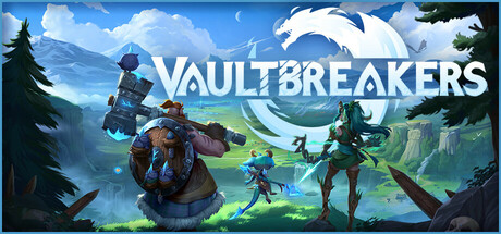
Vaultbreakers is a top-down Extraction RPG where you go on PvE or PvPvE adventures. Build your haven, loot ancient artifacts that shape your playstyle, and explore a vast, corrupted world, alone or with friends. Use preparation, knowledge, and skills to clear your path to the Dragonvault.

Extraction ShooterLooter ShooterLoot
BetaDwarfTo be announced

Vaultbreakers scores 63/100 — better than 6% of Steam capsules we've analysed (n=22,658).

Released To be announced · By BetaDwarf

Quick text summary

Vaultbreakers scored 63/100 on Steam Analyzer — Solid for a Steam capsule. Top priority fix: [title_readability] Replace 'FAE' with the correct game title 'Vaultbreakers' using a similarly bold, high-contrast logo treatment to ensure players can identify the product on the store.

Capsule scores by dimension

  • Genre Clarity: 6/10 — Action RPG implied, genre mixed. The two stylized characters wielding melee weapons (a large scythe-like blade and a glowing axe) suggest an action RPG or brawler, but the top-down extraction RPG nature is not communicated at all. The dark corrupted fantasy setting with purple and teal tones hints at a dark fantasy genre, but nothing implies the extraction or multiplayer loop. At tiny size, you can tell it's a fantasy action game but subgenre remains ambiguous.
  • Title Readability: 7/10 — FAE reads well, but misleading. The title 'FAE' is large, bold, and uses clean white letterforms with a geometric colored triangle emblem as the 'A', making it readable at small size. However, the title shown is 'FAE' and not 'Vaultbreakers', which creates a brand disconnect — this appears to be an older or alternate branding. At tiny size, 'FAE' is still legible due to its high contrast white letters against the dark background, but the mismatch with the game's actual title is a significant concern.
  • Contrast & Color: 7/10 — Strong neon accents aid separation. The bright green glowing blade on the left character creates a strong focal highlight against the dark teal and purple background, and the blue glowing axe adds secondary contrast. The overall dark palette with selective neon lighting separates well from Steam's #1b2838 background. In grayscale, the left character's weapon and the white title maintain clear edges, though the right character merges somewhat with the mid-dark background at tiny size.
  • Uniqueness & Polish: 6/10 — Polished but genre-standard fantasy. The art quality is competent and the character rendering has a stylized MOBA-like quality reminiscent of League of Legends champion art, which feels professional but not particularly distinctive within the crowded dark fantasy RPG space. The geometric logo emblem is a nice touch and adds some brand identity, but the overall composition doesn't communicate a unique selling point like the extraction mechanic or the haven-building loop. Against top-tier benchmarks like Baldur's Gate 3 or Metaphor: ReFantazio, it reads as solid but generic.
  • Brand Consistency: 5/10 — Logo-character style cohesive but mismatched title. The teal, purple, and dark green palette is consistent between the two characters and background environment, giving a coherent art direction internally. The geometric triangle logo emblem is a recognizable identity cue that could anchor future brand recognition. However, displaying 'FAE' instead of 'Vaultbreakers' critically undermines brand consistency for this product, as players cannot associate this visual identity with the correct game title.
  • Composition: 7/10 — Clear hierarchy with dual character focus. The large dominant character on the left with the glowing green weapon anchors the composition well, while the smaller character on the right adds depth and scale contrast. The title 'FAE' is positioned in the upper center-right with breathing room and sits on a relatively controlled dark background area. At small size, the left character's silhouette and glowing weapon remain the primary focal point, though at tiny size the right character blends into the background and the composition feels slightly crowded near the center.

What works

  • Neon weapon contrast. The bright green glowing scythe blade creates an immediate focal point that survives compression to tiny thumbnail sizes.
  • Readable title at small size. The large white 'FAE' lettering with clean spacing remains legible even at 120x45 thumbnail dimensions.
  • Stylized character art quality. Both characters have a polished MOBA-inspired rendering style that communicates production value quickly.
  • Coherent dark fantasy palette. The teal, purple, and dark green color scheme is internally consistent and separates well from Steam's dark background.

What hurts the capsule

  • Title mismatch with game name. The capsule displays 'FAE' rather than 'Vaultbreakers', making it impossible for players to associate the visual with the correct product on the store.
  • No extraction RPG genre cues. Nothing in the image communicates the extraction loop, top-down perspective, or multiplayer nature that differentiates Vaultbreakers from generic fantasy action games.
  • Right character loses detail at tiny size. The smaller white-haired character in the lower right blends into the mid-dark background at 120x45, weakening the dual-character storytelling.
  • Generic fantasy composition. Two characters posing with weapons against a dark fantasy background is one of the most common capsule layouts in the genre, reducing memorability against top competitors.

Priority fixes

  1. [title_readability] Replace 'FAE' with the correct game title 'Vaultbreakers' using a similarly bold, high-contrast logo treatment to ensure players can identify the product on the store.
  2. [genre_clarity] Add a visual cue communicating the extraction or top-down RPG nature, such as a vault door, loot artifact glow, or environmental map element visible in the background.
  3. [uniqueness_polish] Introduce a distinctive compositional hook tied to a core mechanic, such as a glowing artifact being extracted or a stylized corrupted world environment, to differentiate from generic dark fantasy capsules.
  4. [contrast_color] Increase rim lighting or separation on the right character to prevent them from merging with the background at small and tiny sizes.

Store copy priority fixes

  1. [hook_strength] Move the playtest signup to a separate section below the main game description and replace the opening with a single, punchy sentence that leads with the core gameplay loop: 'Hunt cursed artifacts, escape with your loot, and build your haven—alone or with friends in a world that shifts with every player action.'
  2. [feature_communication] Add a bulleted list of core features after the 'About the Game' section (e.g., Tactical top-down combat, Haven building & upgrades, Dynamic events based on player choices, PvE/PvPvE hybrid progression) to ensure skimmers grasp the scope immediately.
  3. [uniqueness] Clarify what sets Vaultbreakers apart: 'Unlike pure extraction shooters, every mission's map evolves based on player actions, meaning shared world consequences affect your individual run' or a similar statement that articulates a specific mechanical advantage.
  4. [tone_match] Reduce lore exposition in the opening 3 paragraphs and frontload the player agency and tactical decision-making; the tone currently reads like a fantasy novel rather than an action RPG where the player is the protagonist.

Related guides

Steam app ID: 306910