Scoring genre clarity...
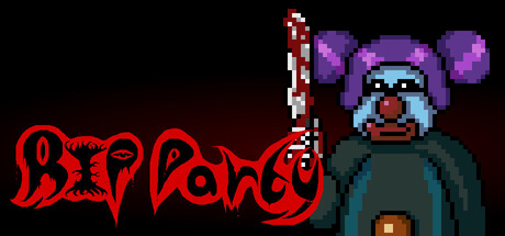
RIP Party capsule

RIP Party

Throw a party at a maniac's mansion. RIP Party is a single player slasher horror game inspired by 80s & 90s horror movies where you and the NPCs are being hunted. Try and survive the micro sandbox experience.

$1.001 user reviews
HorrorMinimalistDark
RewdanSpritesOct 30, 2025

RIP Party scores 65/100 — better than 14% of Horror capsules (n=3,118).

1 user reviews · $1.00 · Released Oct 30, 2025 · By RewdanSprites

Quick text summary

RIP Party scored 65/100 on Steam Analyzer — Solid for a Horror capsule. Top priority fix: [title_readability] Simplify dripping letterforms or add a solid outline to maintain legibility when scaled below 120px width; test readability at exact TINY dimensions.

Capsule scores by dimension

  • Genre Clarity: 7/10 — Horror theme clear, genre readable. The pixel-art antagonist with exaggerated features and menacing posture, combined with the red dripping title treatment, immediately signals horror. At TINY size, the character silhouette and blood-red typography are recognizable as horror-adjacent, though the comedic art style adds ambiguity about tone. The slasher subgenre intent is visible but softened by the cartoony pixel aesthetic.
  • Title Readability: 6/10 — Title readable full, weakens tiny. The red dripping logotype is distinctive and reads clearly at full header size with strong value contrast against the dark background. However, at TINY size (120x45), the decorative dripping letterforms lose definition and the text begins to blur into a general red smear, making individual letters difficult to parse reliably. The stylistic choice serves brand identity but sacrifices some legibility at smallest sizes.
  • Contrast & Color: 7/10 — Strong red-dark separation. The bright red title and character elements pop distinctly against the nearly-black background (#1b2838), creating clear silhouette separation in grayscale tests. The purple and teal accents on the character provide secondary visual interest. The overall value contrast is competent and ensures visibility at SMALL size, though the character's dark clothing blends slightly into the background shadow.
  • Uniqueness & Polish: 6/10 — Stylish but generic horror setup. The pixel-art antagonist and dripping blood typography show intentional craft and thematic coherence, but the 'maniac in mansion' concept and retro pixel style are familiar tropes in indie horror marketing. The execution is polished and the character design has personality, yet the overall composition lacks a distinctive hook that communicates the specific 'micro sandbox party survival' mechanic that differentiates RIP Party from standard slashers.
  • Brand Consistency: 6/10 — Consistent pixel style, weak identity. The capsule maintains coherent pixel-art rendering and a unified red-dark-purple color palette that would carry across marketing materials. However, there are no iconic motifs, recognizable character variants, or signature visual elements that would make RIP Party immediately identifiable in a grid of similar horror games. The style is consistent but generic within the retro indie horror space.
  • Composition: 7/10 — Clear focal point, safe layout. The character anchors the right side as a clear primary subject, while the red title balances the left, creating a stable asymmetrical layout with effective depth layering (background darkness, midground character, foreground title). At SMALL and TINY sizes, the composition remains readable with no critical cropping issues. The black void on the left provides breathing room but risks feeling slightly unbalanced in scrolling context where the right-aligned character may edge toward crop zones.

What works

  • Strong color contrast against Steam dark background. Bright red and teal elements create immediate visual pop and maintain silhouette clarity in grayscale.
  • Thematic pixel-art execution. Character design and dripping blood typography coherently communicate horror tone with intentional craft.
  • Asymmetrical composition avoids dead space. Character and title placement creates visual balance with clear focal hierarchy at full and small sizes.

What hurts the capsule

  • Title loses definition at TINY size. Decorative dripping letterforms blur into illegible smear when scaled below small capsule (120x45 pixels).
  • Generic horror trope without unique mechanic visibility. The 'maniac with axe' setup is familiar; nothing visually communicates the distinctive 'micro sandbox party survival' gameplay hook.
  • Character clothing blends into shadow background. The antagonist's dark torso lacks sufficient separation from the near-black background in value tests.
  • No recognizable brand identity motifs. Capsule relies on generic pixel-horror aesthetic with no iconic symbols or character variants that would enable later recognition.

Priority fixes

  1. [title_readability] Simplify dripping letterforms or add a solid outline to maintain legibility when scaled below 120px width; test readability at exact TINY dimensions.
  2. [uniqueness_polish] Add a visual element that hints at the party/mansion survival mechanic—consider party decorations, multiple characters, or a signature environmental detail that differentiates from standard slasher tropes.
  3. [contrast_color] Brighten or outline the character's torso and dark clothing to increase silhouette separation from the black background, especially at SMALL size.
  4. [brand_consistency] Develop a signature palette element or iconic character variant that would be recognizable in a grid of similar indie horror games.

Store copy priority fixes

  1. [feature_communication] Define 'micro sandbox' explicitly in the first paragraph—e.g., 'a small multi-room mansion you must navigate and escape' or clarify session length expectations.
  2. [feature_communication] Expand the 'Survive the mansion' and 'Help them or help yourself' sections with one concrete example each of how NPC interaction or choice actually plays out in a scenario.
  3. [hook_strength] Rewrite the opening of the detailed description to lead with the moment-to-moment tension—e.g., 'A killer stalks you through a mansion full of strangers. Every decision—share supplies, trade, betray—could save or doom you.' before pivoting to genre inspiration.
  4. [uniqueness] Add a sentence clarifying what makes this sandbox different from other slasher games—e.g., 'Unlike traditional linear horror, your allies' choices and survival directly impact your escape routes' or spotlight the randomization impact.

Related guides

Steam app ID: 3069360 · Tags: Horror, Minimalist, Dark, Atmospheric, Top-Down