Scoring genre clarity...

MIGHTREYA capsule

MIGHTREYA

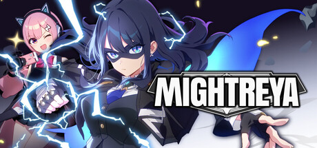
Join schoolgirl superhero Reya and her manager Nio as they embark on their journey as Hero Content Creators, fighting monstrous beings that emerge daily from a dimension beyond. Anime-inspired, heart-pounding hero action is waiting for you!

ActionCharacter Action GameSpectacle fighter
WazenTo be announced

MIGHTREYA scores 72/100 — better than 44% of Steam capsules we've analysed (n=22,658).

Released To be announced · By Wazen

Quick text summary

MIGHTREYA scored 72/100 on Steam Analyzer — Good for a Steam capsule. Top priority fix: [contrast_color] Add a stronger rim light or glow outline around the foreground character's dark outfit to improve silhouette separation against the dark background at tiny size.

Capsule scores by dimension

  • Genre Clarity: 8/10 — Anime action hero clear. The two anime-style female characters in dynamic combat poses with visible lightning effects and a dramatic dark background clearly communicate anime action. The schoolgirl-superhero aesthetic with electric arcs and aggressive stances signals fast-paced hero action. At tiny size the lightning and character silhouettes still read as action-combat, though the schoolgirl-superhero nuance is lost.
  • Title Readability: 8/10 — Bold logo reads well. The MIGHTREYA logo uses a heavy, bold italic sans-serif with a dark outline and shadow, placed in the lower-right quadrant against a relatively controlled background area. At full size it reads cleanly and the letterforms are well-spaced. At tiny size the word remains readable as a single block unit due to its strong weight, though finer letterform details compress.
  • Contrast & Color: 7/10 — Bright blue pops well. The electric blue lightning effects and light-toned foreground character create decent separation against the dark navy-to-black background, which works well on Steam's dark UI. The pink secondary character on the left provides additional color contrast. In grayscale the foreground character's silhouette partially merges with mid-tone background elements, slightly reducing edge clarity at tiny size.
  • Uniqueness & Polish: 6/10 — Polished but genre-typical. The art quality is solid with clean line art, dynamic lighting, and well-rendered characters, but the overall composition closely follows the standard anime action capsule formula seen across many similar titles. There is no single distinctive visual hook or unique storytelling element that separates it from the crowded anime action space. It is competent and attractive but unlikely to stand out in a genre browse row.
  • Brand Consistency: 7/10 — Strong character identity signals. The two clearly distinct characters, Reya in dark outfit with electric powers and the smaller pink-haired Nio, form a recognizable duo that serves as a brand identity anchor. The consistent anime rendering style, electric blue accent color, and dark-contrast palette create internal cohesion. The bold italic logo style matches the energetic tone of the visuals, reinforcing a coherent visual identity.
  • Composition: 7/10 — Clear hierarchy with minor crowding. The large foreground character dominates the right-center as the clear primary focal point, with the secondary pink character on the upper-left providing depth and scale. The logo sits bottom-right without clashing with either character. At small size the dual-character layout reads well, but the two characters compete slightly for attention and the upper-left character risks feeling cropped or secondary to the point of confusion at tiny size.

What works

  • Electric action clarity. The blue lightning arcs and dynamic character poses instantly communicate fast-paced action even at small sizes.
  • Strong logo weight. The heavy bold italic MIGHTREYA lettering holds together at tiny size due to its substantial stroke width and outline.
  • Recognizable character duo. The contrasting dark and pink character pair creates a memorable brand anchor that can build recognition across assets.
  • Dark background synergy. The dark navy-to-black background integrates naturally with Steam's #1b2838 UI, preventing harsh edge cutoff.

What hurts the capsule

  • Genre formula adherence. The composition closely mirrors dozens of other anime action capsules, offering no distinctive visual hook to separate it in a browse row.
  • Grayscale silhouette blending. The foreground character's dark outfit partially merges with the dark background in grayscale, reducing pop at tiny size.
  • Secondary character readability at tiny. The pink left character loses clear definition at tiny size and may read as background decoration rather than a key story element.
  • No genre subtext beyond anime action. The hero-content-creator narrative hook that differentiates the game is entirely absent from the capsule's visual language.

Priority fixes

  1. [contrast_color] Add a stronger rim light or glow outline around the foreground character's dark outfit to improve silhouette separation against the dark background at tiny size.
  2. [uniqueness_polish] Introduce a subtle visual reference to the hero content-creator concept, such as a stylized camera icon or social-media motif, to differentiate from generic anime action capsules.
  3. [composition] Slightly increase the size or brightness of the secondary pink character to ensure she reads as an intentional duo partner rather than background decoration at small size.
  4. [genre_clarity] Strengthen the electric effect color saturation so the genre action cue survives compression at the smallest Steam thumbnail sizes.

Store copy priority fixes

  1. [uniqueness] Rewrite the combat paragraph to highlight what makes MIGHTREYA's combat distinct—e.g., 'hero streamer abilities let you [specific mechanic]' or a unique systems explanation that differentiates it from standard action games.
  2. [feature_communication] Add a sentence about progression, unlockables, or how weapons/attacks evolve, so players understand long-term engagement and replayability beyond stage count.
  3. [audience_targeting] Insert a clear signal early in the detailed description about whether this is more for combo-focused hardcore players or story-driven casual fans—e.g., 'Master frame-perfect timing for true combatants, or enjoy the story on casual difficulty.'
  4. [hook_strength] Lead the short description with a gameplay verb (e.g., 'Master aerial superhero combat as Reya') before introducing the content creator angle to prioritize action over narrative hook.

Related guides

Steam app ID: 3077640