Saihate Station scores 63/100 — better than 9% of Psychological Horror capsules (n=2,166).

Quick text summary

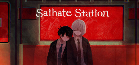
Saihate Station scored 63/100 on Steam Analyzer — Solid for a Psychological Horror capsule. Top priority fix: [contrast_color] Adjust character clothing to cooler or lighter tones (purple, grey, or cream) to create stronger silhouette separation from the red background, improving readability at tiny size.

Capsule scores by dimension

  • Genre Clarity: 5/10 — Ambiguous genre signals. The capsule shows two characters in formal attire inside what appears to be a transit station, which suggests narrative adventure or visual novel, but the exploration/horror elements are not visually communicated. The neon red signage and dark atmosphere hint at mystery but could equally imply noir drama, character-driven narrative, or psychological thriller rather than clearly reading as adventure-exploration or horror at tiny size.
  • Title Readability: 7/10 — Clear serif title, minor size loss. The title 'Saihate Station' is rendered in clean white serif font at full header size with excellent contrast against the red background. However, at tiny size (120x45), the letterforms blur slightly and serif details collapse, reducing legibility to readable but not crisp. The title placement center-top follows conventions well and avoids noisy background regions.
  • Contrast & Color: 7/10 — Strong red-white contrast, muted subjects. The bright red background with white title text creates strong value separation against the dark Steam background (#1b2838), making the header area pop effectively. The two characters in the foreground use dark clothing (maroon/burgundy tones) that blend somewhat into the mid-red background, reducing figure-ground separation; the silhouettes read better at small size than full size due to simplified shapes, but detail is lost.
  • Uniqueness & Polish: 6/10 — Competent but generic visual treatment. The capsule presents a clean composition with professional rendering and atmospheric lighting, but the aesthetic falls into common indie narrative game territory without a distinctive visual hook. Two figures in formal wear at a station is thematically appropriate but visually generic; there's no signature art style, unique color palette, or memorable motif that separates this from dozens of other character-driven indie games.
  • Brand Consistency: 6/10 — Coherent internal style, no strong identity. The rendering, lighting, and color palette are internally consistent with a muted, melancholic aesthetic appropriate to the premise. However, there are no iconic character features, symbolic motifs, or distinctive palette elements that would make this capsule immediately recognizable as belonging to Saihate Station specifically; the visual identity could apply to many similar games.
  • Composition: 7/10 — Clear hierarchy, balanced layout. The focal point is the two figures in the center-bottom, with the glowing red 'Saihate Station' sign anchoring the top third, creating a natural vertical hierarchy. The composition has good depth layering (background station elements, mid-ground characters, foreground signage) and avoids dead center voids. At small and tiny sizes, the characters remain the primary subject, though finer background details fade appropriately; the layout holds together across sizes with no dangerous edge crop violations.

What works

  • Title contrast and placement. White serif text on bright red background achieves excellent value separation against the dark Steam background and sits safely away from edges.
  • Composition hierarchy and depth. Clear focal point on the two characters with supporting neon signage creates natural visual layers that read effectively even at tiny size.
  • Atmospheric coherence. The muted color palette, lighting treatment, and setting are internally consistent and appropriate to a psychological adventure narrative.

What hurts the capsule

  • Character-background color blending. The dark burgundy clothing of the figures blends into the red background, reducing silhouette clarity and separation at all sizes.
  • Genre confusion at small sizes. The visual language reads more as character drama or visual novel than adventure or horror, potentially misleading players about gameplay expectations.
  • Generic visual identity. No distinctive art style, color palette shift, or iconic visual motif differentiates this from dozens of similar indie narrative games.

Priority fixes

  1. [contrast_color] Adjust character clothing to cooler or lighter tones (purple, grey, or cream) to create stronger silhouette separation from the red background, improving readability at tiny size.
  2. [genre_clarity] Add subtle environmental or UI cues that signal exploration or horror elements—consider dim pathway lighting, distorted station signs, or environmental storytelling details that hint at the core mechanic.
  3. [uniqueness_polish] Develop a signature visual element such as a distinctive color accent, character design detail, or symbolic motif unique to Saihate Station that could anchor brand identity across all marketing materials.

Store copy priority fixes

  1. [feature_communication] Expand the dependency mechanic explanation: add 'Your choices in dialogue and actions determine Haru's emotional dependency on Shion, unlocking different story paths and endings based on the relationship you build' to clarify player agency.
  2. [uniqueness] Replace one 'twist' tease with a concrete differentiator: 'The story challenges players to sympathize with morally ambiguous characters and broken bonds—not a redemption arc, but a reconstruction of codependency' to show what makes this distinct.
  3. [feature_communication] Add one example to puzzles: 'Solve environmental puzzles together while uncovering Saihate Station's secrets' to help players visualize the core loop.
  4. [hook_strength] Consider a punchier short description lead: 'Two estranged coworkers wake up trapped in a surreal station. To escape, they must rebuild a friendship fractured by jealousy and inferiority—but the station has its own truth to reveal.' This frontloads emotional stakes and mystery simultaneously.

Related guides

Steam app ID: 3079280 · Tags: Psychological Horror, Visual Novel, LGBTQ+, Horror, 2D