Scoring genre clarity...

Time for Bed capsule

Time for Bed

It’s all over if mom catches you playing video games past bedtime. Pretend to sleep through this nightmare, avoid mother’s surveillance, and complete the game at hand.【Genre: First-person horror stealth game】

$4.99Very Positive(76)
HorrorStealthSingleplayer
NERDY PENGUINJul 11, 2025

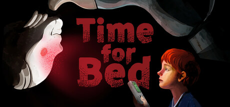
Time for Bed scores 68/100 — better than 23% of Horror capsules (n=3,119).

Very Positive (76 reviews) · $4.99 · Released Jul 11, 2025 · By NERDY PENGUIN

Quick text summary

Time for Bed scored 68/100 on Steam Analyzer — Solid for a Horror capsule. Top priority fix: [uniqueness_polish] Add a distinctive visual signature—consider a unique UI element (e.g., a stylized 'sleep meter,' controller outline, or surveillance camera icon) that reinforces the stealth-pretend-to-sleep mechanic and differentiates from generic horror.

Capsule scores by dimension

  • Genre Clarity: 7/10 — Horror stealth implied but unclear. The red texturing, silhouetted figure on right, and anxious pose suggest tension and fear, which aligns with horror stealth. However, at TINY size the genre reads more as generic suspense than specifically first-person stealth gameplay. The mom figure and bedroom setting communicate the bedtime premise clearly, but lack iconic stealth or horror UI cues that would nail the subgenre immediately.
  • Title Readability: 7/10 — Clear at full, readable at small. The title 'Time for Bed' uses a bold serif or slab font with good size hierarchy and red-on-dark contrast that holds at SMALL size reasonably well. At TINY size the letters compress but remain distinguishable due to the red saturation against the black background. Placement is center-right with clear separation from character elements, avoiding overlap.
  • Contrast & Color: 8/10 — Strong red focus, clean silhouettes. The red text and glowing red accents (mother's face, hand glow) create excellent value separation from the #1b2838 background. The silhouetted boy figure on the right maintains clear edge definition even at TINY size due to light rim and distinct dark outline. Red saturation is controlled enough to avoid muddy mid-tones while still popping in quick scroll.
  • Uniqueness & Polish: 6/10 — Competent premise, generic execution. The 'caught by mom' concept is memorable and distinct from typical horror fare, and the illustrated character on the right shows decent craft. However, the overall composition feels like a straightforward scene illustration rather than a compelling visual hook—the red glow and dark background are standard horror tropes without a distinctive visual signature or mechanic cue that screams premium polish.
  • Brand Consistency: 6/10 — No memorable identity cues yet. The capsule lacks a strong recurring visual identity or iconic character motif that could be recognized across store pages. The illustrated mom silhouette and boy are well-rendered but generic character archetypes. There are no distinctive symbols, logos, or palette signatures that signal 'Time for Bed' specifically and would help players recognize it on repeat visits.
  • Composition: 7/10 — Clear focal point, good balance. The boy figure anchors the right side and draws primary focus; the red title occupies center-left with balanced spacing; the mom silhouette at top-left provides context without competing for attention. At SMALL and TINY sizes the hierarchy remains clear. Safe margins are respected around edges, though the title could sit slightly lower to ensure zero risk of Steam crop interference on very short viewports.

What works

  • Strong red contrast. Red text and glowing accents stand out decisively against the dark background at all viewing sizes, ensuring immediate visual pop in quick-scroll scenarios.
  • Thematic clarity. The bedtime-caught premise is immediately recognizable and distinctive, setting clear narrative expectations for a unique horror stealth angle.
  • Clean composition hierarchy. Characters and title are spatially balanced with clear focal point on the boy; no scattered attention or dead center voids disrupt the read.

What hurts the capsule

  • Generic visual execution. Despite the unique premise, the capsule relies on stock horror atmosphere (red glow, dark background) without a distinctive visual signature or gameplay mechanic cue.
  • No brand identity symbols. Lacks an iconic character, repeating motif, or signature palette that would allow players to recognize this game on subsequent Steam browsing.
  • Stealth gameplay unclear. While the setting and mood suggest horror, first-person stealth mechanics are not visually communicated through UI hints, tools, or camera perspective cues.

Priority fixes

  1. [uniqueness_polish] Add a distinctive visual signature—consider a unique UI element (e.g., a stylized 'sleep meter,' controller outline, or surveillance camera icon) that reinforces the stealth-pretend-to-sleep mechanic and differentiates from generic horror.
  2. [brand_consistency] Introduce a recurring character design or visual motif (stylized mom face, signature color accent, or iconic object) that feels memorable and could serve as a brand identifier across store pages.
  3. [genre_clarity] Layer in subtle stealth or surveillance cues—a faint camera lens, controller silhouette, or first-person perspective hint—to nail first-person stealth subgenre clarity at TINY size.

Store copy priority fixes

  1. [audience_targeting] Add a sentence explicitly welcoming stealth-horror fans and players new to the nostalgia era, e.g., 'Whether you lived this fear or love stealth games with a twist...'
  2. [feature_communication] Specify the number and variety of handheld games, expected playtime, or progression structure to help players understand scope and replayability.
  3. [uniqueness] Strengthen differentiation by adding a specific comparison or mechanic detail, e.g., 'manage dual threats: mother's unpredictable patrol pattern and your own rising anxiety levels.'

Related guides

Steam app ID: 3090570 · Tags: Horror, Stealth, Singleplayer, First-Person, Simulation