Scoring genre clarity...

Locked In capsule

Locked In

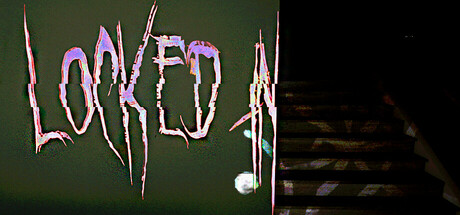
Locked in, your only option is to search for an escape. Alone and afraid, you must wander the same dark halls, searching for a clue. But are they really the same? Expect the unexpected in this unique psychological thriller. Can you expose the truth before the darkness consumes you?

$5.995 user reviews
HorrorExplorationPsychological Horror
Gerch InteractiveOct 20, 2025

Locked In scores 65/100 — better than 14% of Horror capsules (n=3,119).

5 user reviews · $5.99 · Released Oct 20, 2025 · By Gerch Interactive

Quick text summary

Locked In scored 65/100 on Steam Analyzer — Solid for a Horror capsule. Top priority fix: [composition] Add thematic supporting visuals (fractured walls, shadow figures, or architectural elements) to the right side to balance composition and enhance narrative clarity without sacrificing mood.

Capsule scores by dimension

  • Genre Clarity: 7/10 — Psychological thriller evident but subtle. The cracked, distorted pink/purple text on dark green background communicates unease and psychological distress effectively. At TINY size, the fragmented letterforms still read as disturbing text rather than gameplay clarity, which partially works for a thriller but doesn't clearly signal 'escape room' or 'indie puzzle' mechanics. The visual mood succeeds but genre specificity (why escape-focused?) remains unclear from visuals alone.
  • Title Readability: 6/10 — Readable but aesthetically compromised clarity. The title 'LOCKED IN' is present and can be decoded at full size, but the cracked, shattered letterform treatment sacrifices legibility for mood. At SMALL size the text remains mostly readable due to the pink/purple outline against dark background, but at TINY size the broken segments risk collapsing into illegible noise. The artistic choice is intentional but borders on sacrificing functional clarity.
  • Contrast & Color: 7/10 — Strong value separation with atmospheric effect. The bright pink/purple fractured text pops distinctly against the dark green-to-black gradient background, creating solid value contrast that reads at small sizes. The right side shadow transition into pure black adds depth and maintains silhouette clarity. In grayscale, the light letters against dark midground still separate well, though the effect relies heavily on saturation rather than pure value differentiation.
  • Uniqueness & Polish: 7/10 — Distinctive broken aesthetic with creative risk. The shattered, cracked text treatment is visually striking and intentional, positioning the game as psychologically unusual rather than generic. The choice to distort the title for mood shows creative direction and polish, though the execution feels more art-driven than gameplay-revealing. This stands out among typical indie thriller capsules, but the approach prioritizes atmosphere over clarity—a deliberate trade-off that works thematically.
  • Brand Consistency: 6/10 — Coherent mood but limited identity markers. The cracked text aesthetic and dark green-to-black palette create internal cohesion and reinforce the psychological thriller mood consistently. However, there are no recognizable character, icon, or signature motif that would make this capsule identifiable in a crowded store shelf. The visual language is consistent with itself but not distinctly 'Locked In' branded without the title visible.
  • Composition: 6/10 — Unbalanced with empty negative space. The title sits in the left-center area with a large empty dark void on the right side, creating an unbalanced layout that doesn't leverage the full canvas. At SMALL and TINY sizes, the right half becomes wasted real estate that could hold supporting imagery or thematic elements. The focal point (title) is clear but the overall composition feels incomplete and lacks layered depth or supporting visual storytelling.

What works

  • Atmospheric mood alignment. The cracked, fractured aesthetic directly communicates psychological distress and unease, perfectly matching the game's thriller narrative premise.
  • Strong color contrast readability. Pink/purple title against dark background maintains clear separation at all sizes, ensuring the logo remains visible even at TINY thumbnail scale.
  • Intentional artistic direction. The broken letterform treatment shows creative risk and Polish, distinguishing it from generic indie thriller capsules through deliberate visual choice.

What hurts the capsule

  • Excessive empty space on right. Nearly 50% of the canvas sits as unused dark void, creating a lopsided composition that feels incomplete and wastes prime real estate.
  • Genre clarity sacrificed for mood. The visuals communicate 'unsettling' but don't clearly signal 'escape game' or core gameplay loop, making the game type ambiguous at first glance.
  • No supporting visual hierarchy. The title exists in isolation with no secondary elements, supporting imagery, or depth layering to guide the eye or enhance storytelling.
  • Legibility risk at TINY size. The cracked letterforms may fragment into noise at thumbnail scale, where the aesthetic compromise becomes harder to parse under quick-scroll conditions.

Priority fixes

  1. [composition] Add thematic supporting visuals (fractured walls, shadow figures, or architectural elements) to the right side to balance composition and enhance narrative clarity without sacrificing mood.
  2. [genre_clarity] Incorporate subtle gameplay-specific visual cue (locked door silhouette, key element, or prison motif) integrated into the cracked text or background to signal escape-game genre.
  3. [title_readability] Test the cracked title at actual TINY (120x45) size and consider reinforcing letter structure with a thicker outline or internal contrast to ensure segments don't collapse into illegibility.
  4. [brand_consistency] Develop a signature brand icon or motif (distinctive lock design, recurring symbol) that can anchor the identity and remain recognizable across store assets.

Store copy priority fixes

  1. [uniqueness] Replace 'unique psychological thriller' with a concrete unique mechanic, e.g., 'Each loop, the house reconfigures—solve new puzzles to break a curse that reshapes the space itself' to differentiate from generic time-loop games.
  2. [feature_communication] Expand the feature section with player action verbs: 'Intricate Puzzles: Decipher cryptic clues and manipulate the environment to unlock new rooms' instead of generic descriptor.
  3. [audience_targeting] Add a sentence clarifying intended player type: 'Perfect for horror fans who enjoy methodical puzzle-solving and atmospheric dread over jump-scares' to align with the single-player focus.
  4. [hook_strength] Strengthen the short description's final hook by specifying what 'the truth' is: 'Expose the ghost's haunting reason—or become part of the house forever' adds concrete stakes.

Related guides

Steam app ID: 3098380 · Tags: Horror, Exploration, Psychological Horror, Puzzle Platformer, Mystery Dungeon