Scoring genre clarity...

Black Jacket capsule

Black Jacket

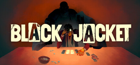
Gamble your way out of hell in this blackjack-inspired rogue-lite deckbuilder. Play powerful card combos or cheat to outwit your opponents and earn your freedom. Win their Soul coins! Bribe the ferryman! And uncover the story of those who stand in your way.

$11.24Very Positive(277)
Card GameRoguelike DeckbuilderRoguelike
Mi'pu'mi Games GmbHMay 12, 2026

Black Jacket scores 75/100 — better than 68% of Steam capsules we've analysed (n=22,658).

Very Positive (277 reviews) · $11.24 · Released May 12, 2026 · By Mi'pu'mi Games GmbH

Quick text summary

Black Jacket scored 75/100 on Steam Analyzer — Good for a Steam capsule. Top priority fix: [contrast_color] Increase value separation between the shadowy background antagonist and the dark upper zone by adding a subtle rim light or glow effect so the silhouette reads clearly at tiny size.

Capsule scores by dimension

  • Genre Clarity: 7/10 — Card game underworld theme clear. The cards on the table and the tense confrontation scene immediately suggest a card game or gambling mechanic. The dark, hellish orange-red atmosphere paired with a looming shadowy figure hints at rogue-lite or underworld stakes. At tiny size the cards remain visible enough to suggest the card/gambling genre, though the rogue-lite deckbuilder nuance is lost.
  • Title Readability: 8/10 — Bold distressed title reads well. The large, bold distressed font for BLACK JACKET dominates the upper portion of the image with strong white letterforms against the warm dark background. The 'O' replaced by an eye/card motif is a clever detail that works at full size. At tiny size the title still reads as two clear words, though the decorative eye element in the 'O' collapses and the distressed texture softens.
  • Contrast & Color: 7/10 — Warm orange against dark background pops. The warm orange-red lighting creates strong separation against Steam's dark #1b2838 background, and the bright white title text has excellent contrast. The central character in lighter tones sits against a darker midground figure, creating reasonable silhouette separation. In grayscale the background figure blends somewhat into the dark upper area, but the overall composition still reads with sufficient value contrast at small sizes.
  • Uniqueness & Polish: 8/10 — Stylish underworld gambling scene. The painterly illustration style with the looming dark silhouette over a smaller, vulnerable card player is a memorable and evocative composition that goes beyond generic card game imagery. The distressed title treatment and the moody hellish atmosphere feel cohesive and premium compared to typical indie card game capsules. Compared to benchmarks like Balatro or Buckshot Roulette, this has strong visual storytelling that communicates tension and stakes without feeling derivative.
  • Brand Consistency: 8/10 — Cohesive dark underworld identity. The warm desaturated orange palette, painterly art style, and underworld aesthetic create a recognizable visual identity that would carry across store assets. The dominant shadowy antagonist figure and the card table setup establish a consistent thematic motif. The distressed typography reinforces the gritty, dangerous tone, making this feel like a unified brand rather than assembled assets.
  • Composition: 7/10 — Strong focal tension, title well placed. The composition uses a clear foreground card table, midground protagonist, and looming background antagonist to create depth and narrative tension. The title sits cleanly at the top in a controlled dark zone above the scene, avoiding conflict with the illustration. At small size the central dramatic interaction between the two figures anchors the image well, though the cards on the table become very small and the compositional weight feels slightly top-heavy due to the large title occupying significant real estate.

What works

  • Evocative tension narrative. The looming dark figure over the smaller card player instantly communicates danger and stakes, creating visual storytelling that matches the rogue-lite underworld theme.
  • Title placement in clean zone. BLACK JACKET is positioned in a controlled dark upper region that avoids the busy illustration, ensuring legibility even at small sizes.
  • Warm palette pops on Steam dark UI. The orange-red atmospheric lighting creates immediate contrast against #1b2838, making the capsule eye-catching during quick scrolling.
  • Painterly art style feels premium. The illustrated style with confident brushwork elevates the capsule above typical low-budget indie card game assets and sits favorably alongside genre benchmarks.

What hurts the capsule

  • Background figure loses detail at tiny size. The large shadowy antagonist merges into the dark upper background at 120x45, reducing the dramatic two-character tension to a muddier silhouette.
  • Card table detail collapses at tiny. The cards and chip dish on the table, which are key genre cues, become indistinct at tiny thumbnail size and may not register as card game imagery.
  • Eye motif in title O is lost small. The clever decorative eye element inside the letter O is a full-size-only detail that disappears completely at small and tiny sizes, wasting a potential identity anchor.
  • Slightly top-heavy composition. The tall title block and upper scene area leave the lower third of the capsule relatively empty, creating mild imbalance that wastes compositional space.

Priority fixes

  1. [contrast_color] Increase value separation between the shadowy background antagonist and the dark upper zone by adding a subtle rim light or glow effect so the silhouette reads clearly at tiny size.
  2. [genre_clarity] Increase the visual prominence of one or two cards on the table, perhaps with a slight brightness boost, so the card game genre cue survives at the 120x45 thumbnail size.
  3. [composition] Tighten the vertical composition slightly by reducing the gap between the title baseline and the top of the figures, filling the lower third with slightly more scene presence.
  4. [title_readability] Consider thickening the title letterforms marginally or adding a very subtle dark shadow beneath to ensure the distressed texture does not erode readability at small sizes on low-contrast displays.

Store copy priority fixes

  1. [feature_communication] Add a paragraph explaining the run structure: Do runs unlock new cards, opponents, or permanent upgrades? How does progression work across failures?
  2. [uniqueness] Strengthen the short description by explicitly contrasting this with traditional deckbuilders: 'Unlike Slay the Spire, your opponent's deck and psychology matter as much as your own.'
  3. [audience_targeting] Add a sentence clarifying difficulty/accessibility: Are runs balanced for casual players or hardcore roguelike veterans seeking mastery?

Related guides

Steam app ID: 3100370