Quantum Witch scores 65/100 — better than 12% of RPG capsules (n=3,544).

Quick text summary

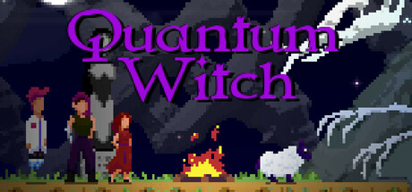
Quantum Witch scored 65/100 on Steam Analyzer — Solid for a RPG capsule. Top priority fix: [title_readability] Replace decorative serif font with a bold sans-serif or stencil-style typeface that maintains legibility at tiny capsule size while retaining visual personality.

Capsule scores by dimension

  • Genre Clarity: 7/10 — Pixel adventure with magic signals. The pixel art style, campfire, robed figures, and magical elements (fire, ethereal shapes) clearly communicate a fantasy adventure game. At tiny size, the silhouettes of characters and the central fire remain readable enough to suggest narrative adventure, though the exact RPG/choice-driven nature is not immediately obvious from visuals alone.
  • Title Readability: 6/10 — Legible but decorative font. The purple 'Quantum Witch' title uses a decorative serif font with moderate contrast against the dark blue background. At full size it reads clearly, but at tiny size the ornate letterforms lose definition and the title compresses into a purple blur that requires prior knowledge to parse. The placement centered top is safe but the font choice sacrifices scalability.
  • Contrast & Color: 7/10 — Strong separation with warm accents. The orange campfire and warm character colors stand out effectively against the cool dark blue night sky, creating clear value separation. The purple title pops against the background. However, the pixel-art characters on the left blend somewhat into the dark background at tiny size, and the grayscale test shows the silhouette contrast could be sharper.
  • Uniqueness & Polish: 6/10 — Competent pixel art, generic scene. The pixel art is cleanly rendered with consistent style and good craft in the character designs and campfire detail. However, the composition—characters gathered around a fire in a fantasy setting—is a fairly common narrative adventure trope that does not communicate a distinctive selling point or core mechanic beyond 'story-driven fantasy game.'
  • Brand Consistency: 6/10 — Coherent art style, no iconic motif. The pixel art style, color palette (purples, warm oranges, cool blues), and character rendering are internally consistent and suggest a cohesive game world. However, there are no memorable iconic symbols, signature character poses, or distinctive visual hooks that would make this capsule immediately recognizable as 'Quantum Witch' on repeat exposure.
  • Composition: 7/10 — Balanced but slightly scattered focus. The composition uses a clear horizon line with foreground characters, midground fire, and background scenery creating depth. The title sits safely in the upper center. However, at tiny size the multiple character figures and scattered elements dilute the focal point—there is no single primary subject commanding attention, which slightly weakens discoverability during quick scroll.

What works

  • Warm color accent effectiveness. The orange campfire and warm character tones create strong visual pop against the cool dark blue background, maintaining contrast even at reduced sizes.
  • Readable pixel art craft. The character designs and environmental details are cleanly rendered with consistent pixel style that holds detail legibility across most viewing sizes.
  • Safe title placement and spacing. The centered purple title avoids edge cropping risks and sits on a relatively clear background region away from cluttered scenery.

What hurts the capsule

  • Decorative font loses definition at tiny size. The ornate serif letterforms compress into an illegible purple blur below small capsule size, requiring prior brand knowledge to identify.
  • Generic fantasy campfire scene. The composition communicates 'narrative adventure' but does not visually signal what makes Quantum Witch distinctive—no unique mechanic, character hook, or visual selling point jumps out.
  • Scattered focal points at tiny size. Multiple character figures and environmental elements compete for attention without a clear primary subject, reducing impact during quick scroll browsing.

Priority fixes

  1. [title_readability] Replace decorative serif font with a bold sans-serif or stencil-style typeface that maintains legibility at tiny capsule size while retaining visual personality.
  2. [genre_clarity] Add a subtle visual element that hints at the choice-driven narrative mechanic or Ren's character prominence—such as a spotlight effect on a central figure or a branching motif—to differentiate from generic fantasy adventure.
  3. [composition] Strengthen focal hierarchy by enlarging or highlighting the protagonist character (Ren) as the clear primary subject, reducing competing silhouettes at small sizes.

Store copy priority fixes

  1. [hook_strength] Rewrite the short description to lead with Ren's immediate conflict (e.g., 'A shepherdess, a vanished flock, and a choice that will reshape worlds') rather than abstract stakes.
  2. [uniqueness] Add 1–2 sentences explaining what makes this game's narrative structure or mechanics distinctive (e.g., how non-linear branching differs from typical choice games, or what Biffo's writing brings that's unique).
  3. [feature_communication] Include estimated playtime or number of endings/routes to help players understand scope and replayability investment.
  4. [audience_targeting] Clarify tone expectations (comedic, dark, or tonal whiplash) and difficulty level to ensure the right players self-select.

Related guides

Steam app ID: 3100650 · Tags: RPG, Atmospheric, 2D, Cartoony, Comedy