Scoring genre clarity...

Cat Cafe Manager 2: Big City Bliss capsule

Cat Cafe Manager 2: Big City Bliss

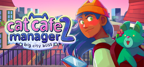
In this cozy management lifesim, care for cute cats & customers while exploring a bustling folkloric city. Build the cat cafe of your dreams and fill hearts with delight using the power of cats, coffee and community 🐱

CatsLife SimExploration
Roost GamesTo be announced

Cat Cafe Manager 2: Big City Bliss scores 72/100 — better than 44% of Steam capsules we've analysed (n=22,658).

Released To be announced · By Roost Games

Quick text summary

Cat Cafe Manager 2: Big City Bliss scored 72/100 on Steam Analyzer — Good for a Steam capsule. Top priority fix: [genre_clarity] Add a subtle visual gameplay cue such as a coffee cup, cat silhouette, or cafe counter element to the foreground to anchor the cafe management mechanic

Capsule scores by dimension

  • Genre Clarity: 7/10 — Cozy sim vibes clear. The cheerful character holding a phone, urban rooftop backdrop with warm pastel tones, and a plush toy companion all strongly suggest a cozy casual sim or life management game. The cafe management aspect is not explicitly visual beyond the character's approachable service-worker energy, but the overall softness and warmth align well with the cozy sim subgenre. At tiny size the pastel palette and cartoon style still read as casual/cozy, though the specific cafe mechanic is not immediately obvious.
  • Title Readability: 7/10 — Title clear at full size. The 'cat cafe manager 2' logo uses a chunky, rounded font with clear cat-ear motifs on the lettering, reading well at full and small sizes. The subtitle 'big city bliss' is noticeably smaller and uses a delicate script-style font that becomes difficult to parse at small size and is essentially unreadable at tiny size. The white lettering on the warm pink-to-blue gradient background holds reasonable contrast but the subtitle risks being a wasted element at small viewing sizes.
  • Contrast & Color: 7/10 — Warm pastels pop on dark. The warm pink and coral gradient sky creates a strong contrast against Steam's dark #1b2838 background, making the capsule pop in a scroll feed. The central character has good value separation with dark hair against the lighter sky, and the green plush toy provides a complementary accent. At tiny size the character silhouette still reads clearly, though the lighter skin tones and the pastel title text slightly reduce crispness in a quick-scroll grayscale mental test.
  • Uniqueness & Polish: 7/10 — Charming but genre-familiar. The illustration style is clean, expressive, and well-crafted with a distinct anime-influenced aesthetic that suits the cozy sim genre well. The cat-ear logo letterforms are a smart branded touch. However, the overall composition of 'cheerful character on a rooftop' is a familiar cozy-sim trope seen in titles like Go-Go Town! and similar games, so it does not strongly differentiate itself from genre peers at a glance.
  • Brand Consistency: 8/10 — Cohesive identity with cat motifs. The palette, character design, and font all feel intentionally unified — the warm pinks, the cat-ear logo embellishments, the plush companion, and the folkloric city backdrop suggest a consistent art direction carried from the first game. The cat motif is woven into the logo itself which is a strong identity anchor. The overall presentation suggests a recognizable sequel brand that fans of the original would immediately connect with.
  • Composition: 7/10 — Character-led with clear hierarchy. The large central character dominates the right two-thirds of the canvas, with the logo occupying the upper-left in a classic Z-pattern read. The rooftop cityscape provides depth without cluttering the midground. At small size the character's face and upper body remain the clear focal point, though the plush toy and background details compress into visual noise. The subtitle text sits low and close to the bottom edge, risking crop loss and adding clutter at small sizes.

What works

  • Warm palette pops on Steam dark background. The coral-pink gradient sky creates immediate contrast against #1b2838, ensuring the capsule stands out in a scroll feed.
  • Cat motif integrated into logo lettering. The cat-ear letterforms in the title are a clever branded touch that reinforce the game's identity without extra visual clutter.
  • Clear expressive character silhouette. The central character's dark hair against the bright sky creates a readable silhouette that holds up even at tiny thumbnail sizes.
  • Cohesive cozy-sim art direction. The rounded illustration style, pastel palette, and plush companion consistently communicate the cozy, casual tone of the game.

What hurts the capsule

  • Subtitle unreadable at small and tiny sizes. The 'big city bliss' subtitle uses a small decorative font that becomes completely illegible below small capsule sizes, wasting valuable branding real estate.
  • Cafe mechanic not visually communicated. Nothing in the image explicitly shows cafe management, cats serving customers, or any gameplay hook that distinguishes it from a generic life-sim or adventure game.
  • Composition is a familiar cozy-sim trope. A smiling character on a rooftop with a city backdrop is a well-worn visual formula in the genre that reduces distinctiveness against competitors like Go-Go Town! or similar titles.
  • Plush toy and background compress into noise. At small and tiny sizes the green plush toy and rooftop details merge into an indistinct background blob that adds clutter without adding clarity.

Priority fixes

  1. [genre_clarity] Add a subtle visual gameplay cue such as a coffee cup, cat silhouette, or cafe counter element to the foreground to anchor the cafe management mechanic
  2. [title_readability] Increase the subtitle 'big city bliss' font size and weight, or remove it entirely for small capsule variants to reduce illegible clutter
  3. [uniqueness_polish] Introduce a more distinctive compositional hook — such as a cat prominently featured alongside or interacting with the character — to better differentiate from generic cozy-sim rivals
  4. [contrast_color] Increase the outline or drop-shadow on the title lettering to improve crispness against the gradient background at small viewing sizes

Store copy priority fixes

  1. [uniqueness] Rewrite the short description to lead with a specific, differentiating mechanic or story element (e.g., 'Possess a magical smartphone and use it to solve a supernatural mystery while building your dream cat cafe') rather than generic adjectives, to clarify what makes this sequel worth playing.
  2. [audience_targeting] Add a sentence specifying the intended playstyle and time commitment (e.g., 'Take your time—there's no pressure or time limits, just pure cozy exploration and cat care at your own pace') to set expectations for casual vs. completionist players.
  3. [hook_strength] Bring the faerie-possession premise and supernatural story hook forward into the short description, as it is more memorable and compelling than 'fill hearts with delight' and better differentiates from other cat-cafe games.

Related guides

Steam app ID: 3109590