Scoring genre clarity...

Deepest Dungeons capsule

Deepest Dungeons

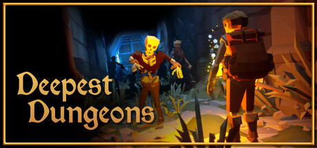
Venture into the ever-shifting labyrinth of Deepest Dungeons, a rogue-like with extraction elements. Explore a maze that changes with each attempt, battle enemies, avoid deadly traps and collect gear. Survive long enough to reach deeper levels, or escape with your belongings and try a new descend.

$5.99Mostly Positive(26)
Dungeon CrawlerRogueliteAction Roguelike
Unmade GamesApr 8, 2025

Deepest Dungeons scores 63/100 — better than 6% of Steam capsules we've analysed (n=22,658).

Mostly Positive (26 reviews) · $5.99 · Released Apr 8, 2025 · By Unmade Games

Quick text summary

Deepest Dungeons scored 63/100 on Steam Analyzer — Solid for a Steam capsule. Top priority fix: [uniqueness_polish] Add a visual cue that communicates the extraction or roguelike mechanic, such as a glowing loot bag, escape rope, or shifting maze motif overlaid on the background, to differentiate from generic dungeon RPG capsules.

Capsule scores by dimension

  • Genre Clarity: 7/10 — Dungeon crawler genre clear. The stone corridor setting, glowing skeleton enemy, and backpack-wearing protagonist clearly communicate a dungeon exploration game. At small size the dungeon environment and enemy silhouette still read reasonably well, hinting at action-RPG or roguelike territory. At tiny size the skeleton's glowing yellow skull remains a recognizable genre cue, though finer details of the characters dissolve.
  • Title Readability: 7/10 — Serif title readable at small size. The golden serif 'Deepest Dungeons' text sits on the lower-left against a relatively dark wall area, giving decent contrast. At small capsule size the two-line stacked layout holds together and the warm gold color pops against the dark stone. At tiny size the letterforms become difficult to fully resolve but the word shape and color still distinguish it as a title rather than decorative text.
  • Contrast & Color: 7/10 — Warm glow separates from dark BG. The warm amber and yellow tones of the glowing skeleton and torchlit corridor contrast well against Steam's dark #1b2838 background, with the bright skull acting as a natural focal light source. The protagonist on the right side is somewhat backlit and merges slightly with the mid-tone stone wall in grayscale. The golden title text pops clearly against the darker left wall region, aiding overall value separation.
  • Uniqueness & Polish: 5/10 — Competent but genre-generic scene. The low-poly stylized art has a pleasant, clean look that reads as intentional rather than asset-flipped, but the composition of 'hero facing skeleton in a corridor' is a very familiar dungeon RPG trope with no distinctive visual hook. Compared to benchmark capsules like Hades II or COCOON that convey a unique visual identity immediately, this feels like a competent but forgettable entry. The polish level is adequate without standing out.
  • Brand Consistency: 6/10 — Cohesive low-poly warm palette. The warm torchlit color palette and low-poly 3D art style form a recognizable internal identity that would likely carry across screenshots. The gold serif title font complements the fantasy dungeon aesthetic without clashing. However, there are no truly iconic motifs, symbols, or character designs memorable enough to anchor brand recognition on their own at small sizes.
  • Composition: 6/10 — Functional layout, crowded midground. The composition places the glowing skeleton roughly in the center-left as the primary focal point, with the protagonist on the right creating depth and narrative tension. The title sits lower-left in a relatively clear zone. At small size the two characters compete for equal visual weight rather than establishing a clear hero-vs-threat hierarchy, and the stone corridor fills the background with mid-tone texture that reduces clarity. The safe margins are respected but the focal depth layering could be stronger.

What works

  • Glowing skeleton focal point. The bright yellow skull creates an immediate point of contrast that draws the eye even at tiny thumbnail size.
  • Warm torchlit atmosphere. The amber corridor lighting effectively establishes a dungeon fantasy mood and separates the image from Steam's dark background.
  • Title placement on dark zone. Positioning 'Deepest Dungeons' over the darker left wall gives the gold serif text solid contrast without competing with the action.
  • Cohesive low-poly art style. The stylized 3D rendering is consistent and clean, lending the capsule a polished indie feel rather than a generic asset look.

What hurts the capsule

  • Generic hero-vs-skeleton trope. The corridor encounter scene is a well-worn dungeon RPG visual cliche that does nothing to communicate the roguelike extraction twist that makes this game unique.
  • Protagonist blends into background. The right-side character is backlit and shares similar mid-tone values with the stone wall, losing silhouette clarity in grayscale and at tiny size.
  • No extraction or roguelike visual cue. Nothing in the image hints at the extraction mechanic or procedural maze element, leaving a key selling point completely invisible to browsing players.
  • Competing character focal points. The skeleton and the protagonist have too similar a visual weight, preventing a single dominant focal point from emerging at small and tiny sizes.

Priority fixes

  1. [uniqueness_polish] Add a visual cue that communicates the extraction or roguelike mechanic, such as a glowing loot bag, escape rope, or shifting maze motif overlaid on the background, to differentiate from generic dungeon RPG capsules.
  2. [contrast_color] Increase the protagonist silhouette separation from the background wall by brightening rim lighting or darkening the stone behind them, ensuring the character reads clearly in grayscale.
  3. [genre_clarity] Introduce a subtle UI or environmental element at mid-ground that hints at the roguelike loop, such as a cracked map, shifting corridor indicator, or item pickup glow, to communicate the game's core loop at a glance.
  4. [composition] Establish a clearer visual hierarchy by making the skeleton the dominant foreground element and reducing the protagonist to a secondary silhouette, creating a stronger single focal point at small and tiny sizes.

Store copy priority fixes

  1. [uniqueness] Expand the extraction mechanic in the short description or first paragraph—explain a specific strategic choice (e.g., 'decide when to leave with your loot before losing it all') that differentiates this from standard roguelikes.
  2. [feature_communication] Add 1–2 sentences about combat feel and gear progression (e.g., 'real-time tactical combat' or 'gear stacks stat bonuses') so players understand moment-to-moment gameplay depth.
  3. [audience_targeting] Include a difficulty or playstyle signal early (e.g., 'designed for players who love high-risk, high-reward dungeon runs' or 'accessible roguelite for new and veteran players') to clarify who this is made for.
  4. [tone_match] Rewrite the narrative framing with a distinct voice or hook—move away from generic 'stolen runes' and give the adventure a personality that reflects the game's actual tone.

Related guides

Steam app ID: 3137960