Scoring genre clarity...

Do No Harm capsule

Do No Harm

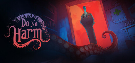
Lovecraftian Doctor Simulator. Diagnose patients by analyzing unsettling symptoms and treat them using your Book of Medicine. Make moral choices — decide who to save or kill, discover whom to trust, and unlock multiple endings! Can you endure 30 days of perilous decisions?

$9.27Mostly Positive(865)
LovecraftianMedical SimStory Rich
Darts GamesMar 6, 2025

Do No Harm scores 73/100 — better than 56% of Steam capsules we've analysed (n=22,658).

Mostly Positive (865 reviews) · $9.27 · Released Mar 6, 2025 · By Darts Games

Quick text summary

Do No Harm scored 73/100 on Steam Analyzer — Good for a Steam capsule. Top priority fix: [genre_clarity] Introduce a subtle medical or diagnostic visual cue (e.g., stethoscope outline, book spine, or medical vial) to differentiate 'doctor simulator' gameplay from generic horror.

Capsule scores by dimension

  • Genre Clarity: 7/10 — Horror simulation with dark mystery. The Lovecraftian aesthetic is communicated through the grotesque tentacle motif, unsettling silhouette in the red window, and ornate decorative typography, establishing a horror-adjacent genre tone. At tiny size, the tentacle and ominous figure remain readable enough to signal 'dark' and 'strange,' though the specific 'doctor simulator' gameplay mechanic is not visually obvious without context. The visual leans more heavily toward Lovecraftian horror than toward simulation gameplay clarity.
  • Title Readability: 8/10 — Clear ornate pink typography. The 'Do No Harm' title uses a bold, decorative serif font with strong magenta-pink color that contrasts well against the dark background, positioned on the left where it has breathing room away from busy elements. At small and tiny sizes, the letterforms remain legible despite decorative serifs, and the placement avoids overlap with the central imagery. The ornate style supports brand identity without sacrificing readability.
  • Contrast & Color: 8/10 — Strong warm-cool value separation. The magenta-pink title pops sharply against the dark navy-black background, while the warm red-orange window and silhouette create clear separation from the cool blue-purple shadows. At tiny size, the high contrast between warm and cool zones maintains visual clarity even under quick scroll. The silhouette reads distinctly in grayscale due to strong mid-tone separation.
  • Uniqueness & Polish: 7/10 — Atmospheric, genre-specific aesthetic. The capsule conveys a premium, cohesive Lovecraftian atmosphere through intentional lighting, color grading, and ornate typography that reflects the game's dark narrative focus rather than generic simulation tropes. The tentacle framing device and mysterious figure establish visual storytelling and a distinctive identity. However, at tiny size some fine detail and polish cues collapse, and the 'simulator' gameplay hook is not clearly differentiated from other horror games in the visual language alone.
  • Brand Consistency: 7/10 — Cohesive dark Lovecraftian identity. The ornate pink serif typography, tentacle motif, red-orange glow, and cool-blue shadows form a consistent visual language that could support later recognition as a Lovecraftian horror title. The rendering style and color palette appear intentional and unified across the key elements. Without reference to the 10 store screenshots, internal cohesion appears solid, though a signature brand symbol or character icon is not strongly dominant enough to guarantee instant recall.
  • Composition: 7/10 — Clear focal point with balanced framing. The silhouetted figure in the red window occupies the strong center-right position and draws the eye as the primary focal point, while the ornate title anchors the left and the tentacle curves frame the composition. Depth is established through background blur, window glow, and foreground shadow play. At small and tiny sizes, the figure and title remain the dominant read, though the tentacle detail becomes less discernible and the overall composition flattens slightly.

What works

  • Strong color contrast against dark Steam background. The magenta-pink title and warm red-orange window pop distinctly against #1b2838, maintaining clear visual separation even at tiny thumbnail size.
  • Coherent Lovecraftian visual identity. The tentacle framing, ornate typography, eerie silhouette, and atmospheric color grading work together to establish a unified dark, mysterious brand aesthetic.
  • Readable ornate title despite decorative styling. The serif letterforms of 'Do No Harm' remain legible at small and tiny sizes due to bold weight and deliberate spacing, not cramped or collapsed.

What hurts the capsule

  • Gameplay mechanic unclear from visuals alone. The 'doctor simulator' aspect is not communicated through visual iconography; the capsule reads as pure horror without clear simulation or medical gameplay cues.
  • Tentacle detail loss at tiny size. The ornate tentacle framing becomes flat and indistinct when scaled down, reducing the premium craft impression at thumbnail view.
  • Figure silhouette lacks distinctive character hook. The central figure is atmospheric but generic; there is no signature character, costume detail, or recognizable protagonist visual that anchors brand recall.

Priority fixes

  1. [genre_clarity] Introduce a subtle medical or diagnostic visual cue (e.g., stethoscope outline, book spine, or medical vial) to differentiate 'doctor simulator' gameplay from generic horror.
  2. [uniqueness_polish] Refine the silhouette at tiny scale by increasing edge definition or adding a small, high-contrast costume or accessory detail (e.g., distinctive hat, gloves, or tools) to create a memorable character identity.
  3. [composition] Ensure the tentacle framing remains visible and dynamic at small sizes by increasing line weight or adding a subtle glow that survives scaling without flattening.

Store copy priority fixes

  1. [feature_communication] Add 1–2 sentences clarifying what happens when a diagnosis or treatment fails (e.g., 'Patient death adds investigation clues' or 'Wrong treatments trigger supernatural consequences'). This would concretize the stakes mentioned in the short description.
  2. [audience_targeting] Specify expected playtime for a 30-day run and hint at difficulty curve or accessibility (e.g., 'Designed for players comfortable with time management pressure and ambiguous choices'). This helps the right audience self-select.
  3. [feature_communication] Expand the Book of Medicine description to clarify its role—is it a complete reference, a hint system, or a puzzle you must decipher? This removes confusion about a core tool.
  4. [hook_strength] Add a specific example of a moral dilemma or consequence in the short description (e.g., 'Save a patient at risk of spreading curse, or let them perish to protect the village'). This would elevate the hook from strong to exceptional by making moral stakes concrete.

Related guides

Steam app ID: 3138780