Scoring genre clarity...

Spirit of the Obelisk capsule

Spirit of the Obelisk

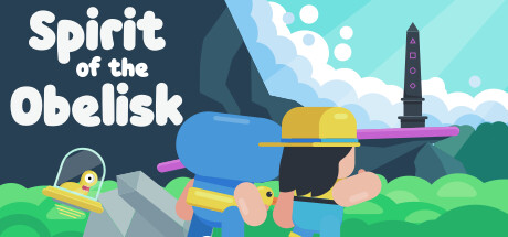
Switch between four unique heroes, each with their own special ability in this charming puzzle platformer. Play alone or with a friend to complete interesting puzzles in vibrant themed worlds.

$5.996 user reviews
Local Co-OpPuzzle Platformer2D Platformer
Joost van der PuttenApr 2, 2025

Spirit of the Obelisk scores 75/100 — better than 51% of Local Co-Op capsules (n=590).

6 user reviews · $5.99 · Released Apr 2, 2025 · By Joost van der Putten

Quick text summary

Spirit of the Obelisk scored 75/100 on Steam Analyzer — Good for a Local Co-Op capsule. Top priority fix: [genre_clarity] Add visual hints of the four-hero switching mechanic—show small character icons, color silhouettes, or skill symbols to communicate the multi-character core mechanic [composition] Integrate hero variety indicators into the composition without overcrowding, such as small character head icons along the top or in a corner.

Capsule scores by dimension

  • Genre Clarity: 7/10 — Puzzle platformer evident from visual. The colorful character with a blue body, yellow hard hat, and obelisk tower in the background immediately signal a puzzle platformer adventure. At TINY size, the distinct character silhouette and fantastical architecture remain readable, though the multi-hero switching mechanic is not visually obvious from this single character view alone.
  • Title Readability: 8/10 — Strong white sans-serif, reads well small. Bold white sans-serif typography placed in the upper left against a dark teal background provides excellent contrast and legibility across all sizes. The title remains readable at SMALL and TINY sizes without any decorative collapse, though at TINY the full text becomes slightly compressed and requires careful focus.
  • Contrast & Color: 8/10 — Vibrant palette pops against dark Steam background. The bright lime green grass, magenta accent lines, cyan character body, and yellow accents create strong value separation from the dark teal background and dark sky. The character silhouette remains distinct and readable at SMALL and TINY sizes due to the saturated color blocking and clean edge definition throughout.
  • Uniqueness & Polish: 7/10 — Charming art style with personality. The illustration demonstrates intentional character design with the whimsical proportions, rounded forms, and playful pose that communicates a casual, lighthearted tone appropriate to the genre. The flat vector art style with layered depth and the obelisk landmark provide visual storytelling, though the overall composition still reads as competent indie craft rather than exceptionally distinctive at this scale.
  • Brand Consistency: 7/10 — Coherent art direction, signature character. The consistent flat vector illustration style, cohesive warm-to-cool color palette, and the distinctive character design with the blue suit and hard hat create recognizable brand identity. The blocky obelisk architecture reinforces the thematic setting, though the capsule lacks additional memorable motifs or symbols that would elevate internal recognition further.
  • Composition: 8/10 — Clear focal point, balanced hierarchy. The character is positioned as the primary focal point in the center-right area with the obelisk tower anchoring the background on the right, creating good depth layering and visual flow. Title placement in the upper left is strategic and does not compete with the character; the composition maintains balance across SMALL and TINY sizes with no critical elements cropped or lost at Steam's typical viewing dimensions.

What works

  • Excellent title contrast and legibility. White bold sans-serif on dark teal background reads cleanly at all sizes from full header down to tiny thumbnail without degradation.
  • Vibrant color palette with strong pop. Bright lime, magenta, cyan, and yellow create visual separation against the dark Steam background and maintain silhouette clarity at small sizes.
  • Character-driven focal point with charm. The blue-suited character with distinctive proportions and pose establishes clear identity and communicates the lighthearted casual adventure tone.
  • Coherent flat vector art style. Consistent rendering approach with clean edges and intentional layering creates a polished, unified visual presentation across all elements.

What hurts the capsule

  • Single character does not communicate four-hero mechanic. The core unique selling point—switching between four unique heroes—is not visually evident from this capsule, which features only one character.
  • Limited visual indication of co-op gameplay. The two-player co-op feature mentioned in the description is not represented in the composition, reducing clarity of the game's versatility.
  • Obelisk tower feels somewhat secondary. While thematic, the tower in the background is less prominent than the character and does not immediately signal the narrative or mechanical importance of the obelisk.

Priority fixes

  1. [genre_clarity] Add visual hints of the four-hero switching mechanic—show small character icons, color silhouettes, or skill symbols to communicate the multi-character core mechanic [composition] Integrate hero variety indicators into the composition without overcrowding, such as small character head icons along the top or in a corner.
  2. [uniqueness_polish] Strengthen the visual narrative by emphasizing the obelisk's presence or adding environmental details that hint at puzzle-solving elements, such as visible puzzle mechanics or world theming cues.
  3. [composition] Test composition for Steam's typical crop zones (top, bottom, edges) and ensure the obelisk and title remain safe and readable if margins are reduced.

Store copy priority fixes

  1. [uniqueness] Add a clear statement of what makes Spirit of the Obelisk different from other puzzle platformers—e.g., 'The only game where you must combine four distinct movement abilities to solve physics-based puzzles' or highlight a specific mechanic fusion that is rare in the genre.
  2. [hook_strength] Replace 'mind-bending' with a more concrete, action-oriented hook in the opening of the detailed description—e.g., 'Switch between four heroes with clashing abilities to solve puzzles that require teamwork, even when playing alone.'
  3. [feature_communication] Eliminate the redundant restatement of the core premise in the second paragraph and instead expand on how the themed worlds (Diver, Mechanic, etc.) introduce new puzzle mechanics or gameplay twists, making each feel fresh.
  4. [tone_match] Shift away from generic marketing phrases like 'ultimate test' and 'challenge your wits' toward more personal, cozy language that reflects the game's relaxing, cute aesthetic—e.g., 'No rush, no fail states—just puzzles that invite you to experiment.'

Related guides

Steam app ID: 3147370 · Tags: Local Co-Op, Puzzle Platformer, 2D Platformer, Cozy, Platformer