Scoring genre clarity...

Agatha Christie - Death on the Nile capsule

Agatha Christie - Death on the Nile

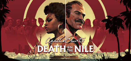
Death on the Nile is an adventure-detective game, offering a fresh twist on Agatha Christie’s famous story. Set in the lively 1970s, play as Hercule Poirot and detective Jane Royce as they solve two connected mysteries. Dive into a journey filled with intrigue, deception, and unexpected revelations.

$19.99Very Positive(14)
AdventureExplorationHidden Object
Microids Studio LyonSep 25, 2025

Agatha Christie - Death on the Nile scores 75/100 — better than 68% of Steam capsules we've analysed (n=22,658).

Very Positive (14 reviews) · $19.99 · Released Sep 25, 2025 · By Microids Studio Lyon

Quick text summary

Agatha Christie - Death on the Nile scored 75/100 on Steam Analyzer — Good for a Steam capsule. Top priority fix: [title_readability] Increase the weight and size of the 'Agatha Christie' script logo or add a subtle drop shadow and outline so it retains brand identity at small and tiny sizes.

Capsule scores by dimension

  • Genre Clarity: 8/10 — Mystery detective narrative clear. The dramatic split-face composition of two characters against a warm golden circle immediately evokes noir detective fiction and classic whodunit aesthetics. The Agatha Christie branding and 'Death on the Nile' title strongly anchor the mystery genre even at small sizes. At tiny size the two-character face-off silhouette still reads as a thriller or detective narrative, though the specific adventure-detective subgenre becomes slightly ambiguous.
  • Title Readability: 7/10 — Title legible, sub-brand smaller. The 'Death on the Nile' title in bold serif lettering sits on a controlled mid-tone band and reads clearly at full and small sizes. The 'Agatha Christie' script logo above it is decorative and harder to parse at small size, becoming largely unreadable at tiny thumbnail size. The white title text contrasts reasonably well against the warm red-gold background, though the script treatment of the brand name loses legibility quickly as size decreases.
  • Contrast & Color: 8/10 — Warm reds pop on dark Steam. The dominant warm crimson and gold palette creates strong contrast against Steam's dark #1b2838 background, making the capsule visually pop in a scroll. The circular golden halo behind the characters provides clear value separation and acts as a strong silhouette anchor. In grayscale the two portrait silhouettes remain distinct from the background, though the mid-range reds lose some punch and the supporting cast figures in the upper corners can blend slightly.
  • Uniqueness & Polish: 7/10 — Polished retro noir aesthetic. The 1970s retro poster design with the dramatic split-portrait composition and warm golden circle feels intentional and thematically coherent, evoking classic film noir and pulp mystery aesthetics. The palm tree silhouettes and waterfront cityscape in the background add period flavor without cluttering the primary read. Compared to top-performing genre peers like Slay the Princess or Chants of Sennaar which have more distinctive art hooks, this feels competently executed but somewhat conventional for a licensed mystery title.
  • Brand Consistency: 8/10 — Strong Agatha Christie identity. The capsule maintains a coherent internal visual language with a consistent warm red-gold-cream palette, period-appropriate design choices, and clear Agatha Christie brand signaling via the prominent script logo. The two main character portraits establish recognizable leads that could serve as recurring identity anchors across marketing materials. The retro poster style is well-sustained throughout the composition without style conflicts, and the Agatha Christie license gives an immediate recognizable brand signal even at small sizes.
  • Composition: 7/10 — Clear split portrait hierarchy. The central split-portrait composition with the golden circle creates a strong focal point and clear visual hierarchy, guiding the eye immediately to the two protagonists. The title text is well-placed in a controlled horizontal band at the bottom third, avoiding noisy texture areas. At small and tiny sizes the two large faces remain the dominant read, though the supporting cast silhouettes in the upper corners add slight visual noise and the overall composition feels slightly crowded at the edges when cropped.

What works

  • Warm palette contrast against Steam dark background. The crimson and gold tones pop immediately against #1b2838, ensuring high discoverability in a quick scroll.
  • Clear protagonist focus at small sizes. The two large portrait faces dominate the frame and remain the primary readable element even at tiny 120x45 thumbnail size.
  • Period-appropriate retro poster design. The 1970s film noir aesthetic coherently communicates the game's setting and tone through visual style alone.
  • Strong license brand signal. The Agatha Christie script logo immediately communicates the trusted mystery brand to fans even before the subtitle is read.

What hurts the capsule

  • Script logo unreadable at tiny size. The decorative 'Agatha Christie' script letterforms collapse and become illegible at 120x45 thumbnail size, losing the key brand anchor.
  • Supporting cast figures add edge clutter. The silhouetted characters arranged along the top edge compete slightly with the primary portrait focal point and feel crowded at small sizes.
  • Mid-tones reduce grayscale separation. In grayscale the warm red tones converge into similar mid-range values, reducing silhouette clarity between the background cityscape and character portraits.
  • Generic for the licensed mystery subgenre. The split-portrait noir poster composition, while well-executed, is a familiar template for mystery games and does not offer a distinctive visual hook compared to top genre peers.

Priority fixes

  1. [title_readability] Increase the weight and size of the 'Agatha Christie' script logo or add a subtle drop shadow and outline so it retains brand identity at small and tiny sizes.
  2. [uniqueness_polish] Introduce one more distinctive visual storytelling element — such as a symbolic prop, a Nile or Egyptian motif, or a unique typographic treatment — to differentiate from generic mystery poster layouts.
  3. [composition] Reduce or soften the supporting cast silhouettes along the top edge to minimize clutter and sharpen focus on the two central protagonist portraits at small sizes.
  4. [contrast_color] Add a subtle darker vignette or shadow behind the title text band to increase value separation and ensure legibility holds in grayscale viewing conditions.

Store copy priority fixes

  1. [hook_strength] Rewrite the opening line to lead with the dual-protagonist hook: 'Play as both Hercule Poirot and a private detective Jane Royce as their investigations collide on the Nile in a brand-new mystery beyond Agatha Christie's original novel.'
  2. [feature_communication] Add explicit mention of hidden object or puzzle gameplay to the feature list, or remove those tags if they are not core to the game.
  3. [tone_match] Standardize the voice: either maintain immersive narrative tone throughout (rename 'Enhanced Mindmap' to 'Build a case using a dynamic mindmap') or consolidate mechanical features into a consistent terminology style.
  4. [uniqueness] Add a sentence clarifying what mechanically or thematically makes this 1970s-set detective experience distinct from other point-and-click mysteries or past Christie adaptations.

Related guides

Steam app ID: 3150480