Scoring genre clarity...

Assassin’s Creed Shadows capsule

Assassin’s Creed Shadows

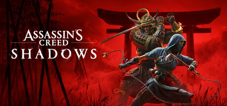
Experience an epic action-adventure story set in feudal Japan! Become a lethal shinobi assassin and powerful legendary samurai as you explore a beautiful open world in a time of chaos.

$31.49Mostly Positive(823)
Action-AdventureOpen WorldNinja
Ubisoft Quebec, Ubisoft Belgrade, Ubisoft Bordeaux, Ubisoft Bucharest & Craiova, Ubisoft Chengdu, Ubisoft Montpellier, Ubisoft Montreal, Ubisoft Osaka, Ubisoft Philippines, Ubisoft Shanghai, Ubisoft Singapore, Ubisoft Sofia, Ubisoft UkraineMar 19, 2025

Assassin’s Creed Shadows scores 83/100 — better than 95% of Steam capsules we've analysed (n=22,658).

Mostly Positive (823 reviews) · $31.49 · Released Mar 19, 2025 · By Ubisoft Quebec

Quick text summary

Assassin’s Creed Shadows scored 83/100 on Steam Analyzer — Good for a Steam capsule. Top priority fix: [contrast_color] Add a subtle dark vignette or shadow zone behind the shinobi figure to prevent the dark costume from merging with the background at tiny size.

Capsule scores by dimension

  • Genre Clarity: 9/10 — Feudal Japan action-RPG clear. Two distinct characters — an armored samurai and a hooded shinobi — are posed dynamically against a red torii gate and misty Japanese landscape, immediately communicating feudal Japan action-RPG. The dual-protagonist setup with contrasting archetypes (heavy warrior vs. stealthy assassin) reinforces the gameplay duality. Even at tiny size the silhouettes and red torii gate read as Japanese-themed action without ambiguity.
  • Title Readability: 8/10 — Logo reads well at small size. The 'Assassin's Creed' wordmark sits in the upper left in clean white serif text with recognizable franchise styling, and 'SHADOWS' is set in a large bold serif below it with clear contrast against the darker lower-left region. At full size both lines are crisp and well-spaced. At tiny size 'Assassin's Creed' becomes very small and the sub-branding detail is lost, but 'SHADOWS' in the larger weight still holds, and the franchise logo is recognizable enough to carry recognition.
  • Contrast & Color: 8/10 — Bold red palette pops on dark Steam. The saturated crimson background creates strong value contrast against Steam's dark navy #1b2838, making the capsule pop immediately in a grid. The two characters are lit with a subtle rim light that separates them from the red atmospheric background. In grayscale, the samurai's bright armor and the ninja's dark silhouette create clear tonal separation from each other and the background, though the ninja figure can slightly merge with darker zones at tiny size.
  • Uniqueness & Polish: 8/10 — Premium AAA craft, strong identity. The composition, color grading, and character rendering are clearly AAA-tier with cinematic lighting and professional key art polish. The dual-character concept is a strong visual hook that communicates the game's unique selling point — two protagonists with contrasting playstyles. Compared to benchmarks like Ghost of Tsushima or Black Myth: Wukong, it holds its own as a distinctive and premium-feeling capsule, though the red monochrome palette is a familiar trope for Japanese-themed games.
  • Brand Consistency: 9/10 — Strong franchise and game identity. The Assassin's Creed franchise logo, signature hood on the shinobi character, and the established typographic hierarchy are all immediately recognizable brand signals for series fans. The red palette and torii gate establish a clear Shadows-specific identity within the franchise. The internal cohesion between the logo placement, character styling, and atmospheric background is tight and professional, creating a visual identity that would be consistent across marketing materials.
  • Composition: 8/10 — Strong dual-figure hierarchy, clean margins. The two characters occupy the right-center of the frame as a clear unified focal group, with the torii gate serving as a strong structural midground anchor and the misty landscape as a soft background layer. The title text is placed cleanly in the upper-left with breathing room, and the safe margins appear well-considered. At small size the character group and red palette still communicate the key visual clearly, though the dual-character detail compresses and becomes harder to distinguish individually at tiny size.

What works

  • Iconic red palette pops on Steam dark background. The saturated crimson environment creates immediate shelf presence against Steam's #1b2838 dark navy UI, standing out in any genre row.
  • Dual-protagonist silhouettes communicate core mechanic. The samurai and shinobi pairing visually tells the player the game has two distinct playstyle archetypes, which is the game's primary USP.
  • Torii gate provides strong structural anchor. The large red torii gate frames the characters and instantly roots the setting in feudal Japan without needing text to explain it.
  • AAA typographic hierarchy is clean and on-brand. The franchise wordmark above a larger game title follows established Assassin's Creed visual language and reads without confusion at full and small sizes.

What hurts the capsule

  • Shinobi figure can blend into dark zones at tiny size. The dark-clad ninja character loses definition against the darker lower-left areas of the image when compressed to 120x45, reducing the dual-character read.
  • Red monochrome palette echoes Ghost of Tsushima comps. The heavy crimson-red atmosphere is a familiar trope in Japanese-themed game marketing, reducing uniqueness against direct genre competitors.
  • 'Assassin's Creed' sub-line unreadable at tiny size. The smaller franchise wordmark above 'SHADOWS' collapses entirely at 120x45 and relies entirely on prior brand recognition to carry meaning.
  • Character detail compresses poorly at tiny scale. The intricate samurai armor and ninja gear details that give the image richness at full size become undifferentiated noise at tiny thumbnail size.

Priority fixes

  1. [contrast_color] Add a subtle dark vignette or shadow zone behind the shinobi figure to prevent the dark costume from merging with the background at tiny size.
  2. [title_readability] Consider slightly increasing the weight or size of the 'Assassin's Creed' wordmark or adding a faint drop shadow to extend its legibility range at small sizes.
  3. [uniqueness_polish] Introduce a subtle secondary color accent (e.g., a cool blue or gold rim light on the characters) to differentiate the palette from other red-dominant Japanese-themed capsules.
  4. [composition] Tighten the character grouping slightly toward center to improve crop resilience and ensure neither figure is clipped in edge-heavy thumbnail crops.

Store copy priority fixes

  1. [hook_strength] Rewrite the short description to lead with the dual-protagonist mechanic and feudal Japan as a specific historical setting, not generic adjectives—e.g., 'Master feudal Japan as a shinobi assassin and a legendary samurai. Two heroes, two playstyles, one unforgettable story.'
  2. [feature_communication] Add a dedicated paragraph to the detailed description explaining RPG progression: skill trees, character growth, and how mastery points shape your playstyle for both Naoe and Yasuke.
  3. [uniqueness] Add 1-2 sentences explaining why feudal Japan matters (historical period, narrative context, environmental storytelling) and why dual protagonists create a unique narrative or mechanical advantage over single-character AC games.
  4. [audience_targeting] Insert a sentence clarifying difficulty options and whether the game is welcoming to stealth newcomers, combat-first players, or story-focused players—e.g., 'Customize difficulty and stealth lethality to suit your playstyle, from story-focused to hardcore challenges.'

Related guides

Steam app ID: 3159330