Quick text summary

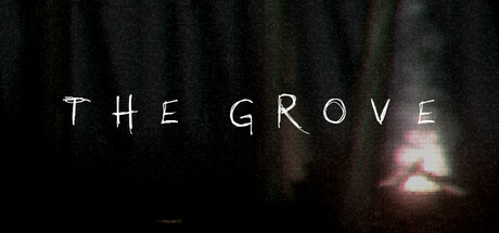
The Grove scored 72/100 on Steam Analyzer — Good for a Horror capsule. Top priority fix: [uniqueness_polish] Introduce a distinctive visual element—such as a recognizable artifact silhouette, child figure, or glowing anomaly—into the foreground or midground to create a unique visual hook beyond generic atmospheric forest mood.

Capsule scores by dimension

  • Genre Clarity: 7/10 — Mystery indie adventure signaled. The dark, misty forest atmosphere with dim warm light and ominous tone clearly signals a supernatural mystery or horror-adventure game rather than action or puzzle-focused indie titles. At tiny size, the silhouette of trees and ambient glow still reads as eerie woodland exploration, though the specific genre mechanics remain ambiguous without gameplay context.
  • Title Readability: 8/10 — Clean, legible at all sizes. Title 'THE GROVE' uses a simple sans-serif with generous letter spacing and white color against dark background, maintaining clarity at full, small, and tiny sizes. The minimal, uncluttered approach ensures the text survives scaling without loss of impact, though the decorative hand-drawn quality is subtle enough to not degrade legibility.
  • Contrast & Color: 8/10 — Strong value separation, moody. White title text pops clearly against the dark forest backdrop (#1b2838 compatible), and the warm amber light in the midground creates clear value separation between subject and environment. In grayscale squint test, the silhouette of trees and atmospheric glow remain distinct; the composition avoids muddy mid-tone collapse despite the overall dark palette.
  • Uniqueness & Polish: 7/10 — Atmospheric mood distinct, modest execution. The moody forest aesthetic with soft ambient lighting and title treatment conveys a deliberate, atmospheric vision that differentiates it from generic adventure capsules. However, the visual execution relies heavily on darkness and atmospheric fog rather than distinctive character, UI, or iconic visual hook; the craft is clean but the hook is subtle.
  • Brand Consistency: 6/10 — Cohesive mood, limited identity cues. The dark, misty woodland palette and minimal text-heavy design are internally consistent and align with mystery-adventure expectations, but there are no distinctive iconography, character silhouettes, or signature visual motifs that would create brand recall across multiple touchpoints. The aesthetic is competent but generic within the supernatural indie space.
  • Composition: 7/10 — Centered title, atmospheric balance. Title is centrally positioned with clean margins, and the warm glow in the background provides subtle focal depth that guides the eye without competing elements. At small and tiny sizes, the composition remains stable and readable, though the middle-ground light is somewhat diffuse and could be more sharply defined to create stronger hierarchy.

What works

  • Title legibility across scales. The white sans-serif 'THE GROVE' text maintains excellent readability from full size down to tiny thumbnail due to clean letterforms, generous spacing, and strong contrast against dark background.
  • Atmospheric mood cohesion. The dark forest environment with warm amber lighting creates a unified, eerie mystery tone that immediately signals adventure-horror rather than action, puzzle, or casual genres.
  • Minimal, focused composition. Avoiding clutter or competing visual elements allows the title and atmospheric glow to dominate, making the capsule quick to parse in quick scroll conditions.

What hurts the capsule

  • Generic identity signals. Despite cohesive mood, the capsule lacks a memorable character, object, or visual icon that would make the brand distinguishable from other dark indie adventures at store shelf or discovery moments.
  • Soft focal point at tiny size. At thumbnail size, the warm glow in the background becomes diffuse and loses definition, making the atmospheric hierarchy less clear compared to sharper, more defined focal subjects in top-tier capsules.
  • Limited unique visual hook. The execution is competent but relies on established mood tropes (misty forest, ambient warmth) without a distinctive art style, signature palette shift, or gameplay-specific visual element that signals novelty.

Priority fixes

  1. [uniqueness_polish] Introduce a distinctive visual element—such as a recognizable artifact silhouette, child figure, or glowing anomaly—into the foreground or midground to create a unique visual hook beyond generic atmospheric forest mood.
  2. [composition] Sharpen or strengthen the warm light source in the midground so it reads as a clear focal point even at tiny thumbnail size, creating stronger value hierarchy and visual anchor.
  3. [brand_consistency] Add a subtle but consistent visual motif or icon (e.g., pine grove symbol, artifact marking, or character silhouette) that could appear across store screenshots and social media to build recognizable brand identity.

Store copy priority fixes

  1. [feature_communication] Replace the vague features list with concrete mechanics: specify what hidden object searching entails, describe 2-3 puzzle types by example, explain how inventory or exploration progression works.
  2. [uniqueness] Add a 1-2 sentence unique angle to the opening or features—what is distinctive about this grove, these missing children, or the investigation that differs from similar horror games?
  3. [genre_clarity] Rewrite the opening of the features section to explicitly name the core gameplay loop (e.g., 'Explore a haunted grove, search for artifacts, solve environmental puzzles, uncover the truth about the vanished children') before listing atmospheric qualities.
  4. [tone_match] Replace marketing clichés in the features section ('masterfully made,' 'will transport you') with more specific, grounded descriptions that maintain the atmospheric, investigative tone from the premise.

Related guides

Steam app ID: 3161690 · Tags: Horror, Survival Horror, Psychological Horror, 3D, Exploration