Scoring genre clarity...

The Backrooms: Expedition capsule

The Backrooms: Expedition

Explore the world of backrooms from this solo developed game. explore creepy and eerie levels, and also calm and liminal levels, but be careful, you're not the only one there.

$3.99Mixed(15)
HorrorWalking SimulatorPsychological Horror
SylvesterJul 1, 2025

The Backrooms: Expedition scores 63/100 — better than 9% of Horror capsules (n=3,118).

Mixed (15 reviews) · $3.99 · Released Jul 1, 2025 · By Sylvester

Quick text summary

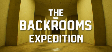
The Backrooms: Expedition scored 63/100 on Steam Analyzer — Solid for a Horror capsule. Top priority fix: [uniqueness_polish] Introduce a distinctive visual hook—such as a shadowy creature silhouette, a unique architectural detail, or a signature environmental artifact—that differentiates this capsule from generic liminal-space imagery.

Capsule scores by dimension

  • Genre Clarity: 6/10 — Liminal space suggests exploration horror. The yellow-toned brutalist corridor with institutional lighting clearly communicates a liminal, unsettling environment that aligns with backrooms exploration gameplay. At tiny size, the geometric architecture and eerie emptiness remain readable and evoke a exploration-horror tone. However, without visible threats, creatures, or dynamic action elements, the adventure-action gameplay hook is not immediately clear.
  • Title Readability: 8/10 — Clear bold title, excellent contrast. The white sans-serif text 'THE BACKROOMS EXPEDITION' is prominently centered with strong contrast against the muted yellow-green background. The text remains fully readable at small and tiny sizes due to large letterforms, good spacing, and strategic placement on a relatively clean background area. No decorative elements or competing visual noise impede legibility.
  • Contrast & Color: 7/10 — Strong value separation, limited vibrancy. White title text pops decisively against the desaturated yellow-ochre environment, creating clear silhouette separation and excellent grayscale contrast. The monochromatic warm palette is cohesive but lacks saturation punch; the design reads well at small size due to value contrast, though it does not feel visually vibrant or energetic against the Steam dark background. Silhouette clarity is strong across all viewing sizes.
  • Uniqueness & Polish: 5/10 — Generic liminal space, minimal distinction. The brutalist corridor is a familiar visual trope in backrooms and liminal space media, rendered competently but without distinctive art direction or memorable visual hook. The composition lacks character, unique architectural detail, or atmospheric storytelling elements that would differentiate it from other liminal exploration games. While technically clean, the capsule reads as thematically appropriate but visually generic for an indie title competing against polished action-adventure peers.
  • Brand Consistency: 5/10 — On-brand but lacks memorable identity. The yellow brutalist aesthetic is thematically consistent with backrooms subject matter and would align with the game's liminal level design mentioned in the description. However, without visible iconic characters, motifs, or a signature visual signature from the game's actual store screenshots, the capsule feels like a generic liminal-space illustration rather than a branded identity. The design is coherent but not distinctively recognizable as 'The Backrooms: Expedition' specifically.
  • Composition: 7/10 — Centered focal point, balanced hierarchy. The title is centered and anchors the composition with clear primary focus, while the architectural perspective and vanishing point guide the eye naturally into the scene's depth. At tiny size, the centered text and geometric corridor remain the dominant focal point without clutter. The layout is safe from Steam's crop margins and maintains effective space hierarchy, though the bottom portion of the corridor contains unused visual real estate that could be leveraged for additional atmospheric detail or secondary cues.

What works

  • Readable title at all sizes. White sans-serif text with high contrast ensures the game title remains legible from full header down to tiny thumbnail without any letterform degradation.
  • Thematic visual coherence. The brutalist yellow corridor directly communicates the liminal, unsettling atmosphere that defines the backrooms exploration premise.
  • Clean composition hierarchy. Strong centered focal point with architectural depth creates a clear visual path and maintains balance across all viewing sizes.

What hurts the capsule

  • Generic liminal aesthetic. The corridor design relies on familiar backrooms tropes without distinctive art direction, memorable characters, or unique visual storytelling hooks that would stand out against genre peers.
  • Lacks action-adventure signals. The static architectural composition does not visually communicate combat, exploration challenge, or dynamic gameplay; it reads more as atmospheric walking simulator than adventure-action hybrid.
  • Muted color palette limits visual pop. The desaturated yellow-ochre scheme is thematically appropriate but lacks vibrancy and energy, making the capsule feel visually flat compared to high-performing action-adventure titles in the benchmark list.
  • No brand identity anchor. Absence of iconic characters, creatures, or signature visual motifs means the capsule does not establish a memorable brand presence that players would recognize on future releases.

Priority fixes

  1. [uniqueness_polish] Introduce a distinctive visual hook—such as a shadowy creature silhouette, a unique architectural detail, or a signature environmental artifact—that differentiates this capsule from generic liminal-space imagery.
  2. [contrast_color] Increase saturation or introduce a secondary accent color (warm orange glow, eerie blue lighting, or red danger signal) to add visual vibrancy and help the capsule pop against the Steam dark background.
  3. [genre_clarity] Add a subtle threat element—a distant figure, creature eyes, or dynamic environmental hazard—to communicate the action-horror and danger aspects alongside exploration.
  4. [brand_consistency] Incorporate a visual motif or character silhouette from the game's actual screenshot reference to establish recognizable brand identity and consistency across marketing materials.

Store copy priority fixes

  1. [hook_strength] Rewrite the short description to lead with a specific hook: 'Descend into the Backrooms—a nightmarish network of liminal spaces where exploration hides unseen threats. Navigate between eerie corridors and eerily calm environments as you uncover what lurks in the darkness.' This explains what Backrooms are and creates immediate curiosity.
  2. [feature_communication] Expand the features list with concrete gameplay details: Replace 'Entities' with 'Encounter dangerous creatures that stalk the levels' and 'Multiple Levels' with 'Explore diverse environments from industrial corridors to suburban liminal spaces.' Add a sentence explaining the core mechanic: 'Stay hidden, navigate carefully, or run for your life.'
  3. [uniqueness] Add a sentence differentiating this game from other Backrooms titles: 'Experience the Backrooms like never before—a solo developer's vision that blends atmospheric exploration with genuine psychological horror and unexpected moments of eerie calm.'
  4. [audience_targeting] Add a line identifying the core audience: 'Perfect for fans of atmospheric horror, liminal space aesthetics, and psychological exploration who prefer tension over jump scares.'

Related guides

Steam app ID: 3162000 · Tags: Horror, Walking Simulator, Psychological Horror, Realistic, First-Person