Scoring genre clarity...
Five Nights at Freddy's capsule

Five Nights at Freddy's

Welcome to your new summer job at Freddy Fazbear's Pizza, where kids and parents alike come for entertainment and food! The main attraction is Freddy Fazbear, of course; and his two friends. They are animatronic robots, programmed to please the crowds!

$4.99Very Positive(377)
HorrorSingleplayerSurvival Horror
Scott CawthonAug 19, 2014

Five Nights at Freddy's scores 88/100 — better than 100% of Horror capsules (n=3,252).

Very Positive (377 reviews) · $4.99 · Released Aug 19, 2014 · By Scott Cawthon

Quick text summary

Five Nights at Freddy's scored 88/100 on Steam Analyzer — Excellent for a Horror capsule. Top priority fix: [uniqueness_polish] Consider adding subtle environmental depth cue (e.g., stage lights, curtain edge, or office chair silhouette) to reinforce the security-office gameplay setting without cluttering the focal point.

Capsule scores by dimension

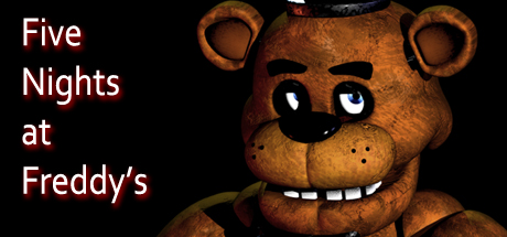
  • Genre Clarity: 9/10 — Iconic horror animatronic instantly recognizable. Freddy's distinctive golden bear face with glowing eyes, top hat, and menacing grin immediately communicates survival horror and animatronic threat. The silhouette reads clearly even at tiny size, and the eerie expression combined with stage lighting establishes the indie horror-simulation genre without ambiguity. At tiny size, the glowing eyes and teeth remain the dominant focal point, successfully conveying dread.
  • Title Readability: 8/10 — Clean white text with strong contrast. The white sans-serif title 'Five Nights at Freddy's' sits on the left against the dark background with excellent legibility at full size and readable at small size. The text maintains proper spacing and line breaks that support scanning. At tiny size some letter detail softens but the word grouping and overall block remain identifiable, though individual character clarity degrades slightly.
  • Contrast & Color: 9/10 — High-value separation with glowing focal point. Freddy's warm golden-brown animatronic contrasts sharply against the near-black background, with bright white eyes creating a secondary light anchor that draws immediate attention. The grayscale silhouette separation is excellent—the bear reads as a distinct solid form even when squinting. Warm orange/gold tones in the suit against cool dark tones maximize pop and readability at all sizes.
  • Uniqueness & Polish: 9/10 — Distinctive horror-comedy aesthetic, branded character. Freddy Fazbear is a signature character with unmistakable visual identity—the weathered animatronic texture, unsettling proportions, and theatrical top hat create a memorable silhouette that differentiates FNAF from generic horror. The intentional uncanny-valley rendering and prop details (top hat, button eyes, stitched smile) show clear craft and thematic coherence. This is not a template or borrowed asset; it is a cornerstone of the franchise identity.
  • Brand Consistency: 9/10 — Signature character maintains franchise identity. Freddy Fazbear is instantly recognizable across the FNAF franchise and community—his design, color palette, expression, and styling are consistent and iconic. The capsule leverages his established character identity without variation or dilution. This character has strong brand recall and would be recognized in isolation as FNAF, fulfilling the highest standard of internal brand cohesion.
  • Composition: 9/10 — Clear hierarchy with title left, character right. The layout uses a balanced asymmetrical composition: white title text anchors the left third with strong left-to-right reading flow, while Freddy's head occupies the dominant right-center position as the primary focal point. No element competes for attention; the bear's glowing eyes are the clear secondary draw after the title. At small and tiny sizes, the focal point hierarchy remains intact with no awkward cropping or edge clipping.

What works

  • Iconic character silhouette. Freddy's distinctive design with top hat, glowing eyes, and stitched grin creates an immediately recognizable and memorable primary focal point across all viewing sizes.
  • Strong contrast and readability. White title text and golden animatronic body separate cleanly from the near-black background, maintaining clarity even at tiny thumbnail size.
  • Coherent horror-simulation messaging. The menacing animatronic expression combined with stage-like lighting effectively communicates the indie survival-horror genre without ambiguity.
  • Professional layout hierarchy. Title on left, character on right creates a balanced, scannable composition that works across full, small, and tiny sizes without cluttering or dead space.

What hurts the capsule

  • Minimal environmental context. The capsule shows only Freddy's head against black; the pizza restaurant setting or office security room environment is absent, reducing narrative immersion.
  • Limited secondary visual storytelling. The silhouetted animatronic in the background left is barely distinguishable and adds minimal insight into the multi-animatronic mechanic or gameplay stakes.

Priority fixes

  1. [uniqueness_polish] Consider adding subtle environmental depth cue (e.g., stage lights, curtain edge, or office chair silhouette) to reinforce the security-office gameplay setting without cluttering the focal point.
  2. [composition] Ensure the background animatronic silhouette receives slightly more light or detail to hint at the multi-threat mechanic while maintaining Freddy as the dominant element.

Store copy priority fixes

  1. [hook_strength] Rewrite the opening line to lead with the threat and emotional stakes: 'You took a summer job as a night security guard at an animatronic-filled pizza venue—but the robots aren't staying in their designated areas anymore.' This maintains the subversion but signals danger immediately.
  2. [uniqueness] Add a sentence explicitly differentiating the game's design philosophy, such as: 'Unlike traditional horror games, FNAF relies on psychological tension and resource scarcity rather than combat—you survive through observation and quick thinking.' This makes the unique angle part of the copy rather than buried in the review.
  3. [feature_communication] Clarify the five-night progression structure in the opening, as it is mentioned in the closing question but not explained—hint at escalating difficulty or the night-by-night challenge system.

Related guides

Steam app ID: 319510 · Tags: Horror, Singleplayer, Survival Horror, Robots, Psychological Horror