Scoring genre clarity...

Robinson Crusoe : The Lost Tribes capsule

Robinson Crusoe : The Lost Tribes

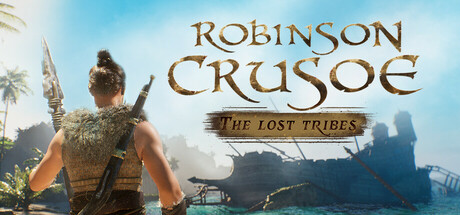
As Robinson Crusoe, a 17th-century castaway, you must survive on a tropical island in this action-adventure game. Explore a dynamic world, uncover secrets, craft tools, build shelters, and defend against dangers. Your choices shape your fate—will you conquer the wilds or fall victim to them?

SurvivalStory RichAction RPG
Infilope GamesComing soon

Robinson Crusoe : The Lost Tribes scores 67/100 — better than 15% of Steam capsules we've analysed (n=22,658).

Released Coming soon · By Infilope Games

Quick text summary

Robinson Crusoe : The Lost Tribes scored 67/100 on Steam Analyzer — Solid for a Steam capsule. Top priority fix: [uniqueness_polish] Introduce a dramatic foreground element such as a threatening enemy, unique creature, or action moment to replace the static scenic back-of-hero pose and create a memorable visual hook.

Capsule scores by dimension

  • Genre Clarity: 7/10 — Survival island adventure clear. The center-back character holding a spear-like weapon, fur/hide clothing, tropical island setting with palm trees and shipwreck ruins in the background clearly communicates a survival or action-adventure genre. At small size the tropical island atmosphere and primitive warrior silhouette still reads as survival action. At tiny size the genre cues compress but the tropical setting and armed character still suggest action-survival rather than pure RPG.
  • Title Readability: 7/10 — Main title reads, subtitle struggles. The 'Robinson Crusoe' title in large golden serif lettering reads well at full and small sizes with good contrast against the sky background. The subtitle 'The Lost Tribes' uses a smaller cursive/italic font on a subtle banner that becomes difficult to parse at small size and is essentially illegible at tiny size. At tiny size only 'Robinson Crusoe' survives as readable text, which is acceptable but the subtitle adds visual noise without contributing readability.
  • Contrast & Color: 6/10 — Adequate contrast, sky helps title. The warm golden title text contrasts well against the light blue sky background in the upper portion. However the character silhouette viewed from behind uses muted earthy tones that blend somewhat into the mid-value background, reducing separation in grayscale. Against Steam's dark #1b2838 background the overall image has decent pop due to the bright sky tones, but the character lacks a strong rim light or edge separation that would make the silhouette punch harder at small sizes.
  • Uniqueness & Polish: 6/10 — Competent but generic survivor scene. The composition of a character viewed from behind overlooking a landscape is a common capsule trope seen across many action-adventure games. The tropical survival setting is distinctive for the genre but the execution feels like a competent asset render without a strong unique visual hook or signature moment. The golden serif title treatment is clean and appropriate for the Robinson Crusoe IP, but the overall capsule does not stand out strongly against top-tier genre benchmarks like Ghost of Tsushima or God of War which have stronger hero silhouettes and production value.
  • Brand Consistency: 7/10 — Cohesive island survival identity. The warm tropical color palette, the primitive crafted clothing, the shipwreck and jungle environment, and the ornate serif title font all work together to establish a consistent 17th-century castaway survival identity. The golden title treatment with its period-appropriate typography signals a premium literary adaptation feel. The visual language is internally coherent and would be recognizable across store assets, though the character being shown from behind limits a strong iconic face or hero identity.
  • Composition: 7/10 — Clear focal point, back-of-hero trope. The character is placed in the lower-center of the frame with the title occupying the upper right, creating a reasonable two-zone hierarchy between identity and character. The background layers from jungle left to ruins right provide depth, and the bright sky in the upper portion gives the title clean space to sit. At small size the composition holds reasonably well with character and title still parsing separately, though the subtitle 'The Lost Tribes' competes with the main title zone and the lower portion of the character may be cropped in certain Steam thumbnail formats.

What works

  • Clean title zone. The golden serif 'Robinson Crusoe' lettering sits against a controlled light sky area, giving it strong contrast and readability at full and small sizes.
  • Strong genre setting cues. Tropical island, palm trees, shipwreck ruins, and primitive gear collectively communicate survival adventure quickly even under quick scroll conditions.
  • Coherent art direction. The warm earthy palette, period-appropriate costume, and ornate title font form a unified visual identity consistent with a literary survival IP.

What hurts the capsule

  • Subtitle illegible at tiny size. The cursive 'The Lost Tribes' text on the banner becomes completely unreadable at 120x45 and adds visual clutter without contributing to identification.
  • Weak character silhouette separation. The from-behind character in muted earthy tones lacks a strong rim light or edge contrast, causing the figure to partially merge with the mid-tone background in grayscale.
  • Generic back-of-hero composition. Showing the protagonist from behind is a heavily used trope that reduces memorability and fails to establish an iconic face or character identity compared to top genre competitors.
  • No standout visual hook. The capsule depicts a competent scenic moment but lacks a dramatic action beat, unique creature, or signature visual element that would differentiate it from dozens of similar survival-adventure capsules.

Priority fixes

  1. [uniqueness_polish] Introduce a dramatic foreground element such as a threatening enemy, unique creature, or action moment to replace the static scenic back-of-hero pose and create a memorable visual hook.
  2. [title_readability] Increase the size and weight of 'The Lost Tribes' subtitle or simplify it to a single bold line so it reads at small size, or remove it entirely and rely on 'Robinson Crusoe' alone.
  3. [contrast_color] Add a strong rim light or edge glow to the character silhouette to separate the figure from the background, ensuring the hero reads as a clean distinct shape in grayscale at tiny size.
  4. [composition] Ensure the main character is positioned higher in the frame or scaled larger to survive Steam's tightest thumbnail crop without losing the head or weapon detail.

Store copy priority fixes

  1. [uniqueness] Rewrite the opening sentences to emphasize what makes this Robinson Crusoe adaptation distinct—e.g., 'Master a deep crafting system where every tool you create shapes your survival story' or highlight the three-faction dynamic as a core differentiator from other survival games.
  2. [audience_targeting] Add explicit clarity about expected player archetype and experience: 'Ideal for story-driven survival fans who value stealth and moral choice over pure combat' or specify if this is a challenging, methodical experience versus casual-friendly.
  3. [hook_strength] Replace the generic closing rhetorical question in the short description ('will you conquer the wilds or fall victim to them?') with a more specific, concrete value proposition tied to the Crusoe narrative or faction system.
  4. [feature_communication] Clarify the Early Access scope more prominently—specify expected full-release date or content roadmap so players understand what they're purchasing versus what's unfinished.

Related guides

Steam app ID: 3197100