Scoring genre clarity...

RippleLoop capsule

RippleLoop

Chain together stone skips in this relaxing incremental game. Launch, bounce across the water, upgrade, and go further with every throw. Buy new upgrades and powers to become the best stone skipper.

IdlerIncrementalArcade
DistortedGameDev2026

RippleLoop scores 78/100 — better than 73% of Idler capsules (n=1,301).

Released 2026 · By DistortedGameDev

Quick text summary

RippleLoop scored 78/100 on Steam Analyzer — Good for a Idler capsule. Top priority fix: [uniqueness_polish] Add a visual element representing progression or upgrades (stone or character detail) to differentiate from generic casual water games and hint at the incremental loop depth

Capsule scores by dimension

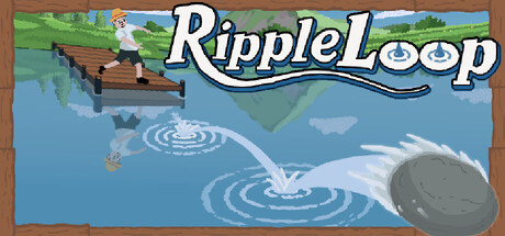
  • Genre Clarity: 8/10 — Clear casual incremental water game. The stone skipping mechanic is immediately communicated through the prominent ripple circles in the water and the peaceful landscape setting. At TINY size, the ripples and water environment still read clearly as the core gameplay loop, establishing a relaxing casual game identity without ambiguity.
  • Title Readability: 9/10 — Excellent legibility at all sizes. RippleLoop uses a bold, white outlined sans-serif font with thick strokes that maintains perfect clarity from full header down to tiny thumbnail. The title is positioned in the upper safe zone over the landscape background, avoiding text overlap and ensuring zero readability loss at any viewing distance.
  • Contrast & Color: 8/10 — Strong value separation and appeal. The white title with black outline pops distinctly against the blue sky and green landscape background, creating excellent contrast against Steam's dark UI. The blue water and sky dominate the composition with good saturation control, and the ripple circles use light blue/white to stand out clearly even at TINY size.
  • Uniqueness & Polish: 7/10 — Polished casual aesthetic, familiar formula. The art style is clean and purposefully minimalist with a cohesive illustrated look that feels premium for an indie title. However, the peaceful landscape and water elements follow established casual indie game conventions, making it competent but not visually distinctive enough to stand out as innovative among top-tier indie releases.
  • Brand Consistency: 7/10 — Consistent casual indie presentation. The soft color palette (pastels, sky blues, greens) and friendly typography establish a recognizable casual brand identity that should be consistent across the store page. The ripple motif is a signature visual element that directly connects to the game's core mechanic and can anchor brand recognition in future marketing assets.
  • Composition: 8/10 — Well-balanced hierarchy and focal depth. The composition uses strong layering with sky, landscape midground, and prominent water ripples in the foreground, creating clear depth. The title sits securely in the upper region with the ripples anchoring attention below, though the composition is somewhat horizontally centered which works for this peaceful theme and maintains safe margins across all sizes.

What works

  • Bold readable title. White outlined sans-serif lettering maintains perfect legibility across full, small, and tiny viewing sizes without any collapse or blur.
  • Mechanical clarity through visuals. Ripple circles immediately communicate the stone-skipping core loop and make the game's incremental mechanic visually obvious at any size.
  • Cohesive peaceful aesthetic. The soft color palette, calm landscape, and serene water environment establish an inviting brand identity for a relaxing incremental game.

What hurts the capsule

  • Generic casual indie formula. While well-executed, the peaceful landscape and ripple visuals follow established indie game design patterns without a distinctive visual hook that separates it from genre peers.
  • Limited visual storytelling. The capsule communicates the mechanic but lacks characters, narrative elements, or unique visual storytelling that suggests deeper gameplay progression or upgrades mentioned in the description.

Priority fixes

  1. [uniqueness_polish] Add a visual element representing progression or upgrades (stone or character detail) to differentiate from generic casual water games and hint at the incremental loop depth
  2. [composition] Consider introducing a subtle character or upgraded stone element in the mid-foreground to create a focal point beyond just landscape and ripples

Store copy priority fixes

  1. [feature_communication] Expand the detailed description to 150+ words with concrete examples of upgrades (e.g., 'heavier stones,' 'spin boost,' 'wind assist') and explain how chaining works mechanically—does it multiply distance, add bonuses, or unlock new stages?
  2. [uniqueness] Add one sentence that differentiates RippleLoop from other incremental games, such as a unique mechanic (e.g., 'the only stone-skip game where physics and timing matter'), a story hook, or an unexpected progression twist.
  3. [hook_strength] Rewrite the final sentence of the short description to lead with an emotional or curiosity hook rather than generic 'become the best'—e.g., 'Watch your skips ripple across endless waters' or 'Discover what lies beyond the horizon.'
  4. [feature_communication] Fix the typo 'powerfull' → 'powerful' and clarify what 'full strength' means in context; consider replacing the vague fourth bullet with a concrete progression example.

Related guides

Steam app ID: 3204820 · Tags: Idler, Incremental, Arcade, Indie, Pixel Graphics